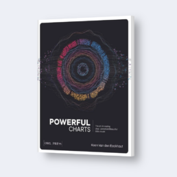
Our book: Powerful Charts
Charts are an excellent way to share complex ideas or large amounts of data with your audience. But they are also hard to make: which chart works best in which situation – and why? What color scheme should you use to strengthen your message? What are some common pitfalls to avoid? How can you add the perfect title, labels, legend and caption? And how do you move beyond a boring pie or bar chart?

Powerful Charts
The Art of Creating Clear, Correct and Beautiful Data Visuals
Koen Van den Eeckhout
€ 35,00
- Language: English
- Softback, 200 pages
- Delivery (in Belgium) in 1 to 2 working days
- Free shipping to Belgium and the Netherlands
Powerful Charts explains how basic design and communication principles help you decide which chart type is best for you, which out-of-the-box charts might grab the attention of your audience, and how you should style them. We’ll look at tools, techniques and workflows to create beautiful, clear and convincing charts that go far beyond the default spreadsheet graphs.
Who is this book for?
Powerful Charts is not a heavy theoretical data visualization manual for those who want to become #dataviz experts. It’s also not a purely decorative book with jaw-dropping visuals that take weeks to create.
Powerful Charts is aimed at everyone who regularly needs to communicate using data – researchers, marketeers, consultants, journalists,… – but wants to do so in a more powerful way. It’s full of practical advice to turn the charts you currently use into convincing visuals that tell a clear story.
We focus on three key aspects of a powerful chart:
✅ Clarity: the chart’s message is easy to understand
✅ Correctness: data is presented accurately, using the right chart type
✅ Beauty: the chart’s design supports the message and is pleasing to look at
For each of these aspects, we discuss just enough theoretical background to understand what we’re doing, and why it works.
✨ Powerful Charts will be your guide to make the data visuals in your next presentation, report, app or article shine!
What people say
⭐⭐⭐⭐⭐
“Through the years, I learned a lot from Koen about effective scientific data visualisation. Great that now his wisdom is available in book format. This book will show the principles to dressing charts that are clear, correct and beautiful.”
– Michiel, post-doctoral researcher at Ghent University
⭐⭐⭐⭐⭐
“Wow! Essential reading for every scientist, both those experienced and novice in data visualization.”
– Wim, professor at Ghent University
About the author
Koen Van den Eeckhout is a PhD in Physics with a passion for visual communication, business and innovation, science and technology. In 2014 Koen founded Baryon, an information design agency that assists companies, researchers and organizations to get their message across in the most clear, powerful, and visual way.
