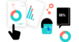
Our Services
We turn dusty shelf reports into actionable insights

One third of all the reports being produced is never read. Not a single time! That’s because ploughing through an endless collection of text-filled pages is hard, and boring.
We help you turn your report into an accessible dashboard to unlock the data, or an enticing visual story highlighting the key insights!
We turn endless text into interactive infographics

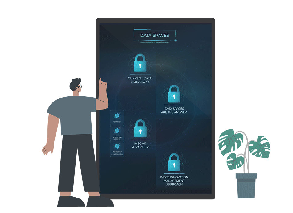
Your audience is bombarded with content. They don’t have time to read the fiftieth blog post.
In order to stand out, visualization is the way to go. Infographics turn boring text into enticing visuals. Adding interactivity will keep your audience even more engaged!
You can use your infographics on social media, on your website, or even on the big screen during a conference or trade fair.
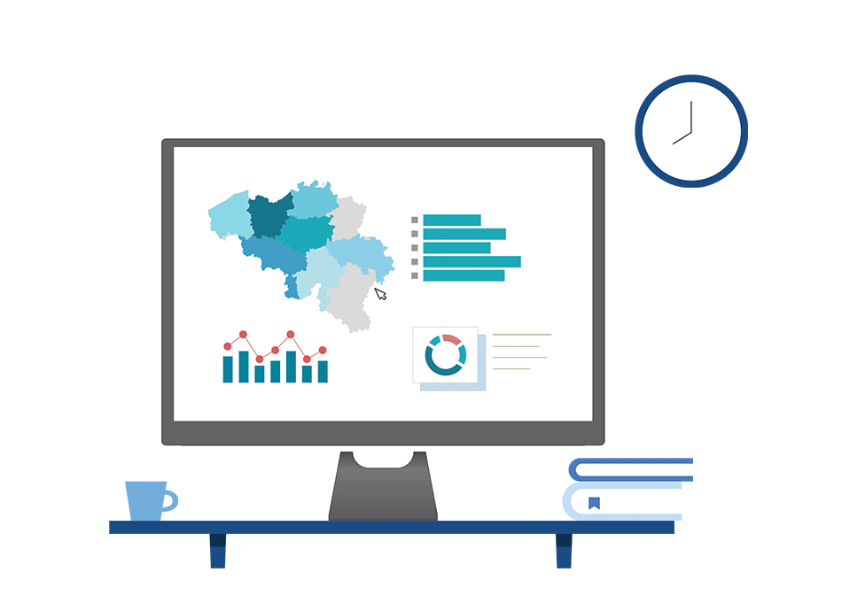
We turn convoluted spreadsheets into accessible information
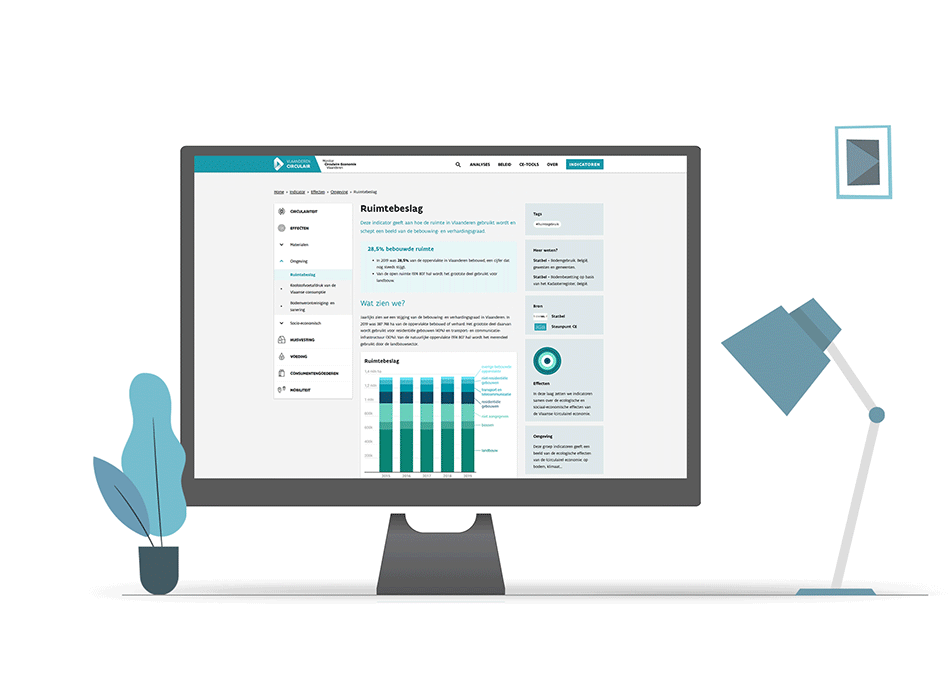
If your data is stored in Excel sheets, it’s hard to quickly see what’s going on. Sharing spreadsheet data with users, management, or clients is not the way to go – they don’t have time to browse dozens of tabs digging for nuggets of information.
Present actionable insights in user-friendly websites using interactive charts for an optimized user experience.
We turn complex research into engaging visual stories


Complex research or large datasets can be tricky to communicate. By turning it into a visual story, you can take your audience by the hand and guide them through the story or let them explore the data. One key insight at a time.
Visual storytelling is the ultimate way to present data in an interactive, enticing way!
We turn puzzling results into crystal‑clear summaries
After a large survey, you can end up with an overwhelming pile of results. Sharing everything with your audience would just be too much.
The best way to keep them informed is by writing crystal-clear summaries with insightful charts – typically a combination of standard bar and pie charts with more custom, out-of-the-box data visuals.
Eager to turn your complex data into powerful and attractive information graphics?