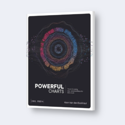
Powerful Charts
The Art of Creating Clear, Correct and Beautiful Data Visuals
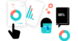
Ten years of data visualization experience bundled in a practical, hands-on book for everyone who regularly needs to communicate with data!
Selected work

REPORT DESIGN
APPLiA — Annual Statistical Report
The European home appliance industry’s yearly data publication, redesigned as both an interactive website and a print report.

INFOGRAPHICS
Université de Liège — Research Infographics
Seven infographics translating complex academic research into clear, visually engaging summaries.
DATA VISUALIZATION
OVAM & CE Center — Circular Economy Monitor
Belgium’s circular economy data, transformed into an accessible, interactive data experience with hundreds of custom charts.

WORKSHOPS & KEYNOTES
Nerdland Festival — Keynote Presentation
A keynote on data visualization and visual communication for an audience of 500+, bringing the ideas from Powerful Charts to the stage.
12+
Years designing infographics, reports, and data visualizations.
PhD
In Physics — I understand complex data because I used to produce it
Book
Powerful Charts — a practical guide to clear and beautiful chart design
EU
Clients across Europe — trade associations, government, academia
About
Baryon is my studio
Based in Herzele, Belgium
I’m Koen Van den Eeckhout. I founded Baryon over a decade ago to do one thing well: turn complex information into visuals that are clear, correct, and beautiful.
I work with trade associations, government agencies, research institutions, and companies who have important data but struggle to communicate it effectively. Every project starts with understanding the data and the audience — the design follows from there.
When a project calls for it, I collaborate with specialists in illustration, animation, and web development. But the analytical and design work is always mine.
Some of my clients


From the blog

Review: Info We Trust
Info We Trust is an ambitious, visually stunning book that sits somewhere between philosophy, information design, and a collection of visual essays.

Gridlines are better than axes
Almost always, gridlines are better than axes. Vertical axes are the default option, and they have been around for centuries, so they are very well known. But they also have downsides. My biggest problem with vertical axes is that they’re often so far away from where the action is really happening.

Review: A History of Data Visualization and Graphic Communication
Michael Friendly and Howard Wainer clearly love graphs. But A History of Data Visualization and Graphic Communication isn’t just about graphs — it’s about the stories behind them: the context, the people, the new measurements that made them necessary, and the discoveries they enabled.
I am really into visual communication!
Every now and then I send out a newsletter with latest work, handpicked inspirational infographics, must-read blog posts, upcoming dates for workshops and presentations, and links to useful tools and tips. Leave your email address here and I’ll add you to my mailing list of awesome people!

Eager to turn your complex data into powerful and attractive information graphics?