How powerful charts can boost your career
An American accountant managed – as the youngest ever! – to win a crucial election in Los Angeles – thanks to the power of data visualization.
Kenneth Mejia, a 32-year-old accountant of Filipino descent, is very committed to issues of poverty, affordable housing and mobility. In the 2022 elections he ran for “City Controller”, a sort of treasurer, for his hometown of Los Angeles. It’s a department with responsibilities almost as big as those of the city’s mayor and chief justice. For example, the City Controller can commission audits to evaluate the effectiveness of city departments.
Data visualization as election propaganda
Kenneth took a remarkably creative and unusual approach in the run-up to the election: he made imported data about the city instantly accessible and visible. On his campaign website, for example, he created a whole series of interactive maps, reports and searchable databases. He even put up billboards showing with graphs what the anticipated city budget will be used for in 2022-2023.
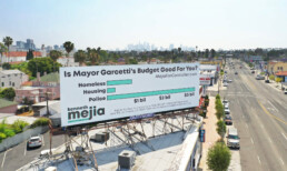
That transparent communication did not miss its mark. Kenneth won, as the youngest city controller ever. This approach shows how powerful data visualization is to unlock information, which may seem difficult and unfathomable to the general public, in a very accessible way. As a result, citizens not only gain insight but also become more engaged in politics. They become better informed and can vote more knowledgeably.
You too can make a difference thanks to powerful data visualization
Whether you have political ambitions, want to present your scientific research comprehensibly or convince your management of your brilliant ideas… Would you also like to learn how to create powerful graphics that can inform, convince and engage your audience? Charts that not only accurately represent the numbers, but also have a clear message and are attractive to look at?
In the book “Powerful Charts” physicist and Baryon founder Koen Van den Eeckhout explains in an accessible and practical way how this can be done. An indispensable guide for anyone who communicates with and about figures.
This brand new book is available now at Owl Press.
Read more:
Uncommon chart types: Slopegraphs
Slopegraphs appear in 'serious' newspapers, but they are very easy to create yourself. Use them if you want to compare how values have changed between two different points in time!

Data visualization in a time of pandemic – #6: Viral scrollytelling
In this final chapter, we’ll dive deeper into some of the insightful stories which have been published about the novel coronavirus and the COVID-19 pandemic. Rather than looking at single charts, we’ll highlight some long-form stories about the origin of the virus, how it works, and how it spread.

Five steps towards improving your dashboard
Today I would like to share with you the five steps I usually follow when I analyze and improve dashboards. If you are planning to analyze and improve your own dashboard, or maybe the dashboard someone else created and you want to provide feedback on, you could follow these five steps as well.

Dear Data: Dataviz book review
Last February, on a cold and rainy day, I received the Dear Data book as part of a Dataviz Drawing workshop by Stefanie Posavec. A pretty large and heavy book, the kind you could put on your coffee table to show off (which I did!). Let's review it!
Data visualization tools: Datawrapper
If you are writing articles online and need to quickly insert beautiful, interactive charts, maps or tables, Datawrapper is the tool you are looking for.
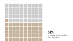
Uncommon chart types: Waffle charts
If you thought a pie chart was the only food-related chart type out there, think again! Waffle charts are a great alternative.
We are really into visual communication!
Every now and then we send out a newsletter with latest work, handpicked inspirational infographics, must-read blog posts, upcoming dates for workshops and presentations, and links to useful tools and tips. Leave your email address here and we’ll add you to our mailing list of awesome people!

