Improving your graph: a case-study
Here’s the thing I love most about visual communication: there’s always room for improvement. As soon as you think a graph or data visualization is finished and perfect, someone else will come along with an idea to make it even better. Take, for example, the excellent series of blogposts “The little of visualization design” by (the amazing) Andy Kirk. How a minor detail can make a visualization so much more awesome!
If you have 15 minutes of spare time, I strongly encourage you to watch the following video, because it’s the perfect example of improving visualizations for dummies, and a great intro for this blog post: https://www.youtube.com/watch?v=IB7crD_paKQ
Summary: Alan Smith, Data Visualization Editor at the Financial Times, shows some great examples of converting ‘meh’ graphs from press releases to awesome visualizations that really tell a story. He also organizes crash courses to teach his fellow journalists how to do this in order to become more ‘data critical’.
In this blogpost, I’d like to do the same for a graph I encountered in my Twitter timeline a few days ago. To come straight to the point, here’s the graph we’ll redesign:
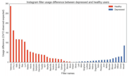
The graph is taken from a (publicly available) research paper on predicting depression from Instagram pictures. In short, the filter you use to prettify your Instagram pictures tells something about how you feel. Okay, to be more precise, there appears to be a correlation between the usage of certain filters and the mental health state of an Instagram user. You can see that in the graph above, but it’s not very clear. Let’s improve that!
Step 1: Readability
I’ve always learned that horizontal words are easier to read than vertical words. So, let’s turn all those words 90° to improve readability. In fact, why not rotate the entire graph? There’s no real added value in the current orientation.
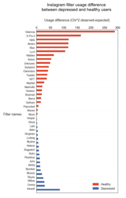
Hey, this just saved us from some serious neck injuries!

Read more:
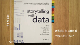
Storytelling with Data: Dataviz book review
The Storytelling with Data book has been on my wishlist as long as I can remember, because so many people recommend it as one of the must read dataviz books. So let's see what the fuzz is all about - here's my review!
Uncommon chart types: Slopegraphs
Slopegraphs appear in 'serious' newspapers, but they are very easy to create yourself. Use them if you want to compare how values have changed between two different points in time!

Data visualization in a time of pandemic – #6: Viral scrollytelling
In this final chapter, we’ll dive deeper into some of the insightful stories which have been published about the novel coronavirus and the COVID-19 pandemic. Rather than looking at single charts, we’ll highlight some long-form stories about the origin of the virus, how it works, and how it spread.
Five steps towards improving your dashboard
Today I would like to share with you the five steps I usually follow when I analyze and improve dashboards. If you are planning to analyze and improve your own dashboard, or maybe the dashboard someone else created and you want to provide feedback on, you could follow these five steps as well.

Dear Data: Dataviz book review
Last February, on a cold and rainy day, I received the Dear Data book as part of a Dataviz Drawing workshop by Stefanie Posavec. A pretty large and heavy book, the kind you could put on your coffee table to show off (which I did!). Let's review it!
Data visualization tools: Datawrapper
If you are writing articles online and need to quickly insert beautiful, interactive charts, maps or tables, Datawrapper is the tool you are looking for.
We are really into visual communication!
Every now and then we send out a newsletter with latest work, handpicked inspirational infographics, must-read blog posts, upcoming dates for workshops and presentations, and links to useful tools and tips. Leave your email address here and we’ll add you to our mailing list of awesome people!

