Choosing a colour scheme for your infographics
Choosing the colours for your infographic might not sound like a priority, but a colour scheme can make or break your entire design, no matter how good your structure or your images are.
Stephen Wildish, The importance of colour
There is an extremely large degree of freedom when choosing a colour scheme: whether you prefer light or dark colours, soft pastel tints or flashy saturated colours, playful or very serious, multiple varieties of the same colour or rather highly contrasting accents. For inspiration, just take a look at the ton of website colour scheme examples over at canva.com.
The hidden meaning of colours
Of course, this plethora of options can very quickly turn into a nightmare. If so many colour schemes exist, where should we start? In case of doubt, it’s always a good idea to return to the basics: the psychological meaning of colours.
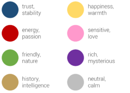
Every colour might trigger an unconscious response with your audience, to greater or lesser extent. For example, blue is often used to demonstrate trust and stability. This is the reason why many banks choose a blue logo and branding style. Red, on the other hand, is associated with energy or passion, possibly because of its meaning in nature. Red animals or plants mean trouble, danger, “don’t eat me!”.
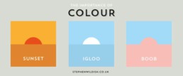
If your infographic has a historical theme, (light) brown might be a good choice. That is the reason why I have selected it as the main colour of my Nobel Prize in Physics infographic, together with bright orange to draw the attention of the reader. Combined with a washed-out version of the medal in the background, the light brown adds a classical, intelligent feel to the visualization:
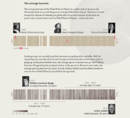
Personal project: history of the Nobel Prize in Physics
Does the product, brand, place or theme you’re making an infographic about have a characteristic colour? Then you’re lucky: you have already found the main colour to start building your colour scheme around. Imagine you are making an infographic about the history of Coca-Cola. Red would be the logical — and probably best — choice for that. Or an infographic about the oceans, fishing, and the diversity of marine life? Blue is the colour you need!
Finding inspiring colour schemes
If you don’t feel confident about building your own infographic colour scheme from scratch, there’s no need to worry. The internet is an endless source of inspiration to add colours to your designs. In the past few years, several handy, free tools have emerged to help you with this task.
One of my personal favourites is coolors.co, which suggests a great new colour scheme at the click of a button (or rather, a spacebar stroke). If you like a colour, but not the entire scheme, you can keep it locked while getting new suggestions for the other colours. Or you can simply play with the sliders to modify the hue, saturation or value of the suggested colours. To top it off, there are multiple easy export options available.

Coolors.co colour scheme generator (screenshot)
A somewhat older, but more community-based sit is COLOURlovers. Here, the colours and colour schemes are chosen by the visitors, and you can browse, search, and like your way through an endless collection of them. And if you’re feeling confident, you can of course share your own favourite personal scheme with the entire community.
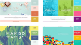
If you make or find some great infographics using a stunning colour scheme, please share them with us, for example using the comments below! As a start, here are some of my favourite examples with a bold colour scheme choice!
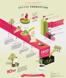
A few thoughts on coffee production (Café du Monde UK)
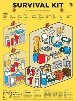
Survival kit (found on Pinterest, artist unknown)
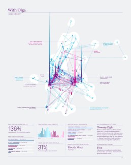
With Olga in New York City (Nick Felton)
Read more:

Visualizing Complexity: Dataviz book review
Visualizing Complexity is a great new data visualization book published by information design Superdot. Here's our verdict.

This chart is trying to trick you
The original chart in this example is trying to suggest a strong correlation between sugar intake and obesity in the US between 1980 and 2000. It does so by carefully choosing the vertical axis ranges and scaling so both lines nicely fall on top of each other.

Research visuals: all the resources you’ll ever need!
If you want to start creating clear and attractive visuals about your research, but don't know where to start, this page is for you! Here's a complete overview of tools, resources and inspiration you can use as a starting point for your designs.

Small datasets to practice your data visualization skills
When you're teaching data analysis or data visualization, or when you're learning new data visualization tools and techniques, you might be looking for datasets to practice with. Here are some great starting points.

How to create a graphical abstract
Graphical abstracts are becoming more and more important. Journal publishers such as Elsevier encourage you to create a concise visual summary of the main findings of your research. But where to start? What steps should you follow to create the perfect graphical abstract for your article? What tools can you use?

Behind the maps
In the 30-day Map Challenge, you are challenged to design a new map every day around a certain topic. I participated in November 2020, and wrote this post to share my thought processes, data sources, tools and results!
We are really into visual communication!
Every now and then we send out a newsletter with latest work, handpicked inspirational infographics, must-read blog posts, upcoming dates for workshops and presentations, and links to useful tools and tips. Leave your email address here and we’ll add you to our mailing list of awesome people!
