
Infographics: all the resources you'll ever need!
Infographics are the perfect way to turn complex information into attractive visual insights. They can help researchers, marketeers, journalists or consultants to share knowledge with students, clients, readers, or the general public. If you want to start creating clear and attractive infographics, but don’t know where to start, you’ve come to the right place. This page gives you a complete overview of tools, resources and inspiration you can use as a starting point for your designs!
Inspiration for infographics
- Information is Beautiful: informationisbeautiful.net
- Information is Beautiful awards: informationisbeautifulawards.com
- Visual.ly: visual.ly/view
- Pinterest: pinterest.com
- Google Dataset Search: datasetsearch.research.google.com
- Dear data: dear-data.com
Digital tools to create infographics
- Canva: canva.com
- Infogram: infogram.com
- Piktochart: piktochart.com
- Venngage Infographic maker and Graph maker
- Whimsical: whimsical.com
- Adobe Illustrator: adobe.com
- Affinity Designer: affinity.serif.com
- BioRender (like Canva, but specifically for life sciences): biorender.com
- Free infographic templates in PowerPoint: hubspot.com/infographic-templates
- List of dataviz tools: creativebloq.com/design-tools/data-visualization
Photos to use in infographics
- Burst: burst.shopify.com
- Flickr: flickr.com/
- Picography: picography.co
- Pixabay: pixabay.com
- Reshot: reshot.com
- Unsplash: unsplash.com
- Visual Hunt: visualhunt.com
Illustrations and icons to use in infographics
- Freepik: freepik.com
- The noun project: thenounproject.com
Photos and illustrations (specific themes)
- Cathopic, catholic pictures: cathopic.com
- Figshare, plant illustrations and more for biologists: figshare.com/authors/Plant_Illustrations
- Medical illustrations: smart.servier.com
Colour schemes for infographics
- Adobe Color CC: color.adobe.com
- Coolors.co: coolors.co
- Pictaculous: digitalinspiration.com/color-palette-generator
- Website color schemes: canva.com/learn/website-color-schemes
- 100 brilliant color combinations: canva.com/learn/100-color-combinations
- Article: Your friendly guide to colors in data visualisation
Typography for infographics
- Dafont: dafont.com
- Google Fonts: fonts.google.com
- FontSquirrel font identifier: fontsquirrel.com/matcherator
- Font Pairing: fontpair.co
Inkscape tutorial videos
Creating graphs for infographics
- Dataviz catalogue: datavizcatalogue.com
- Choose and design the perfect chart: chart.guide
- Choosing the right chart: infogram.com/page/choose-the-right-chart-data-visualization
- The Chartmaker Directory: chartmaker.visualisingdata.com
- The Data Viz Project: datavizproject.com
- Datawrapper: datawrapper.de
- Flourish: flourish.studio
- LocalFocus: localfocus.nl
- D3.js: d3js.org
Creating maps for infographics
- Snazzy maps (Google maps styles): snazzymaps.com
- Mapbox: mapbox.com
- Mapme: mapme.com/stories
- Datawrapper: datawrapper.de
- Leaflet JavaScript Library: leafletjs.com
- 3D maps with QGIS and Aerialod: statsmapsnpix.com
- Read our blogpost: Behind the maps
Books about infographics
- Data visualisation, Andy Kirk
- Dear Data, Giorgia Lupi & Stefanie Posavec
- Information graphics, Taschen
- Infographic designers’ sketchbooks, Steven Heller & Rick Landers
- Storytelling with data, Cole Nussbaumer Knaflic
- The visual display of quantitative information, Edward Tufte
- Trees, maps and theorems, Jean-Luc Doumont
- Visual journalism, Gestalten
- Visual thinking, Willemien Brand
People on social media talking about infographics
- Twitter list: Dataviz world leaders
- Bluesky list: Dataviz Community Starter Pack
Videos about infographics
- The beauty of data visualization (David McCandless)
- Journalism in the age of data (Geoff McGhee)
- Datafest online 2020 (78 different talks)
- Outlier 2021 (62 free talks)
Infographic blogs and online magazines
- Chartable (by the Datawrapper team)
- Cool Infographics (Randy Krum)
- Flowing Data (Nathan Yau)
- Infographics for the People (John Grimwade)
- The Information is Beautiful blog (David McCandless)
- Junk Charts (Kaiser Fung)
- Nightingale (by the Data Visualization Society)
- The Storytelling with Data blog (Cole Nussbaumer Knaflic)
- The Visme blog on infographics
- Visualising Data (Andy Kirk)
Infographic podcasts
- Data Journalism Conversations
- Datasaurus Rex
- Data Stories
- Data Viz Today
- Explore Explain
- Storytelling with Data
- The Data Journalism Podcast
…and make sure to check out the most up-to-date list of information design podcasts.

Read more:

Avoiding abbreviations
People are lazy. Make it as easy as possible for them to see what you are trying to show. There are tons of ways to reduce mental noise in your charts, but one of the easiest is avoiding abbreviations.
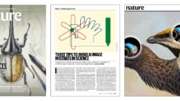
The uncomfortable relationship between scientific illustrations and AI
Scientific journal Nature devoted the headline of its 23 July 2026 issue to “the human art of scientific illustration in the age of artificial intelligence”. Of course, that sparked my attention.

Review: Info We Trust
Info We Trust is an ambitious, visually stunning book that sits somewhere between philosophy, information design, and a collection of visual essays.
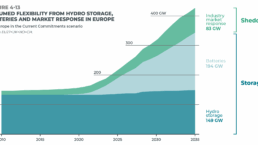
Gridlines are better than axes
Almost always, gridlines are better than axes. Vertical axes are the default option, and they have been around for centuries, so they are very well known. But they also have downsides. My biggest problem with vertical axes is that they’re often so far away from where the action is really happening.
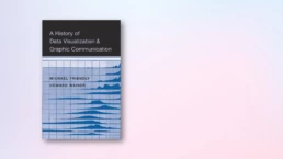
Review: A History of Data Visualization and Graphic Communication
Michael Friendly and Howard Wainer clearly love graphs. But A History of Data Visualization and Graphic Communication isn’t just about graphs — it’s about the stories behind them: the context, the people, the new measurements that made them necessary, and the discoveries they enabled.

Report visuals don’t have to suck
Discover how CREG, Belgium’s electricity regulator, turns complex data into clear and engaging visuals. From smart annotations to small multiples and uncommon chart types, their Monitoring Report shows how thoughtful data visualization makes technical reports easier to read and understand.
We are really into visual communication!
Every now and then we send out a newsletter with latest work, handpicked inspirational infographics, must-read blog posts, upcoming dates for workshops and presentations, and links to useful tools and tips. Leave your email address here and we’ll add you to our mailing list of awesome people!
