Data visualization in a time of pandemic - #2: Visualizing exponential growth
This is a multi-chapter post!
- Chapter 1: Finding reliable data
- Chapter 2: Visualizing exponential growth
- Chapter 3: Mapping the virus
- Chapter 4: We need to talk about flattening the curve
- Chapter 5: On top of the outbreak with daunting dashboards
- Chapter 6: Viral scrollytelling

Chapter 2: Visualizing exponential growth
Let me warn you in advance: this will probably be the most theoretical and mathematical chapter of this entire blog post. We’ll have a short look at the underlying scientific principles of a pandemic and analyze how this translates to visualizing data. If that’s not really your thing, it’s totally okay to just look at the pictures and then skip to the next chapter! 😉

A mathematical approach to pandemics
A pandemic disease is a complex thing to model. We live in a world of nearly 8 billion people in over 230 countries, connected with each other through 100.000 daily plane flights and an equally mind-boggling number of train and bus rides. Nevertheless, many experts have attempted to model the spread of a disease in a closely-connected world.
For example, professor biostatistics Kurt Barbé models the pandemic spread through a first order differential equation, resulting in the number of active infections following a Gaussian curve, with its typical bell shaped profile:
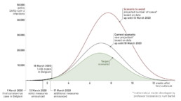
Different scenarios for the coronavirus spread in Belgium, as modeled by professor Kurt Barbé (March 18, 2020).
This is a simplified but not unrealistic model. For example, if we look at the number of active COVID-19 cases in China, where the peak has nearly passed, we can see that the Gaussian profile is a pretty good approximation (the sudden increase in the number of cases on February 13 is the result of a change in reporting methodology).
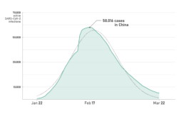
Evolution of the number of active SARS-CoV-2 infections in China.
We can assume that if the number of active infections follows a Gaussian-shaped profile, the number of new infections and the number of deaths will also follow Gaussian profiles. If we plot cumulative data, such as the total number of confirmed cases or the total number of deaths, this will follow an S-shaped cumulative function profile — the integral of the Gaussian function. For example, the total number of deaths by COVID-19 in China looks like this:
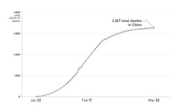
Evolution of the total number of COVID-19-related deaths in China.
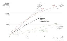
Crucially, at the start of such peaks and S-curves, the shape will follow an approximately exponential profile, with the number of infections or the number of deaths doubling every few days at a constant acceleration. That’s the reason why we are seeing so many graphs appearing which show the number of infections on a logarithmic scale — such as the one below by John Burn-Murdoch for the Financial Times. On such a log-scale, exponential growth will appear as straight lines. The steeper the line, the more rapidly the growth is accelerating.
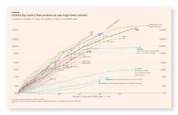
Financial Times graphic by John Burn-Murdoch on the growth of the number of coronavirus cases in different countries.
Which brings us to the following point of discussion: is using a logarithmic scale a good idea?
Logarithmic scales: yes or no?
Using logarithmic scales in a data visualization is sometimes frowned upon, as it has some obvious drawbacks:
- Requires additional explanation when communicating towards a general public, which might not be familiar with this type of plot.
- Not a good way at all to compare values with each other.
However, there are specific cases where the use of logarithmic scales might be justified: when the underlying mechanism behind the data is multiplicative in nature, leading to (more or less) exponential growth. This is exactly the case in the early outbreak stage of a contagious disease (when only a minor fraction of the population is infected).
For example, a patient infected with smallpox will infect on average 5 other people. This is the basic reproduction number of the infection. These 5 people will — on average — each infect 5 new people, or 25 in total. These 25 will infect 5 x 25 = 125, and so on, and so on. For the novel coronavirus, early estimates of the basic reproduction number range between 1.4 and 3.9, which is higher than a seasonal flu (0.9–2.1), but much lower than for example measles (12–18).
The basic reproduction number is influenced by many different factors which cannot be controled, such as the incubation time and the infectiousness of the disease. However, it also depends on the number of susceptible people that affected patients are in contact with. This is the main reasoning behind social distancing measures to ‘flatten the curve’ (more about flattening the curve visuals in a later chapter): the lower the number of people an infected patient comes in contact with, the lower the reproduction number and the slower the disease will spread through the population.
As many countries are currently in the early exponential growth phase of the epidemic, and taking measures to reduce the reproduction number, this is an appropriate opportunity to plot the number of infections (and the number of deaths) on a logarithmic scale. It enables us to quickly evaluate in which countries measures are more effective and the disease is spreading less rapidly, such as Japan or Singapore:
Number of confirmed coronavirus cases per country, on a linear-logarithmic scale.
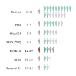
Basic reproduction number of well-known infectious diseases. (Source: Wikipedia)
As an additional benefit, linear-logarithmic plots like these can educate the general public about the exponential nature of the disease in its early stage. This avoids more sensation-oriented headlines such as ‘More new infections today than ever before!’. While this is true, it doesn’t have to mean things are getting out of control. Everything might be entirely as expected, or even improving. As Hans Rosling notes in his bestseller Factfulness (if you haven’t read it, do it immediately!): things can be both better and bad.
A final note on logarithmic scales before I shut up about it and we can move on to more exciting things. As the infection continuous to spread, a growing fraction of the population will become either already infected, or immune when they have been infected in the past but survived. Also, vaccines can be developed, or increasingly strict measures of social distancing and quarantine can be enforced. In practice, this means the effective reproduction number will drop, the exponential growth will start to decelerate and the number of infections will reach a peak and start dropping again. When this happens, the usefulness of logarithmic scales has reached its end.

Even Bill agrees.
But aren't absolute numbers meaningless?
By now, I have created many different visuals related to the novel coronavirus, and one of the most pervasive comments concerns the use of absolute numbers. Many people argue that we cannot directly compare numbers between countries without correcting for the population count. This sounds relatively convincing — how on earth can we compare the number of deaths between a tiny country such as Belgium, and a massive nation like China?
However, this is a multifaceted question without a definitive answer. Let me list the major arguments for both approaches:
We must use relative numbers, because:
- The number of infections and deaths in a country depends on the size of that country.
- We want to evaluate the stress the pandemic will put on a country’s healthcare system, which can usually only support a certain fraction of the population being infected.
We must use absolute numbers, because:
- The rate at which a disease spreads depends on the population density and the level of social distancing, but has nothing to do with the population number. In this regard, country borders are pretty arbitrary ways of grouping people, anyway.
- Relative numbers will create pretty meaningless ‘outliers’ for some very small countries.
- Should we plot the relative or the absolute number of infections?
In my impression, most data visualizers follow the approach of using absolute numbers when plotting the total number of infections. The above-mentioned John Burn-Murdoch also agrees:

Thanks for backing me up here, John!
Nevertheless, using relative numbers can be very useful for other use cases such as:
- Showing the number of tests performed per capita.
- Showing the available number of doctors, hospital beds, intensive care beds,… per capita.
- Comparing how hard different countries are currently hit by the crisis.
For example, comparing the number of COVID-19 tests performed by country in absolute and relative numbers reveals some interesting insights:
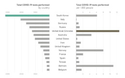
Number of tests performed per country and per 1.000 inhabitants. (Source: Our World in Data)
This is a multi-chapter blog post!
Continue reading:
- Chapter 1: Finding reliable data
- Chapter 2: Visualizing exponential growth
- Chapter 3: Mapping the virus
- Chapter 4: We need to talk about flattening the curve
- Chapter 5: On top of the outbreak with daunting dashboards
- Chapter 6: Viral scrollytelling
For all your comments, suggestions, errors, links and additional information, you can contact me at koen@baryon.be or via Twitter at @koen_vde.
Disclaimer: I am not a medical doctor or a virologist. I am a physicist running my own business (Baryon) focused on information design.
Read more:

Review: Info We Trust
Info We Trust is an ambitious, visually stunning book that sits somewhere between philosophy, information design, and a collection of visual essays.

Gridlines are better than axes
Almost always, gridlines are better than axes. Vertical axes are the default option, and they have been around for centuries, so they are very well known. But they also have downsides. My biggest problem with vertical axes is that they’re often so far away from where the action is really happening.

Review: A History of Data Visualization and Graphic Communication
Michael Friendly and Howard Wainer clearly love graphs. But A History of Data Visualization and Graphic Communication isn’t just about graphs — it’s about the stories behind them: the context, the people, the new measurements that made them necessary, and the discoveries they enabled.

Report visuals don’t have to suck
Discover how CREG, Belgium’s electricity regulator, turns complex data into clear and engaging visuals. From smart annotations to small multiples and uncommon chart types, their Monitoring Report shows how thoughtful data visualization makes technical reports easier to read and understand.

Data visualization podcasts 2025
At Baryon, we’re huge fans of podcasts! Data visualization podcasts are a great way to stay up to date on the latest trends and techniques in data visualization.

Tell me why… I don’t like dashboards
I don't like dashboards. Well, most dashboards at least. They're just trying too hard... to do everything, everywhere, all at once. Why is that? And is there a better solution?
We are really into visual communication!
Every now and then we send out a newsletter with latest work, handpicked inspirational infographics, must-read blog posts, upcoming dates for workshops and presentations, and links to useful tools and tips. Leave your email address here and we’ll add you to our mailing list of awesome people!
