Three roles of colour in a data visual
Colour is one of the most crucial tools we have to turn a normal chart into a powerful chart with a clear message, a chart which tells a story rather than simply presenting the information.
This Venn diagram shows the number of harmful pesticides, presented as dots, banned or phased out in four major economic regions (Brazil, the United States, Europe and China).

Notice how colour is used in three different ways here.
Background colours
Grey is used as a background colour– elements in grey are present and visible, but they will never be at the foreground of the visual, or get in the way of the key message. Used in a clever way, grey can help our viewer to distinguish between what’s most and what’s less important, and bring structure to the layout of the visual.
In fact, most of the time it’s a good idea to create the first version of your data visual purely in tints of grey. This will help you to quickly see if your design will work, and how your data visual will be perceived.
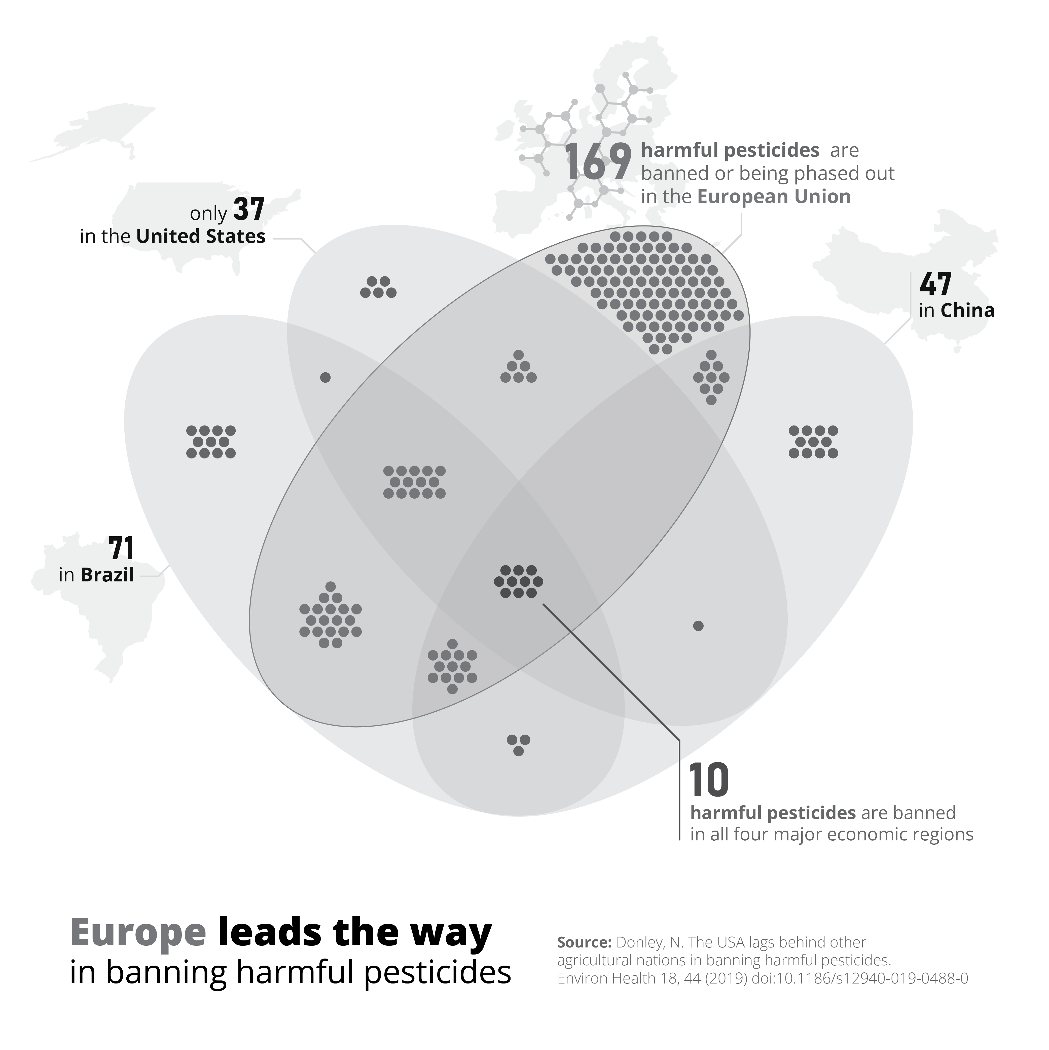
Thematic colours
Blue is used as a thematic colour – because we associate the European Union with the colour blue (because of its flag and logo), it is a logical choice to use this colour to indicate everything related to Europe. Blue is not only used for the dots and the Venn diagram, but also the number 169 in the label, and the words ‘Europe’ and ‘European Union’ in the title and label. This helps to tie all the different parts of the image – diagram, title and annotations – together in a logical, visual way.
Accent colours
Finally, red is used as an accent colour – it almost automatically draws our attention to the central part of the visual: the 10 harmful pesticides which are banned in all four major economic regions simultaneously. Make sure to use your accent colours sparingly. As they are so good at drawing attention, using too much of them will quickly overwhelm your audience – they won’t know where to look first! Highlight only the elements which are crucial to explain your key message.
If you want to know more about visualizing data in the right way, you can check out the other videos in this series. Or I invite you to read my book, Powerful Charts, that will give you actionable insights and practical guidelines to create data visuals that truly engage and inspire your audience.
Full video series
- 01. Why is data visualization so powerful?
- 02. Why is data visualization so challenging?
- 03. Navigating the landscape of powerful charts
- 04. A powerful chart tells a story
- 05. A powerful chart has a high signal-to-noise ratio
- 06. Making a data visual noise-free
- 07. 7 different goals for your chart
- 08. Three roles of colour in a data visual
- 09. Choosing the right font for your data visual
- 10. Can you use Excel to create a powerful chart? (coming on January 09, 2023)

Read more:

Review: Info We Trust
Info We Trust is an ambitious, visually stunning book that sits somewhere between philosophy, information design, and a collection of visual essays.

Gridlines are better than axes
Almost always, gridlines are better than axes. Vertical axes are the default option, and they have been around for centuries, so they are very well known. But they also have downsides. My biggest problem with vertical axes is that they’re often so far away from where the action is really happening.

Review: A History of Data Visualization and Graphic Communication
Michael Friendly and Howard Wainer clearly love graphs. But A History of Data Visualization and Graphic Communication isn’t just about graphs — it’s about the stories behind them: the context, the people, the new measurements that made them necessary, and the discoveries they enabled.

Report visuals don’t have to suck
Discover how CREG, Belgium’s electricity regulator, turns complex data into clear and engaging visuals. From smart annotations to small multiples and uncommon chart types, their Monitoring Report shows how thoughtful data visualization makes technical reports easier to read and understand.

Data visualization podcasts 2025
At Baryon, we’re huge fans of podcasts! Data visualization podcasts are a great way to stay up to date on the latest trends and techniques in data visualization.

Tell me why… I don’t like dashboards
I don't like dashboards. Well, most dashboards at least. They're just trying too hard... to do everything, everywhere, all at once. Why is that? And is there a better solution?
We are really into visual communication!
Every now and then we send out a newsletter with latest work, handpicked inspirational infographics, must-read blog posts, upcoming dates for workshops and presentations, and links to useful tools and tips. Leave your email address here and we’ll add you to our mailing list of awesome people!
