Data visualization in a time of pandemic - #5: On top of the outbreak with daunting dashboards
This is a multi-chapter post!
- Chapter 1: Finding reliable data
- Chapter 2: Visualizing exponential growth
- Chapter 3: Mapping the virus
- Chapter 4: We need to talk about flattening the curve
- Chapter 5: On top of the outbreak with daunting dashboards
- Chapter 6: Viral scrollytelling

Chapter 5: On top of the outbreak with daunting dashboards
There’s so much coronavirus data out there – and more is being generated every second. In order to keep the overview, or at least keep some of our sanity, many organizations and individuals have created dashboards. Rather than being a lengthy, descriptive overview, this chapter will point you to some of the best dashboards out there. For those who want to stay on top of things, even during these crazy times.
Dashboards by official organizations
The WHO maintains a Situation Dashboard. This one was recently updated to a much brighter and cleaner design. Make sure to scroll down to see more than just the map! Especially the breakdowns by country are a great addition:
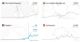
Country breakdowns for the number of cases on the WHO Situation Dashboard.
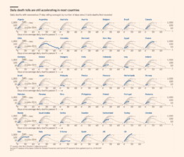
The WHO Regional Office for Europe also maintains a dashboard, albeit of somewhat dubious design quality. Nevertheless, it contains some interesting gauge graphs (created with Infogram) to illustrate how much the most affected countries contribute to the total number of cases in Europe:
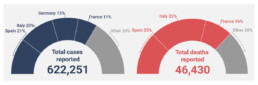
Gauge graphs indicating the contribution of the most affected countries to the total number of cases and deaths (Source: WHO Regional Office for Europe).
The European CDC (Centre for Disease Prevention and Control) has its own dashboard, although in my experience, it is rather difficult to navigate, with a complex layout, a few visual bugs and some counterintuitive (sideways) scrolling which makes it difficult to quickly find the numbers you are looking for.

Dashboards by experts
No, we are not talking about the many armchair virologists or epidemiologists popping up on social media or Medium. This is the real stuff: dashboards created by universities, groups of universities, or teams of experts.
Johns Hopkins University – of course, who else – has probably the most well-known dashboard on COVID-19, built in Ember.js. The focal point of this rather gloomy-colored dashboard is a bubble world map with different viewing options including confirmed cases, active cases, incidence rate and case-fatality ratio. The map is somewhat difficult to read for certain heavily affected regions, but can easily be zoomed in on:
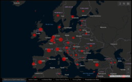
Cumulative confirmed cases in Europe as visualized on the JHU dashboard.
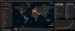
General overview of the JHU dashboard.
The Johns Hopkins dashboard also has a mobile-friendly version.
Other noteworthy expert dashboards include:
- University of Virginia COVID-19 Surveillance Dashboard
- The dashboard by Edward Parker and Quentin Leclerc at the London School of Hygiene & Tropical Medicine which, as a nice bonus, also allows you to visualize past outbreaks of SARS (2003), swine flu (2009) or Ebola (2014).
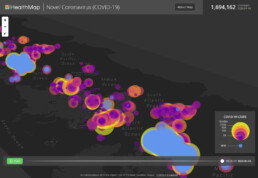
- The Novel Coronavirus HealthMap by the Open COVID-19 Data Curation Group, an initiative including many famous universities such as the University of Oxford and Harvard Medical School. With even a publication in The Lancet, this will be as expert-y as it gets! Basically a (somewhat difficult to read) bubble map, but with some weird navigation tools for you to play around with:
Article-like dashboards
As you probably know by now I’m a sucker for beautiful examples of data journalism. An overview of dashboards would not be complete without mentioning some excellent articles summarizing our information about the outbreak:
- Coronavirus Map: Tracking the Global Outbreak in the New York Times
- Mapping the worldwide spread of the coronavirus in the Washington Post
- Sorry for the patriotism, but I should mention the excellent visuals by the dataviz team at Belgian newspaper De Tijd.
- Coronavirus tracked: the latest figures as the pandemic spreads in the Financial Times. Here, I especially like the bold choice to visualize the spread using small multiples – I don’t usually like this approach, but here I must admit it works really well:
More small multiples! MOAR! (Source: Financial Times)
Other initiatives
And finally, some other noteworthy initiatives:
- The Coronavirus Dashboard by Avi Schiffmann and Jensen. Currently at the top of the Google results if you’re looking for coronavirus dashboards, well done!
- Vinícius Henrique Neves created a dashboard in Microsoft Power BI.
- Bing created their own dashboard, which adds some relevant news items and videos to the mix, as well as some interesting treemaps and strip charts:
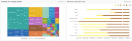
Treemap and strip chart on the Bing COVID-19 dashboard.
This is a multi-chapter blog post!
Continue reading:
- Chapter 1: Finding reliable data
- Chapter 2: Visualizing exponential growth
- Chapter 3: Mapping the virus
- Chapter 4: We need to talk about flattening the curve
- Chapter 5: On top of the outbreak with daunting dashboards
- Chapter 6: Viral scrollytelling
For all your comments, suggestions, errors, links and additional information, you can contact me at koen@baryon.be or via Twitter at @koen_vde.
Disclaimer: I am not a medical doctor or a virologist. I am a physicist running my own business (Baryon) focused on information design.
Read more:

Storytelling with Data: Dataviz book review
The Storytelling with Data book has been on my wishlist as long as I can remember, because so many people recommend it as one of the must read dataviz books. So let's see what the fuzz is all about - here's my review!
Uncommon chart types: Slopegraphs
Slopegraphs appear in 'serious' newspapers, but they are very easy to create yourself. Use them if you want to compare how values have changed between two different points in time!

Data visualization in a time of pandemic – #6: Viral scrollytelling
In this final chapter, we’ll dive deeper into some of the insightful stories which have been published about the novel coronavirus and the COVID-19 pandemic. Rather than looking at single charts, we’ll highlight some long-form stories about the origin of the virus, how it works, and how it spread.

Five steps towards improving your dashboard
Today I would like to share with you the five steps I usually follow when I analyze and improve dashboards. If you are planning to analyze and improve your own dashboard, or maybe the dashboard someone else created and you want to provide feedback on, you could follow these five steps as well.

Dear Data: Dataviz book review
Last February, on a cold and rainy day, I received the Dear Data book as part of a Dataviz Drawing workshop by Stefanie Posavec. A pretty large and heavy book, the kind you could put on your coffee table to show off (which I did!). Let's review it!
Data visualization tools: Datawrapper
If you are writing articles online and need to quickly insert beautiful, interactive charts, maps or tables, Datawrapper is the tool you are looking for.
We are really into visual communication!
Every now and then we send out a newsletter with latest work, handpicked inspirational infographics, must-read blog posts, upcoming dates for workshops and presentations, and links to useful tools and tips. Leave your email address here and we’ll add you to our mailing list of awesome people!

