How powerful charts can boost your career
An American accountant managed – as the youngest ever! – to win a crucial election in Los Angeles – thanks to the power of data visualization.
Kenneth Mejia, a 32-year-old accountant of Filipino descent, is very committed to issues of poverty, affordable housing and mobility. In the 2022 elections he ran for “City Controller”, a sort of treasurer, for his hometown of Los Angeles. It’s a department with responsibilities almost as big as those of the city’s mayor and chief justice. For example, the City Controller can commission audits to evaluate the effectiveness of city departments.
Data visualization as election propaganda
Kenneth took a remarkably creative and unusual approach in the run-up to the election: he made imported data about the city instantly accessible and visible. On his campaign website, for example, he created a whole series of interactive maps, reports and searchable databases. He even put up billboards showing with graphs what the anticipated city budget will be used for in 2022-2023.
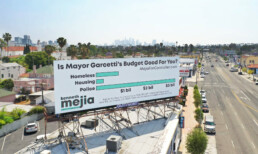
That transparent communication did not miss its mark. Kenneth won, as the youngest city controller ever. This approach shows how powerful data visualization is to unlock information, which may seem difficult and unfathomable to the general public, in a very accessible way. As a result, citizens not only gain insight but also become more engaged in politics. They become better informed and can vote more knowledgeably.
You too can make a difference thanks to powerful data visualization
Whether you have political ambitions, want to present your scientific research comprehensibly or convince your management of your brilliant ideas… Would you also like to learn how to create powerful graphics that can inform, convince and engage your audience? Charts that not only accurately represent the numbers, but also have a clear message and are attractive to look at?
In the book “Powerful Charts” physicist and Baryon founder Koen Van den Eeckhout explains in an accessible and practical way how this can be done. An indispensable guide for anyone who communicates with and about figures.
This brand new book is available now at Owl Press.
Read more:

Review: Info We Trust
Info We Trust is an ambitious, visually stunning book that sits somewhere between philosophy, information design, and a collection of visual essays.

Gridlines are better than axes
Almost always, gridlines are better than axes. Vertical axes are the default option, and they have been around for centuries, so they are very well known. But they also have downsides. My biggest problem with vertical axes is that they’re often so far away from where the action is really happening.

Review: A History of Data Visualization and Graphic Communication
Michael Friendly and Howard Wainer clearly love graphs. But A History of Data Visualization and Graphic Communication isn’t just about graphs — it’s about the stories behind them: the context, the people, the new measurements that made them necessary, and the discoveries they enabled.

Report visuals don’t have to suck
Discover how CREG, Belgium’s electricity regulator, turns complex data into clear and engaging visuals. From smart annotations to small multiples and uncommon chart types, their Monitoring Report shows how thoughtful data visualization makes technical reports easier to read and understand.

Data visualization podcasts 2025
At Baryon, we’re huge fans of podcasts! Data visualization podcasts are a great way to stay up to date on the latest trends and techniques in data visualization.

Tell me why… I don’t like dashboards
I don't like dashboards. Well, most dashboards at least. They're just trying too hard... to do everything, everywhere, all at once. Why is that? And is there a better solution?
We are really into visual communication!
Every now and then we send out a newsletter with latest work, handpicked inspirational infographics, must-read blog posts, upcoming dates for workshops and presentations, and links to useful tools and tips. Leave your email address here and we’ll add you to our mailing list of awesome people!
