
Tell me why... I don't like dashboards
😶 I don’t like dashboards. There, I said it.
Ok, some nuance: I don’t like _most_ dashboards. The main reason: they’re trying to do everything, everywhere, all at once.
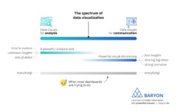
On the spectrum of data visualization, two main clusters of powerful visuals exist:
1️⃣ Data visuals for analysis: useful for data analysts, who have time to explore the data in full detail, with lots of filters, offering many different perspectives on the data. Their goal: extracting the insights from the data.
2️⃣ Data visuals for communication: useful for managers, or a more general audience. They don’t have a lot of time and want to know the major insights, fast, loud and clear. For more complicated stuff, we can craft a strong narrative to guide them through the major insights.
What most dashboards are trying to do, is both of these things simultaneously: raw data goes in, crystal-clear insights come out – or so people expect.
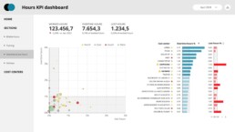
The solution? We make a full-fledged dashboard for the analysts, and a dedicated light-weight version for the management, showing only what they need to know for their decision-making. Or we do our analysis first, and translate those insights into an engaging visual storytelling piece, or an attractive visual report.

As always, we have to think about the audience and their goals. Not just dump the data on top of them, and hope they will figure it out!
Read more:

Avoiding abbreviations
People are lazy. Make it as easy as possible for them to see what you are trying to show. There are tons of ways to reduce mental noise in your charts, but one of the easiest is avoiding abbreviations.
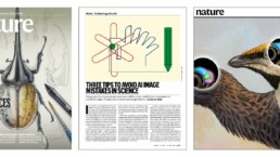
The uncomfortable relationship between scientific illustrations and AI
Scientific journal Nature devoted the headline of its 23 July 2026 issue to “the human art of scientific illustration in the age of artificial intelligence”. Of course, that sparked my attention.

Review: Info We Trust
Info We Trust is an ambitious, visually stunning book that sits somewhere between philosophy, information design, and a collection of visual essays.
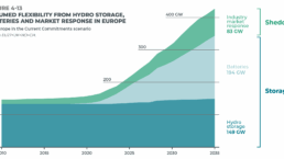
Gridlines are better than axes
Almost always, gridlines are better than axes. Vertical axes are the default option, and they have been around for centuries, so they are very well known. But they also have downsides. My biggest problem with vertical axes is that they’re often so far away from where the action is really happening.

Review: A History of Data Visualization and Graphic Communication
Michael Friendly and Howard Wainer clearly love graphs. But A History of Data Visualization and Graphic Communication isn’t just about graphs — it’s about the stories behind them: the context, the people, the new measurements that made them necessary, and the discoveries they enabled.

Report visuals don’t have to suck
Discover how CREG, Belgium’s electricity regulator, turns complex data into clear and engaging visuals. From smart annotations to small multiples and uncommon chart types, their Monitoring Report shows how thoughtful data visualization makes technical reports easier to read and understand.
We are really into visual communication!
Every now and then we send out a newsletter with latest work, handpicked inspirational infographics, must-read blog posts, upcoming dates for workshops and presentations, and links to useful tools and tips. Leave your email address here and we’ll add you to our mailing list of awesome people!
