
Information design resources
Here you’ll find a curated collection of tools, templates, articles, and ideas to help you design and communicate information with clarity. Whether you’re working on a data-heavy report, an engaging infographic, or an interactive chart, these resources are here to guide, inspire, and save you time.
I’ve gathered what I use in my own projects, alongside practical tips and examples you can adapt to your own work. Browse around, take what’s useful, and feel free to share with others who value thoughtful, well-crafted information design.
Finding useful datasets
Looking for reliable, well-structured datasets to jump-start your next data visualization project? Here are some of my favorite starting points:
- Google Dataset Search: datasetsearch.research.google.com
- Kaggle: kaggle.com – they also have a list of beginner-friendly datasets
- data.world: data.world datasets
- Our World in Data
- The NASA Open Data Portal
Looking for more? Read our blogpost: Small datasets to practice your data visualization skills
Inspiration for data visualization
- Information is Beautiful: informationisbeautiful.net
- Information is Beautiful awards: informationisbeautifulawards.com
- Visual.ly: visual.ly/view
- Pinterest: pinterest.com
- Dear data: dear-data.com
Digital tools to create infographics and data visuals
- Canva: canva.com
- Infogram: infogram.com
- Piktochart: piktochart.com
- Visme: visme.co
- Venngage Infographic maker and Graph maker
- Whimsical: whimsical.com
- Adobe Illustrator: adobe.com
- Affinity Designer: affinity.serif.com
- Flowchart tool: draw.io
- BioRender (like Canva, but specifically for life sciences): biorender.com
- List of dataviz tools: creativebloq.com/design-tools/data-visualization
- ggplot2 cheat sheet: https://www.maths.usyd.edu.au/u/UG/SM/STAT3022/r/current/Misc/data-visualization-2.1.pdf
Inkscape tutorials
Learning how to create and edit vector images (rather than bitmap images) is one of the key steps in unlocking your full information design power. Inkscape is a powerful free tool to help you do just that. I personally found the following tutorials very useful, not too long, and to-the-point:
Illustrations and icons
- Freepik: freepik.com
- The noun project: thenounproject.com
Colours
It is undeniable that Lisa Charlotte Muth (Head of Communications at Datawrapper) is the ultimate expert when it comes to color use in data visualization. The list of articles about color on the Datawrapper blog is the best source you’ll ever find on the topic. In particular, the following articles are very worthwhile:
- What to consider when choosing colors for data visualization
- How to find & create good color palettes
- What to consider when visualizing data for colorblind readers
If you’re looking for tools and inspirational places that can help you create color combinations for your visuals, here are some of my favorites:
- Adobe Color CC: color.adobe.com
- Coolors.co: coolors.co
- Pictaculous: digitalinspiration.com/color-palette-generator
- Website color schemes: canva.com/learn/website-color-schemes
- 100 brilliant color combinations: canva.com/learn/100-color-combinations
- Python Color Palette Finder
- Data Viz Color Palette Generator
- ColorBrewer
- Chroma.js Color Palette Helper
Typography
- Dafont: dafont.com
- Google Fonts: fonts.google.com
- FontSquirrel font identifier: fontsquirrel.com/matcherator
- Font Pairing: fontpair.co
Creating graphs
- Dataviz catalogue: datavizcatalogue.com
- Choose and design the perfect chart: chart.guide
- Choosing the right chart: infogram.com/page/choose-the-right-chart-data-visualization
- The Chartmaker Directory: chartmaker.visualisingdata.com
- The Data Viz Project: datavizproject.com
- Datawrapper: datawrapper.de
- Flourish: flourish.studio
- LocalFocus: localfocus.nl
- D3.js: d3js.org
- Notion now has a feature to create charts
Creating maps
- Snazzy maps (Google maps styles): snazzymaps.com
- Mapbox: mapbox.com
- Mapme: mapme.com/stories
- Datawrapper: datawrapper.de
- Leaflet JavaScript Library: leafletjs.com
- 3D maps with QGIS and Aerialod: statsmapsnpix.com
- Read our blogpost: Behind the maps
Creating tables
- The Ultimate Guide to Designing Data Tables
- Table inspiration: fivethirtyeight.com
Ethics in data visualization
Books about infographics and data visualization
Here are some of the books that were foundational for my own career path in data visualization and information design:
- Data visualisation, Andy Kirk
- Dear Data, Giorgia Lupi & Stefanie Posavec
- Information graphics, Taschen
- Infographic designers’ sketchbooks, Steven Heller & Rick Landers
- Storytelling with data, Cole Nussbaumer Knaflic
- The visual display of quantitative information, Edward Tufte
- Trees, maps and theorems, Jean-Luc Doumont
- Visual journalism, Gestalten
- Visual thinking, Willemien Brand
If you’re looking for more, make sure to check our complete list of data visualization books!
People on social media talking about data
- Twitter list: Dataviz world leaders
- Bluesky list: Data visualization community
Videos about data visualization
- The beauty of data visualization (David McCandless)
- Journalism in the age of data (Geoff McGhee)
- Datafest Tbilisi (dozens of free talks)
- Outlier 2021 (62 free talks)
Dataviz blogs and online magazines
- Chartable (by the Datawrapper team)
- Cool Infographics (Randy Krum)
- Flowing Data (Nathan Yau)
- Infographics for the People (John Grimwade)
- The Information is Beautiful blog (David McCandless)
- Junk Charts (Kaiser Fung)
- Nightingale (by the Data Visualization Society)
- The Storytelling with Data blog (Cole Nussbaumer Knaflic)
- The Visme blog on infographics
- Visualising Data (Andy Kirk)
Dataviz podcasts
- Data Journalism Conversations
- Datasaurus Rex
- Data Stories
- Data Viz Today
- Explore Explain
- Storytelling with Data
- The Data Journalism Podcast
These are some of my personal favorites. Looking for more? We have a complete list of podcasts on data visualization and information design!

Read more:
Behind the maps
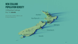
In the 30-day Map Challenge, you are challenged to design a new map every day around a certain topic. I participated in November 2020, and wrote this post to share my thought processes, data sources, tools and results!

Data visualization resources: all the links you’ll ever need!
You want to start creating clear and attractive data visuals, but don't know where to start? No worries, here's a complete overview of tools, resources and inspiration you can use as a starting point for your designs.
Storytelling with Data: Dataviz book review
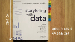
The Storytelling with Data book has been on my wishlist as long as I can remember, because so many people recommend it as one of the must read dataviz books. So let's see what the fuzz is all about - here's my review!
Uncommon chart types: Slopegraphs
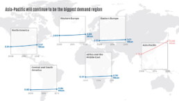
Slopegraphs appear in 'serious' newspapers, but they are very easy to create yourself. Use them if you want to compare how values have changed between two different points in time!
Data visualization in a time of pandemic – #6: Viral scrollytelling
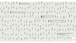
In this final chapter, we’ll dive deeper into some of the insightful stories which have been published about the novel coronavirus and the COVID-19 pandemic. Rather than looking at single charts, we’ll highlight some long-form stories about the origin of the virus, how it works, and how it spread.
Five steps towards improving your dashboard
Today I would like to share with you the five steps I usually follow when I analyze and improve dashboards. If you are planning to analyze and improve your own dashboard, or maybe the dashboard someone else created and you want to provide feedback on, you could follow these five steps as well.
We are really into visual communication!
Every now and then we send out a newsletter with latest work, handpicked inspirational infographics, must-read blog posts, upcoming dates for workshops and presentations, and links to useful tools and tips. Leave your email address here and we’ll add you to our mailing list of awesome people!
