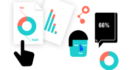
Powerful charts for analysts, designers, researchers, and decision-makers, tailored to your data and context.
How do you make sure management actually understands what’s going on? How do you use data to convince your clients to act? How do you share insights with a very broad, or a very specific audience, and make them stick?
In many of these situations, data visualization is the most effective ways to turn complex information into clear, actionable insights.
The challenge is knowing where to start. For example:
- Which tools make sense for your context? How do you use online tools such as Canva, Datawrapper, or RAWGraphs in a meaningful way?
- What type of chart do you need to present your data?
- When is Excel or PowerPoint enough, and when does it make sense to go further?
- How do you design charts and tables that are correct, clear, and worth looking at?
- How do you build visuals that help explain, persuade, and support better decisions?

These questions are at the core of our trainings and presentations. We work with:
- Academics and researchers from a wide range of fields
- Professionals in business and public organizations, from specialists to managers
- Government agencies looking to reach a broad audience
Formats range from short, focused keynote presentations to multi-day workshops, and anything in between. This can be online or in person, but always adapted to your audience, data, and goals.
What we can do for you:

Data visualization training
Learn one of the most essential skills for the future. In this training we explore the basics of data visualization, discuss good and bad graphs, showcase tools and techniques to craft the perfect chart, and offer guidelines to follow and pitfalls to avoid.
Number of participants: typically 8 to 16
Duration: between 2 hours and 2 full days
Format: both online and offline are possible

Infographics training
There are dozens of online and offline tools to create infographics, but how to design one that sticks? Using practical examples, participants will go home with tips and tricks, do’s and don’ts, and a checklist to ensure the visualizations in your next publication, newsletter or social media post will be on point!
Number of participants: typically 8 to 16
Duration: between 2 hours and 2 full days
Format: both online and offline are possible

Custom trainings or presentations
Hey, we’re flexible! Hire me for a custom presentation or training in infographics, data visualization, or visual communication in general. We can include examples directly from your data, and present the tools most relevant for your specific use case. I will be my passionate self and inspire your audience with key insights, tips and tricks, and examples based on over 12 years of expertise. Silly jokes are included free of charge!
Number of participants: any
Duration: any
Format: both online and offline are possible
By the numbers
In 2025:
-
we held 69 workshop sessions
-
we welcomed 1200+ participants
-
we spent 760 hours preparing, improving and teaching
-
we inspired audiences from small teams to ~500 people
Don’t see any trainings you fancy? Be sure to subscribe to our newsletter below if you want to be the first to know about any new trainings, or simply send us a message if you want to organize a training or be added to our waiting list!
Eager to turn your complex data into powerful and attractive information graphics?