
Three tips to create powerful charts in Excel
Microsoft Excel can be a powerful tool for making sense of complex data sets, and for visualizing them. By creating charts and graphs in Excel, you can quickly and easily identify trends, patterns, and outliers in your data. This can help you to gain valuable insights and make more informed decisions.
However, creating effective data visualizations in Excel can also be challenging. Excel is not specifically designed for creating charts and graphs, so it can be difficult to get them to look exactly the way you want. The default option presented by Excel is often not the most pretty one.
Additionally, Excel doesn’t always make it easy to format and customize charts, which can make it difficult to create visualizations that accurately and effectively communicate your data. Creating data visualizations in Excel can be time-consuming, especially if you have a large amount of data to work with.
However, if you’re not willing to spend time or resources on other tools, Excel can get you quite far in creating beautiful, powerful charts – as long as you apply some basic data visualization principles.
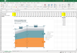
📊 Here are our top three tips to create powerful charts in Excel:
1. Abandon the defaults
Excel’s default chart settings are not meant to make your chart look good, they’re meant to help you get an idea of what’s possible. Feel free to add or remove gridlines, data labels or legends as you see fit to make your chart more clear and more beautiful.
2. Find more suitable colors
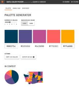
Excel’s default color scheme is not exactly ideal. Each of the colors feels equally important, so it’s difficult to create a clear visual hierarchy. Use a tool like Coolors, ColorBrewer or the Data Color Picker to find a palette that matches the theme of the visual and allows you to use a strong accent color if needed. Don’t forget to use grey to send less important elements to the background!
3. Make combinations of charts
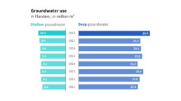
Excel’s chart options are substantial, but also have their limits. Sometimes you’ll have to group different charts together to reach the desired result. The butterfly chart below was created by grouping two separate bar charts (make sure they use the same scale!) and adding a text box to act as a title.
Read more:

Dear Data: Dataviz book review
Last February, on a cold and rainy day, I received the Dear Data book as part of a Dataviz Drawing workshop by Stefanie Posavec. A pretty large and heavy book, the kind you could put on your coffee table to show off (which I did!). Let's review it!
Data visualization tools: Datawrapper
If you are writing articles online and need to quickly insert beautiful, interactive charts, maps or tables, Datawrapper is the tool you are looking for.
Uncommon chart types: Waffle charts
If you thought a pie chart was the only food-related chart type out there, think again! Waffle charts are a great alternative.

We are really into visual communication!
Every now and then we send out a newsletter with latest work, handpicked inspirational infographics, must-read blog posts, upcoming dates for workshops and presentations, and links to useful tools and tips. Leave your email address here and we’ll add you to our mailing list of awesome people!
