
Uncommon chart types: Waffle charts
If you thought a pie chart was the only food-related chart type out there, think again! There is the donut chart – basically just a pie chart with a hole in the middle – but as a Belgian, I am particularly fond of what’s called a waffle chart. It’s a great alternative to a pie chart, and very easy to make. Oh dear, my stomach’s growling already!
What is a waffle chart?
A waffle chart is basically a square display, usually consisting of 100 smaller squares arranged in a 10-by-10 layout. The squares are colored according to the proportions you are aiming to visualize, similarly to how you would color different slices of a pie chart. As this square layout somewhat resembles a delicious waffle, this immediately explains the name of the chart:
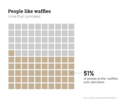
However, compared to a pie chart, a waffle chart is much easier to read – our brain is not well suited to compare different angles and slices, but we can quite easily compare different areas.
Alternative waffle charts
You will notice that many waffle charts are not made up of squares, but of alternative shapes, usually circles. Other shapes, such as small icons, are also possible – in this case we are approaching the realm of pictogram charts.
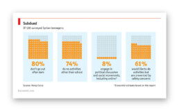
Another alternative are waffle charts consisting of more (or less) than 100 units, where the items represent actual numbers rather than fractions or percentages:
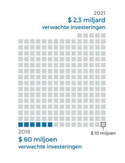
Here, each square represents $10 million, rather than 1%.
In the latter case, there are some similarities with charts we typically see after elections, showing the distribution of the different seats. One could argue that these kind of charts (‘Parliament charts’) are just a form of ‘warped’ waffle charts:
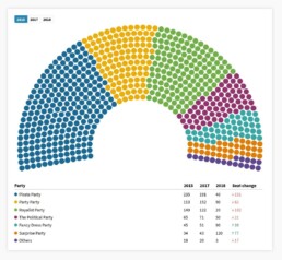
A Parliament Chart created using Flourish.
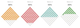
Some people prefer to turn their waffle charts by 45°, simply for design purposes, but well, some people are just weird:
Creating waffle charts
Making waffle charts is maybe a little bit tedious, but very simple! For example, you could create square cells in Excel, and color them using intelligent cell formatting to recreate the effect. If you google ‘waffle chart Excel‘ you will immediately get hundreds of blog posts and video tutorials describing the necessary steps.
Or you could take your favourite graphics software (such as Paint.NET, GIMP, or Inkscape), draw 100 identical shapes and color them according to your data.
And some people have managed to do it in Infogram, apparently.
More waffles than you'll ever need
To conclude, some wonderful things people have done with waffle charts, including this tile grid map of waffle charts about internet use in Africa:
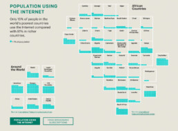
Apparently created by one.org, but I can’t find the exact source!
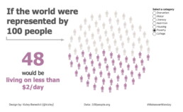
Oh, and a circular waffle chart is sometimes called a plum pudding chart, after J.J. Thomson’s plum pudding model for the atom, which is in turn named after a Christmas cake. The more you know!
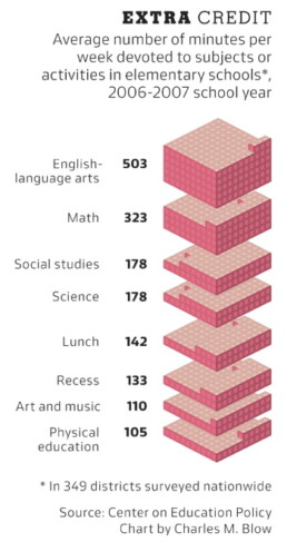
Finally, if you would ever think about creating a 3D waffle chart… it’s not impossible, but let’s say it’s frowned upon. Maybe we should keep that 3rd dimension for real waffles only?
More uncommon chart types? We have already covered:
- Slopegraphs
- Waffle charts
Read more:

Data visualization resources: all the links you’ll ever need!
You want to start creating clear and attractive data visuals, but don't know where to start? No worries, here's a complete overview of tools, resources and inspiration you can use as a starting point for your designs.
Storytelling with Data: Dataviz book review
The Storytelling with Data book has been on my wishlist as long as I can remember, because so many people recommend it as one of the must read dataviz books. So let's see what the fuzz is all about - here's my review!
Uncommon chart types: Slopegraphs
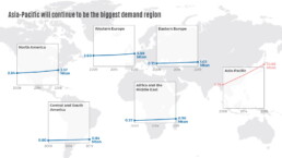
Slopegraphs appear in 'serious' newspapers, but they are very easy to create yourself. Use them if you want to compare how values have changed between two different points in time!
Data visualization in a time of pandemic – #6: Viral scrollytelling
In this final chapter, we’ll dive deeper into some of the insightful stories which have been published about the novel coronavirus and the COVID-19 pandemic. Rather than looking at single charts, we’ll highlight some long-form stories about the origin of the virus, how it works, and how it spread.

Five steps towards improving your dashboard
Today I would like to share with you the five steps I usually follow when I analyze and improve dashboards. If you are planning to analyze and improve your own dashboard, or maybe the dashboard someone else created and you want to provide feedback on, you could follow these five steps as well.

Dear Data: Dataviz book review
Last February, on a cold and rainy day, I received the Dear Data book as part of a Dataviz Drawing workshop by Stefanie Posavec. A pretty large and heavy book, the kind you could put on your coffee table to show off (which I did!). Let's review it!
We are really into visual communication!
Every now and then we send out a newsletter with latest work, handpicked inspirational infographics, must-read blog posts, upcoming dates for workshops and presentations, and links to useful tools and tips. Leave your email address here and we’ll add you to our mailing list of awesome people!
