
Avoiding abbreviations
People are lazy. Make it as easy as possible for them to see what you are trying to show. “Mental noise” is my name for ‘work’ your audience has to do before they can actually see what they want to see. In a graph, it can be taking out a ruler to measure a distance, but also tilting the page to read non-horizontal text, or having to look up jargon.
There are tons of ways to reduce mental noise in your charts, but one of the easiest is avoiding abbreviations. Of course, space constraints, general usage, and the specific nature of the abbreviation don’t always make this possible (I wouldn’t replace DNA by deoxyribonucleic acid everywhere), but a specific case where I tend to avoid abbrevations at all costs are countries.
Yes, countries do have official abbreviations — standardized by the ISO 3166 guidelines. There are even 2-letter ánd 3-letter abbrevations for each country. For example, Belgium’s alpha-2 code is BE, and its alpha-3 code is BEL. In most official documents, such as reports by the European Union, the alpha-2 codes are most commonly used. Lack of space is often the main reason, in charts where 27 countries need to be shown.

But these alpha-2 abbrevations are not always as straightforward as in the case of Belgium. Most people will recognize FR, NL or IT. If you know your languages, DE or ES will also make sense. And with some effort, we can decypher SK or AT, even though they don’t always make sense. Some of the lesser known ones are probably EE (Estonia – local name Eesti), HR (Croatia – local name Hrvatska) or EL (Greece – local name Elláda or Ελλάδα).
If you’re looking at 27 EU countries in a list of graph, that’s quite a lot of cognitive load to untangle and recall all of them. Your audience needs quite some background knowledge in order to fully understand your chart. Some people might not even bother looking up country codes they don’t recognize, which of course lowers the relevance of our entire graph. For this reason, I will almost always avoid country abbreviations, and write their names in full. That doesn’t even have to take up much more space:

By avoiding these abbreviations, we ensure that readers don’t have to look up anything. They can stay engaged with the chart and get to the point much more quickly. And that’s of course what it’s all about.

Source: I encountered a version of this visual on VRT NWS, in an article on the number of political mandates per country (in Dutch). Most of their data was collected from a flash Eurobarometer report “Local politicians of the EU and the future of Europe” by the European Committee of the Regions.
Read more:
Tell me why… I don’t like dashboards
I don't like dashboards. Well, most dashboards at least. They're just trying too hard... to do everything, everywhere, all at once. Why is that? And is there a better solution?
Why I love matrix charts
This one is definitely in my top 5 of favourite chart types: a matrix chart! Super flexible, can provide some great insights into the data, and it will fit well into your beautiful report design.
Vreemde plaatsnamen in Vlaanderen
Iedereen kent wellicht 'Kontich' en 'Reet', maar in Vlaanderen hebben we nog veel meer merkwaardige, onverwachte, en vaak grappige plaatsnamen. Heb je bijvoorbeeld ooit al gehoord van Buitenland, Dikkebus, of Grote Homo?
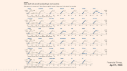
Small multiples can save your chart
When you're dealing with a chart that has too much information on it, the most straightforward advice to follow is: break it down into multiple charts, each with less information on them. A powerful example of this is a so-called small multiple approach.

Can you use Excel to create a powerful chart?
Spreadsheet tools such as Microsoft Excel or Numbers might not be the first thing on your mind when considering data visualization tools, but they can be pretty solid choices to build data visuals. Don’t let anyone convince you that using Excel to create data visuals is unprofessional.

Choosing the right font for your data visual
Fonts evoke emotions: there are very sophisticated fonts, playful fonts, attention-grabbing fonts, and elegant handwritten fonts. Using the wrong type of font can have a lot of impact. In data visualization the implications of typography are mainly focused on readability. Labels and annotations can easily become so small they get hard to read. Above all else, we should choose a font which is readable at small sizes.
We are really into visual communication!
Every now and then we send out a newsletter with latest work, handpicked inspirational infographics, must-read blog posts, upcoming dates for workshops and presentations, and links to useful tools and tips. Leave your email address here and we’ll add you to our mailing list of awesome people!
