
The uncomfortable relationship between scientific illustrations and AI
Scientific journal Nature devoted the headline of its 23 July 2026 issue to “the human art of scientific illustration in the age of artificial intelligence”. Of course, that sparked my attention. Three complementary articles, one occasioned by the journal’s own history of cover art, from the earliest sketches and black-and-white photographs to the 150th-anniversary cover that turned 88,000 citation links into an image. But it’s the other two pieces that stuck with me: a practical guide on avoiding AI mistakes in scientific figures, and a set of interviews with five scientific illustrators about where AI actually fits into their process.
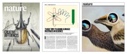
Together they made me think harder than I expected about a question that gets asked too loosely: what is the impact of AI on the field of scientific visualization?
The wrong question
I’ll be honest: the debate whether scientists and designers should use AI tools or not isn’t that interesting to me. AI tools are already assisting researchers with illustration, and that’s not going to reverse. The interesting question isn’t whether, but where, and how, and how much oversight is needed.
Kuukua Wilson, a medical illustrator interviewed in the piece, recalls a professor’s line from her master’s degree:
“People used to worry that illustrators would be replaced by the camera. But if a camera takes a photo of a surgery, you don’t see anything, just blood. You still need a medical illustrator to draw everything else.”
Illustration was never actually competing with photography. It does something photography can’t: show what’s obscured, too abstract, or not visible.
I think that’s the right lens for AI, too. Not “will it replace illustrators” but “what is illustration actually for, and where does that purpose hold up against a tool that’s extremely convincing, and occasionally wrong”.
Proof versus explanation
Here’s my take. Some scientific images exist to prove something — a photograph, a microscopy image, a western blot, a data graph. Their entire job is faithful representation of something that happened or was measured. Other images exist to explain — a graphical abstract, a flowchart, a timeline, a schematic. Their job is to make something understood, not to serve as evidence for it.
I’d never use AI to touch a proof-image. The risk of distortion, even the most subtle, is exactly what we can’t afford when the image is the evidence. For explanatory images, though, such as flowcharts or timelines or illustrations, I think AI can be a genuinely good assistant. In those situations, a human is making deliberate design decisions and oversight is straightforward.
“When talking about AI-generated images, people usually think of art and illustrations. But scientific graphics can also include schematics, visual abstracts, figures that depict a study’s data and images used as evidence. The ethical issues are very different, if you’re using images as evidence or using them to explain things.”
— Ethicist Sebastian Porsdam Mann
This is close to what the Nature technology piece calls out directly: the ethicist Sebastian Porsdam Mann notes that the ethical questions differ sharply depending on whether an image is being used as evidence or used to explain. The clearest cautionary tale for the evidence side is well-known: in April 2026 a biologist generated a full set of convincing-looking western blots from a single ChatGPT prompt, just to demonstrate how easy fabrication has become. Another paper was retracted from the New England Journal of Medicine after an AI-adjusted image left behind a telltale error in a tape measure’s numbering.
So, what should you do? Are AI tools allowable when creating scientific visuals? It’s good to know that publishers don’t agree on any of this. PLOS allows AI-generated images with disclosure. Cell Reports bans AI graphical abstracts outright. Springer Nature (Nature’s own publisher) prohibits generative AI images except when an article is specifically about AI. So whatever your own ethical line is, check your target journal’s policy before you touch a figure with an AI tool.
And what about graphs?
The one place I disagree with the article is graphs, of course my favorite subject. Marc-Oliver Gewaltig, co-founder of the academic-writing consultancy Thesify, suggests plotting your data yourself, then asking AI to make the figure more polished. His argument is that you already know what the chart should look like, so validation is easy.
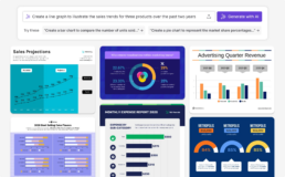
But a graph’s entire purpose is to be a faithful encoding of data: position, length, angle mapped directly to numbers. That’s a much tighter constraint than “make it look nice,” and it’s exactly where a small, well-intentioned AI edit could shift an axis, round a value, or smooth a line in a way that changes what’s on the chart without changing how it looks. It’s easy to visually verify the contents of a flowchart, but it’s hard to see whether a chart shows all the data points in the correct position. The same reasoning that makes AI dangerous for evidence-images in general is even sharper for graphs, because a chart’s whole credibility rests on its precision.
What scientific illustrators actually do
What surprised me most, reading the interviews, is that even for images squarely on the explain side of our own line — where we’d expect AI assistance to be less controversial — the illustrators themselves are still very cautious. Every one of the five interviewed said they avoid AI in finished work. Not because oversight is impossible, but because they see illustration itself as a long sequence of judgment calls: what’s known, what’s uncertain, what a specific audience needs, how to represent that honestly. Melissa Weiss put it well: she uses AI tools the way she’d use a brush or an eraser — for small cleanup, never to build the core of an image, specifically to keep her authority over the result intact.
Ella Marushchenko, a journal-cover artist, flagged a subtler effect I see in my own practice as well: AI hasn’t just changed how images get made, it’s changed the brief. Researchers now often arrive with an AI-generated concept image instead of a rough sketch. That’s mainly a positive evolution: it helps scientists to explain what they would actually like to see. But it also carries a risk, by pushing illustrators into a direction that might not be the best fit for the subject or the article.
The strongest argument against AI on the explain side came from Shehryar Saharan, who this year illustrated the innervation of the clitoris and vulva, anatomy mapped at high resolution only in the past year, and relevant to surgeries that can otherwise sever those nerves. There was nothing for an AI model to draw on; the accurate source material didn’t exist until very recently, and its absence for so long reflects a real history of medical neglect. Sometimes an “explanatory” image is the first accurate representation of something.
Where that leaves us
The proof/explain distinction still holds up, I believe, as the right first cut for where AI belongs in scientific images. But two things complicate it in practice: graphs sit closer to the proof side than most people treat them, and even on the explain side, the actual craft and judgment calls of illustration resist automation for reasons that have nothing to do with accuracy.
Which brings me back to the camera. Illustration survived photography not because illustrators outcompeted the lens, but because they were never really playing the same game. I suspect AI-generated imagery will settle into science the same way: not as a replacement for judgment, but as one more tool that still needs someone to decide what the picture is actually for.
Credentials: I’m an information designer and PhD in Physics from Belgium, often helping scientists by creating graphs, graphical abstracts, and infographics. Feel free to connect with me on LinkedIn. This blog post is also available on Medium.
Read more:

Avoiding abbreviations
People are lazy. Make it as easy as possible for them to see what you are trying to show. There are tons of ways to reduce mental noise in your charts, but one of the easiest is avoiding abbreviations.

Review: Info We Trust
Info We Trust is an ambitious, visually stunning book that sits somewhere between philosophy, information design, and a collection of visual essays.
Gridlines are better than axes
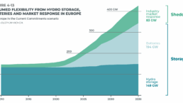
Almost always, gridlines are better than axes. Vertical axes are the default option, and they have been around for centuries, so they are very well known. But they also have downsides. My biggest problem with vertical axes is that they’re often so far away from where the action is really happening.
Review: A History of Data Visualization and Graphic Communication
Michael Friendly and Howard Wainer clearly love graphs. But A History of Data Visualization and Graphic Communication isn’t just about graphs — it’s about the stories behind them: the context, the people, the new measurements that made them necessary, and the discoveries they enabled.

Report visuals don’t have to suck
Discover how CREG, Belgium’s electricity regulator, turns complex data into clear and engaging visuals. From smart annotations to small multiples and uncommon chart types, their Monitoring Report shows how thoughtful data visualization makes technical reports easier to read and understand.
Data visualization podcasts 2025
At Baryon, we’re huge fans of podcasts! Data visualization podcasts are a great way to stay up to date on the latest trends and techniques in data visualization.
We are really into visual communication!
Every now and then we send out a newsletter with latest work, handpicked inspirational infographics, must-read blog posts, upcoming dates for workshops and presentations, and links to useful tools and tips. Leave your email address here and we’ll add you to our mailing list of awesome people!
