How powerful charts can boost your career
An American accountant managed – as the youngest ever! – to win a crucial election in Los Angeles – thanks to the power of data visualization.
Kenneth Mejia, a 32-year-old accountant of Filipino descent, is very committed to issues of poverty, affordable housing and mobility. In the 2022 elections he ran for “City Controller”, a sort of treasurer, for his hometown of Los Angeles. It’s a department with responsibilities almost as big as those of the city’s mayor and chief justice. For example, the City Controller can commission audits to evaluate the effectiveness of city departments.
Data visualization as election propaganda
Kenneth took a remarkably creative and unusual approach in the run-up to the election: he made imported data about the city instantly accessible and visible. On his campaign website, for example, he created a whole series of interactive maps, reports and searchable databases. He even put up billboards showing with graphs what the anticipated city budget will be used for in 2022-2023.
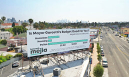
That transparent communication did not miss its mark. Kenneth won, as the youngest city controller ever. This approach shows how powerful data visualization is to unlock information, which may seem difficult and unfathomable to the general public, in a very accessible way. As a result, citizens not only gain insight but also become more engaged in politics. They become better informed and can vote more knowledgeably.
You too can make a difference thanks to powerful data visualization
Whether you have political ambitions, want to present your scientific research comprehensibly or convince your management of your brilliant ideas… Would you also like to learn how to create powerful graphics that can inform, convince and engage your audience? Charts that not only accurately represent the numbers, but also have a clear message and are attractive to look at?
In the book “Powerful Charts” physicist and Baryon founder Koen Van den Eeckhout explains in an accessible and practical way how this can be done. An indispensable guide for anyone who communicates with and about figures.
This brand new book is available now at Owl Press.
Read more:

Data visualization resources: all the links you’ll ever need!
You want to start creating clear and attractive data visuals, but don't know where to start? No worries, here's a complete overview of tools, resources and inspiration you can use as a starting point for your designs.

Why is data visualization so powerful?
The amount of data coming our way is growing exponentially. In 2021 alone, it is estimated that humankind generated 74 zettabytes of data – that’s about 10,000 GB per person. How on earth are we going to keep this manageable?

Infographic: Amazing facts about the brain
Did you know that our brain makes up 2% of our body weight, but consumers about 20% of our energy? Did you know that we have a second brain, located in our gut?
Our information designer Sofia made this insightful infographic, giving you an overview of eight amazing facts about the brain!

How common is your birthday?
Not all birthdays are created equal... in fact, for most countries in the north temperate zone, more people are born in summer (May - August) than in winter (October - January). This heatmap allows you to check how popular your birth date is. It shows the number of people in Belgium for each specific birthday.

Visualizing Complexity: Dataviz book review
Visualizing Complexity is a great new data visualization book published by information design Superdot. Here's our verdict.

This chart is trying to trick you
The original chart in this example is trying to suggest a strong correlation between sugar intake and obesity in the US between 1980 and 2000. It does so by carefully choosing the vertical axis ranges and scaling so both lines nicely fall on top of each other.
We are really into visual communication!
Every now and then we send out a newsletter with latest work, handpicked inspirational infographics, must-read blog posts, upcoming dates for workshops and presentations, and links to useful tools and tips. Leave your email address here and we’ll add you to our mailing list of awesome people!

