Visualizing Complexity: Dataviz book review
We love the smell of new dataviz books in the morning… and ‘Visualizing Complexity’ is about as new as it gets! Written by (super-cool) information design agency Superdot from Basel (Switzerland) and published in May 2022, it contains an excellent analytical overview of the modular design system they developed over the past 10 years.

The book
The book, which arrived with a nice and friendly signed postcard, is printed on heavy high-quality paper, with a sturdy cardboard cover. A bit smaller than we expected, at 23 by 16 centimeters, it has a compact and inviting look and feel. The colors, fonts and layout are very reminiscent of the famous Bauhaus design movement, and despite the very intense, saturated color scheme, the design rarely overpowers the actual content. To be honest: it’s been lying on our desk for a week now, just to show off its beautiful design 😇
The highly structured book is divided into five parts:
- Data dimensions: different ways of presenting and processing datasets
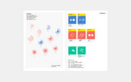
- Diagrammatical dimensions, visual dimensions and structuring dimensions: a total of 80 elements which can be used to create shapes, arrange them, and make them visually distinguishable based on the different data dimensions
- Multidimensional visualizations: examples of the Modular Information Design system breaking down powerful data visuals to show how they are built from combinations of these 80 elemental dimensions
The authors
Darjan Hill and Nicole Lachenmeier are the founders of information design agency Superdot (previously Yaay), which has grown into a well-known multidisciplinary team of information designers, developers and storytellers. They combine a background in Business Informatics (Darjan) and Visual Communication (Nicole) into a unique blend allowing them to approach information visualization challenges from a wide variety of perspectives.
Besides serving an impressive list of clients, winning many awards, and being involved in multiple teaching and mentoring program, Superdot is the initiator of the “On Data And Design” event series, and a pioneer in the field of DX – Data Experience Design.
The verdict
⭐⭐⭐⭐
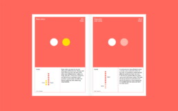
With our background in science, the highly analytical approach of Visualizing Complexity resonates strongly with us. It is a welcome update of Jacques Bertin’s visual variables concept, with a bigger focus on combining different variables/elements to construct multidimensional and multi-layered visualizations.
The exactly 80 elements, consisting of 25 diagrammatical, 40 visual, and 15 structuring dimensions might feel a bit contrived at times, but on the other hand it is also a very complete overview. We’ll definitely browse through this book during future projects, to ensure we’ve covered as many different visual ideas as possible.
What we’re missing a little bit in this book is an evaluation of how powerful each of these elements are. In the many examples in the final section of the book, it is clear how some elements (e.g. color hue) are much more prominent than others (e.g. contour details). Therefore, some of them are very logical choices for certain data dimensions, and others are less logical or way too subtle to clearly tell the story we want to tell in our visual. This evaluation is left to the reader to experience as a part of experimentation process – which is probably a good thing, as it could be quite dependent on the exact data.
All in all, this is a book that has definitely earned a prominent place on our dataviz bookshelf – a must have for everyone who wishes to understand the analytical thought processes behind strong data visuals!
More dataviz book reviews? We have already covered:
- Dear Data
- Storytelling with Data
- Visualizing Complexity
Read more:

Review: Info We Trust
Info We Trust is an ambitious, visually stunning book that sits somewhere between philosophy, information design, and a collection of visual essays.

Gridlines are better than axes
Almost always, gridlines are better than axes. Vertical axes are the default option, and they have been around for centuries, so they are very well known. But they also have downsides. My biggest problem with vertical axes is that they’re often so far away from where the action is really happening.

Review: A History of Data Visualization and Graphic Communication
Michael Friendly and Howard Wainer clearly love graphs. But A History of Data Visualization and Graphic Communication isn’t just about graphs — it’s about the stories behind them: the context, the people, the new measurements that made them necessary, and the discoveries they enabled.

Report visuals don’t have to suck
Discover how CREG, Belgium’s electricity regulator, turns complex data into clear and engaging visuals. From smart annotations to small multiples and uncommon chart types, their Monitoring Report shows how thoughtful data visualization makes technical reports easier to read and understand.

Data visualization podcasts 2025
At Baryon, we’re huge fans of podcasts! Data visualization podcasts are a great way to stay up to date on the latest trends and techniques in data visualization.

Tell me why… I don’t like dashboards
I don't like dashboards. Well, most dashboards at least. They're just trying too hard... to do everything, everywhere, all at once. Why is that? And is there a better solution?
We are really into visual communication!
Every now and then we send out a newsletter with latest work, handpicked inspirational infographics, must-read blog posts, upcoming dates for workshops and presentations, and links to useful tools and tips. Leave your email address here and we’ll add you to our mailing list of awesome people!
