This chart is trying to trick you
⚠ Warning: this chart is lying to you!
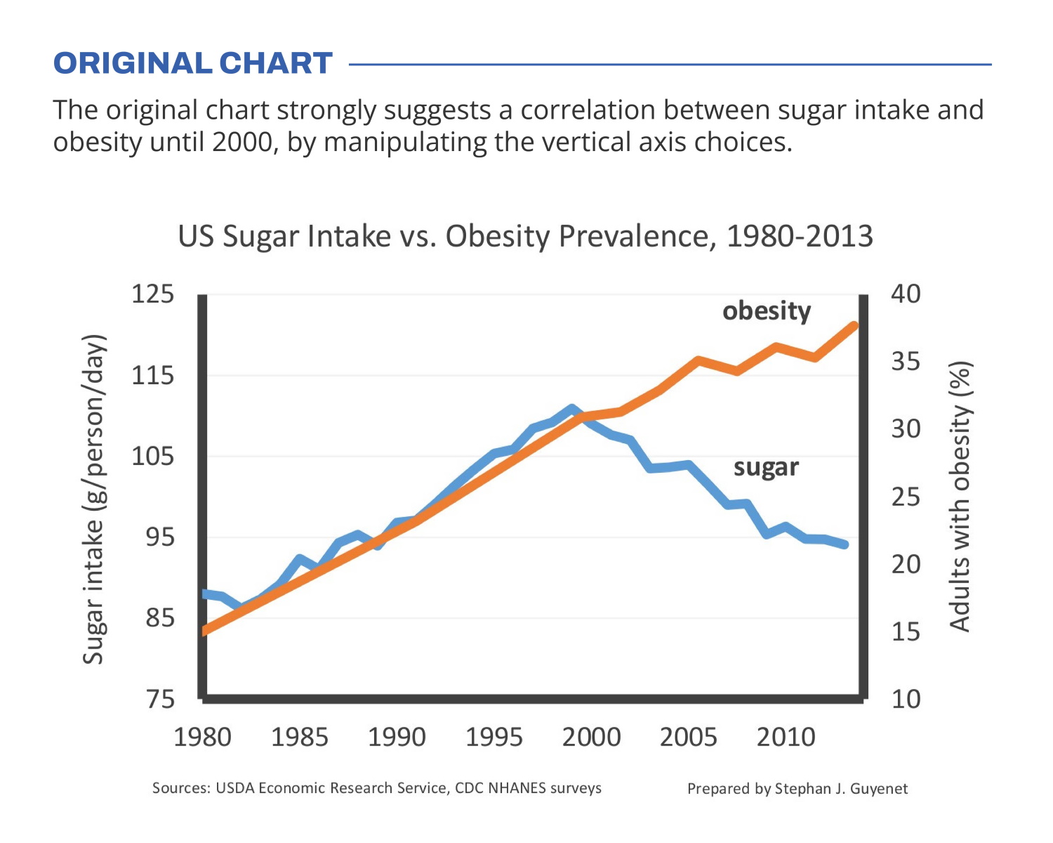
🍬 The original chart in this example is trying to suggest a strong correlation between sugar intake and obesity in the US between 1980 and 2000. It does so by carefully choosing the vertical axis ranges and scaling so both lines nicely fall on top of each other.
But with a closer look we can see something else is going on. Sugar intake levels are rising by 30% (from 85g to 110g), while obesity prevalence is rising by 164% (from 14% to 37% of the population). For an accurate comparison, these lines shouldn’t nicely align at all!
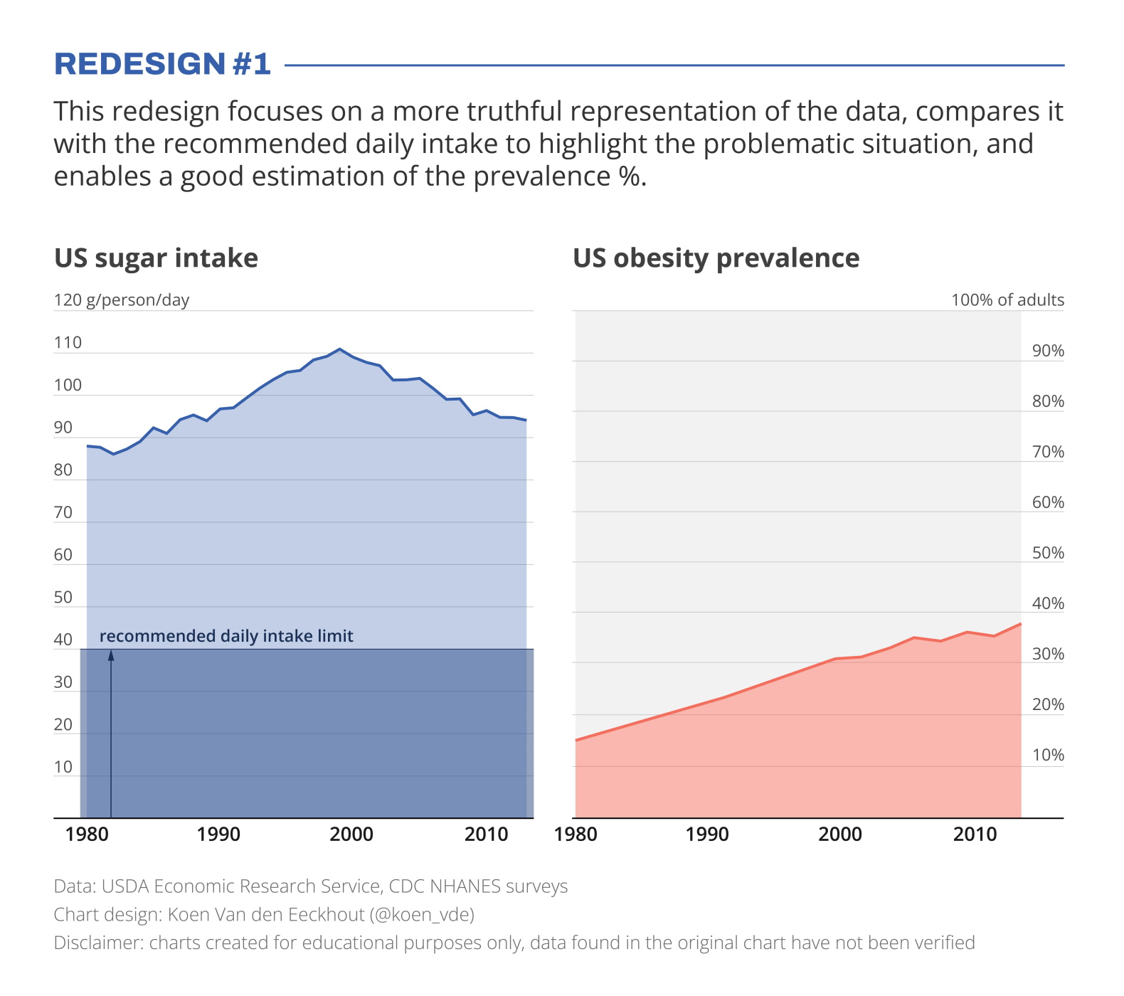
I’ve created two redesigns to present some better solutions for this visualization. In redesign 1 we focus on a presentation which is as truthful as possible, comparing the data with the recommended intake level, and enabling an accurate estimation of the prevalence %.
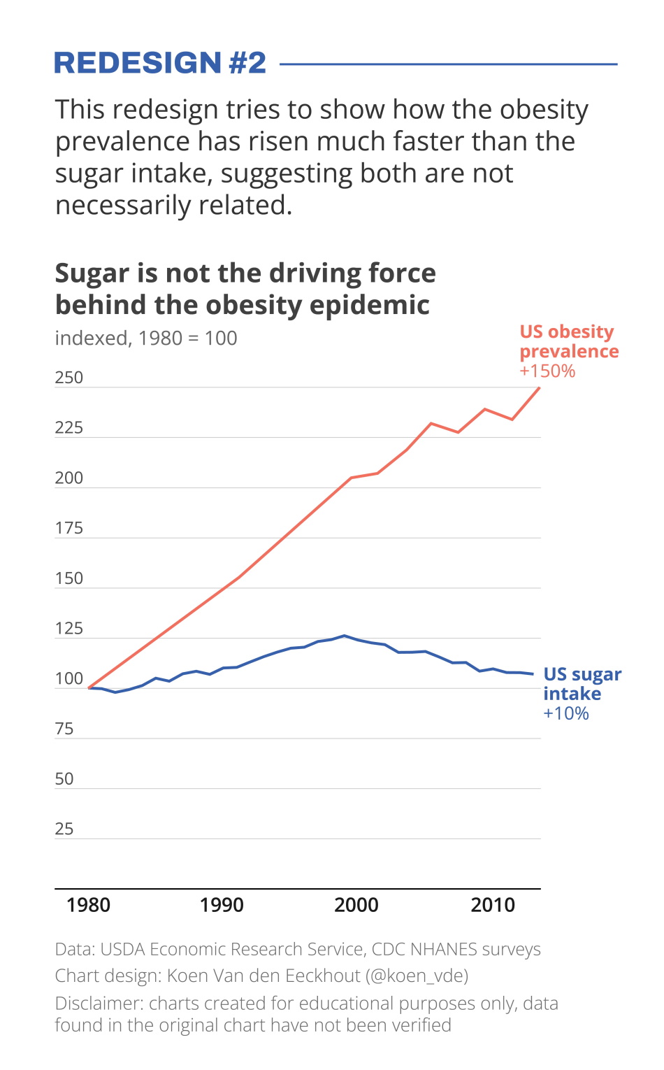
In redesign 2 we focus on showing how much faster the obesity prevalence has grown compared to the sugar intake, which has remained relatively stable.
Depending on the message you want to bring, one presentation might be preferable above the other. But in any case, manipulating your vertical axes to suggest a strong correlation which might not be there, is not very nice!
Still struggling with telling a strong visual message using truthful charts? Find out how we can help you, or reach out to us directly.
Read more:

Review: Info We Trust
Info We Trust is an ambitious, visually stunning book that sits somewhere between philosophy, information design, and a collection of visual essays.

Gridlines are better than axes
Almost always, gridlines are better than axes. Vertical axes are the default option, and they have been around for centuries, so they are very well known. But they also have downsides. My biggest problem with vertical axes is that they’re often so far away from where the action is really happening.

Review: A History of Data Visualization and Graphic Communication
Michael Friendly and Howard Wainer clearly love graphs. But A History of Data Visualization and Graphic Communication isn’t just about graphs — it’s about the stories behind them: the context, the people, the new measurements that made them necessary, and the discoveries they enabled.

Report visuals don’t have to suck
Discover how CREG, Belgium’s electricity regulator, turns complex data into clear and engaging visuals. From smart annotations to small multiples and uncommon chart types, their Monitoring Report shows how thoughtful data visualization makes technical reports easier to read and understand.

Data visualization podcasts 2025
At Baryon, we’re huge fans of podcasts! Data visualization podcasts are a great way to stay up to date on the latest trends and techniques in data visualization.

Tell me why… I don’t like dashboards
I don't like dashboards. Well, most dashboards at least. They're just trying too hard... to do everything, everywhere, all at once. Why is that? And is there a better solution?
We are really into visual communication!
Every now and then we send out a newsletter with latest work, handpicked inspirational infographics, must-read blog posts, upcoming dates for workshops and presentations, and links to useful tools and tips. Leave your email address here and we’ll add you to our mailing list of awesome people!
