
Report visuals don’t have to suck
Lots of reports have boring, ugly visuals. Or, even worse, visuals which are really, really hard to understand. The reports by CREG, the Belgian Federal Commission for Electricity and Gas Regulation, are completely different. For example, just browsing through the Monitoring Report — their yearly study on the functioning and price evolution of the Belgian wholesale electricity market — you can immediately see that it’s full of really thought-through visuals and graphs. There are three key principles they apply to bring their visuals to the next level.
Principle 1: add helpful annotations
Sometimes it’s in the small things, like adding a simple arrow to show that the yellow area is equal to the gray area between the grid load and the total load:

The total load and grid load in these curves have very strong seasonal patterns, making it hard to spot whether the delta between them also has seasonal patterns or not. Duplicating that delta at the bottom of the graph — nicely aligned with the horizontal axis — is the best way of making such patterns visual. In this case, there is some seasonality (the delta is slightly lower in winter), but much less pronounced than the seasonal patterns of the loads.
Principle 2: use small multiples to untangle complicated stories
When charts feel complicated, it’s often because they try to explain to many things at once. Different key stories in the data are fighting for our attention. Rather than just eliminating information to make a chart simpler, a helpful technique is to break it up into multiple smaller copies, each of which tells a single part of the story: a ‘small multiples’ approach.

The visual above shows the evolutions for four different countries over a 10-year time period in a small multiples arrangement. Comparing the exact values for the different countries side-by-side is a bit harder, because the bars are a bit further apart from each other than in a traditional clustered bar chart. But comparing the patterns between countries is now easy to do, and that’s the main objective of this chart — to show how different the electricity flow is among Belgium’s different borders.
Principle 3: don’t be afraid to use less common chart types
Not everything has to be a bar, line or pie chart. There are 100+ chart types available to us (if you want an extensive overview, you could check out the Data Viz Project or Data Visualisation Catalogue). Different chart types of course have similar things they can do, but each chart type does have its own strengths and weaknesses when it comes to highlighting certain aspects of your story. If you have an important key message to share, it’s worth considering a few different chart types and choosing the one that shows your message the most clearly.

In the CREG report, you will find bump charts, variable width bar charts (or Marimekko charts if you want to sound fancy), heatmaps, slopegraphs, waterfall charts, and ridgeline plots sprinkled in between the more traditional line and scatter plots. These more exotic charts are added on purpose, with a clear goal in mind, not just to make the report a little bit more fancy (although that is also an effect of chart variety: less boring reports).
Benefits of using better charts
The result of all of this? A 150-page report that doesn’t feel like a chore to read. There is variety, and everything is well explained. Thanks to the clear titles, subtitles and annotations every visual is its own self-contained mini-story — it’s not always necessary to read all the text before and after the figure to understand what’s going on. And most important of all: the graphs are clear and transparent. CREG gets its message across flawlessly, without being hampered by chart clutter, noise, or unnecessary complications. A clear, correct ánd beautiful presentation of the information — that’s what we should all strive for!
Disclaimer
I was (unfortunately!) not involved in the creation of these beautiful graphs. All visuals were created by Senior CREG Advisor Nico Schoutteet. You can read the report on the CREG website.
Read more:

Avoiding abbreviations
People are lazy. Make it as easy as possible for them to see what you are trying to show. There are tons of ways to reduce mental noise in your charts, but one of the easiest is avoiding abbreviations.
The uncomfortable relationship between scientific illustrations and AI
Scientific journal Nature devoted the headline of its 23 July 2026 issue to “the human art of scientific illustration in the age of artificial intelligence”. Of course, that sparked my attention.

Review: Info We Trust
Info We Trust is an ambitious, visually stunning book that sits somewhere between philosophy, information design, and a collection of visual essays.
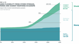
Gridlines are better than axes
Almost always, gridlines are better than axes. Vertical axes are the default option, and they have been around for centuries, so they are very well known. But they also have downsides. My biggest problem with vertical axes is that they’re often so far away from where the action is really happening.

Review: A History of Data Visualization and Graphic Communication
Michael Friendly and Howard Wainer clearly love graphs. But A History of Data Visualization and Graphic Communication isn’t just about graphs — it’s about the stories behind them: the context, the people, the new measurements that made them necessary, and the discoveries they enabled.

Data visualization podcasts 2025
At Baryon, we’re huge fans of podcasts! Data visualization podcasts are a great way to stay up to date on the latest trends and techniques in data visualization.
We are really into visual communication!
Every now and then we send out a newsletter with latest work, handpicked inspirational infographics, must-read blog posts, upcoming dates for workshops and presentations, and links to useful tools and tips. Leave your email address here and we’ll add you to our mailing list of awesome people!
