
Gridlines are better than axes
Almost always, gridlines are better than axes. At least for vertical axes.
I admit, vertical axes are the default option, and they have been around for centuries, so they are very well known. But your typical vertical axis also has some downsides. My biggest problem with vertical axes is that they’re often so far away from where the action is really happening. Take a typical chart like this, were nothing is really happening on the left (all the values are zero), but the growth is really big on the right hand side of the visual:
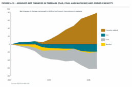
If you want to know the data values near the end of the chart, in 2036 in this case, we almost have to take out a ruler to measure, but the lack of axis ticks (the little horizontal lines next to the numbers) and the distance make that hard to do:

A simple compromise is to move the axis to the right hand side of the visual, where it’s much closer to the ‘action’ — the values we’re actually most interested in:

We had to move the legend to the left in order to free up some space for the axis, but it actually worked out really well. Notice also how we’ve added some explicit tick lines to increase the precision of the visual.
However, moving the vertical axis to the right hand side is not always an option. Often, we’ll have some direct labels or annotations on that side that make it harder to fit in the axis. It would create too much of a barrier between the data and the text. Take this visual for example:
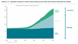
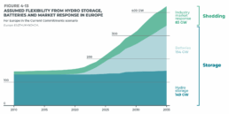
This is a really clean, strong visual thanks to the use of direct labels and some helpful annotations to the right. The only thing I don’t really like is that lonely vertical axis sticking out like a sore thumb at the left side of the visual. However, these labels and annotations are in the way when we want to move the axis to the right:
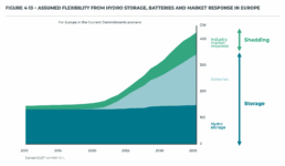
I’m probably just nitpicking, but that doesn’t look so great to me! In these situations, I will always prefer to switch to gridlines. Yes, they take up more space and create more ‘stuff’ in the visual, but they have two major benefits:
✅ more precision if you’re trying to estimate data values
✅ this precision boost impacts all parts of the visual: left, middle, and right
Here’s how that looks like for the visual above:
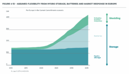
I’ve made the colored areas a little bit transparent, so you can still see the gridlines clearly enough. Notice how you can quite easily see that the total value is growing to 200 GW by 2025, and reaching 300 GW by 2030. These intermediate values were quite hard to read in the original visual!
Some final cleanup things we can do:
- nicely align the subtitle and the note with the rest of the visual
- add ticks to the horizontal axis as well
- optimize the annotation to the right, brackets would make more sense here than arrows I think
- add explicit data values for the different categories in 2035 to further increase precision
- move the ‘GW’ label to the tick label
This is how the end result looks like:

Finally, a small bonus tip. If for some reason you’re tight on space, and you have to squeeze your chart a bit to make everything fit, you don’t have to make your gridlines go all the way from left to right. You could consider only having them show up when they’re needed. That would give you some extra whitespace to fit, for example, your title and subtitle:
Of course, that’s something not every #dataviz tool will allow, so that’s only for when you’re willing to make some final custom modifications for your report.
Here’s the full comparison between our original visual, and the reworked chart:

Note: visuals taken from Elia’s ‘Adequacy and flexibility study for Belgium, 2026–2036’, which you can access here: Adequacy and flexibility study for Belgium (2026–2036) by Elia Group — Issuu
Read more:

Avoiding abbreviations
People are lazy. Make it as easy as possible for them to see what you are trying to show. There are tons of ways to reduce mental noise in your charts, but one of the easiest is avoiding abbreviations.
The uncomfortable relationship between scientific illustrations and AI
Scientific journal Nature devoted the headline of its 23 July 2026 issue to “the human art of scientific illustration in the age of artificial intelligence”. Of course, that sparked my attention.

Review: Info We Trust
Info We Trust is an ambitious, visually stunning book that sits somewhere between philosophy, information design, and a collection of visual essays.

Review: A History of Data Visualization and Graphic Communication
Michael Friendly and Howard Wainer clearly love graphs. But A History of Data Visualization and Graphic Communication isn’t just about graphs — it’s about the stories behind them: the context, the people, the new measurements that made them necessary, and the discoveries they enabled.

Report visuals don’t have to suck
Discover how CREG, Belgium’s electricity regulator, turns complex data into clear and engaging visuals. From smart annotations to small multiples and uncommon chart types, their Monitoring Report shows how thoughtful data visualization makes technical reports easier to read and understand.

Data visualization podcasts 2025
At Baryon, we’re huge fans of podcasts! Data visualization podcasts are a great way to stay up to date on the latest trends and techniques in data visualization.
We are really into visual communication!
Every now and then we send out a newsletter with latest work, handpicked inspirational infographics, must-read blog posts, upcoming dates for workshops and presentations, and links to useful tools and tips. Leave your email address here and we’ll add you to our mailing list of awesome people!
