Review: A History of Data Visualization and Graphic Communication
Michael Friendly and Howard Wainer clearly love graphs. But A History of Data Visualization and Graphic Communication isn’t just about graphs — it’s about the stories behind them: the context, the people, the new measurements that made them necessary, and the discoveries they enabled. The authors don’t just show us the end result; they take us through the process that led there, often in a delightful amount of detail.
The structure of the book balances chronology with theme. This keeps the feeling of historical evolution intact, without falling into the trap of a dry timeline. We jump from 17th-century innovators to 20th-century pioneers, always with a clear narrative thread.
What stood out to me most was the variety of examples. While the book is clearly indebted to Edward Tufte’s work, it doesn’t recycle his canon. I encountered many visualizations I hadn’t seen before, and even familiar ones were presented with fresh insight. The ideas on how new data, collected with new measurement techniques, often prompt entirely new kinds of charts were particularly eye-opening for me. It’s a reminder that visualization doesn’t just explain data — it also adapts to it.
That idea was so powerful to me that I used it as one of the foundations for my keynote lecture, Graphs can save the world! This book helped me think more deeply about why visualizations matter — not just aesthetically or functionally, but historically and socially.
That said, not every chapter lands equally well. Some sections feel a bit scattered or lightweight, especially when they only briefly touch on developments that deserve more space. The final chapter, Graphs as Poetry, takes a more philosophical turn, but I wasn’t entirely sure what the authors were trying to argue there.
Also worth noting: while the book is visually rich, it’s a shame that most of it is printed in black and white. Some of the visual clarity and impact is lost as a result. And while the authors occasionally offer “reworked” versions of historical charts to show how they could be improved, these redesigns don’t always convince — sometimes the original speaks more eloquently in its own language.
Despite those minor critiques, this is a generous, well-researched, and deeply informative book. I’d recommend it to anyone interested in the intersection of data, history, and design. It’s a reminder that charts are tools, but also more than tools — they are artifacts of human thought, and sometimes, even acts of discovery.
Rating: ⭐⭐⭐⭐
Read this review, as well as many others, in our complete overview of data visualization books (work in progress).
Read more:
Storytelling with Data: Dataviz book review
The Storytelling with Data book has been on my wishlist as long as I can remember, because so many people recommend it as one of the must read dataviz books. So let's see what the fuzz is all about - here's my review!
Uncommon chart types: Slopegraphs
Slopegraphs appear in 'serious' newspapers, but they are very easy to create yourself. Use them if you want to compare how values have changed between two different points in time!
Data visualization in a time of pandemic – #6: Viral scrollytelling
In this final chapter, we’ll dive deeper into some of the insightful stories which have been published about the novel coronavirus and the COVID-19 pandemic. Rather than looking at single charts, we’ll highlight some long-form stories about the origin of the virus, how it works, and how it spread.
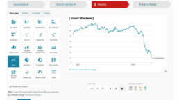
Five steps towards improving your dashboard
Today I would like to share with you the five steps I usually follow when I analyze and improve dashboards. If you are planning to analyze and improve your own dashboard, or maybe the dashboard someone else created and you want to provide feedback on, you could follow these five steps as well.

Dear Data: Dataviz book review
Last February, on a cold and rainy day, I received the Dear Data book as part of a Dataviz Drawing workshop by Stefanie Posavec. A pretty large and heavy book, the kind you could put on your coffee table to show off (which I did!). Let's review it!
Data visualization tools: Datawrapper
If you are writing articles online and need to quickly insert beautiful, interactive charts, maps or tables, Datawrapper is the tool you are looking for.
We are really into visual communication!
Every now and then we send out a newsletter with latest work, handpicked inspirational infographics, must-read blog posts, upcoming dates for workshops and presentations, and links to useful tools and tips. Leave your email address here and we’ll add you to our mailing list of awesome people!
