Storytelling with Data: Dataviz book review
The book
This dataviz book has been on my wishlist for a very long time! So many people have added it into their recommendations that I have lost track. It’s in nearly every list of ‘must read books on data visualization’ you will find. So it was about time for me to read, and review, Storytelling with Data by Cole Nussbaumer Knaflic.
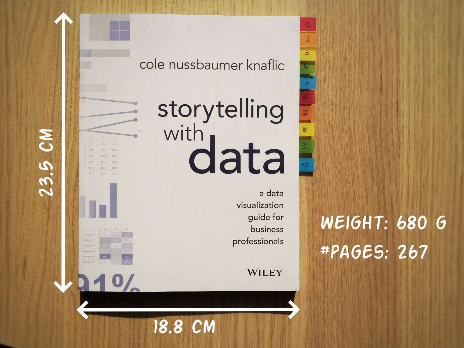
Storytelling with Data, published in 2015, is presented as a practical guide for business professionals (think managers or consultants) who regularly need to present data, or findings based on data. People who have no prior experience with data visualization, except maybe for the occasional default bar or pie chart in Microsoft Excel.
Knaflic wrote this book to teach how – as Nancy Duarte described it in her review – it’s not about the data, it’s about the meaning of the data. Or, as Jean-Luc Doumont would put it: it’s not about the what, but about the so what.
This book offers hands-on advice to turn mind-numbing default charts into powerful, convincing graphs telling a story. This way, rather than just ‘looking fancy’, data visualization becomes a tool to actually change people’s minds.
The author
Cole Nussbaumer Knaflic is the perfect woman to teach us these techniques. Not only is she an excellent teacher in Information Visualization at the Maryland Institute College of Art, she also has an MBA and has worked as a manager on the Google People Analytics team for more than 5 years.
She is the founder and CEO of Storytelling with Data, where she has built a team to do exactly the things she describes in the book: she helps people and organizations to create graphs that tell compelling, action-inspiring stories.
In 2019 she wrote a companion book to this one, titled ‘Storytelling with Data: Let’s Practice‘, with even more examples, and with hands-on exercises.
The verdict
⭐⭐⭐
Storytelling with Data is definitely a dataviz book aimed at an audience of true business professionals, the kind of people you will find at large consulting firms, banks, or big tech companies, rather than die-hard fans of beautiful visualization art or information graphics. The author has (successfully) to convey the very simple, basic principles of building an excellent graph. She avoided adding complicated or jaw-droppingly beautiful examples, as this might discourage data visualization novices to try these principles for themselves.

This is the perfect book to pick up for your first encounter with data visualization. You will learn what’s wrong with default Excel charts and why they don’t work to convey your message. Knaflic shows how clever chart, font styling or color choices will dramatically improve the effectiveness of data visuals in your presentations. And she does it very well.
On the other hand, if you are a seasoned dataviz lover or admirer of infographics, this is not really the book for you. At times it will feel more like an academic syllabus or business report rather than a book you’ll read for fun or inspiration. But it could be the perfect gift for your colleague or friend who is just starting out and could use some basic, very practical advice!
Do you consider yourself a dataviz novice, or a true data wizard? What did you learn from this book?
And of course, if you have some data visualization challenges you think we could help you with, let me know as well – we are always happy to assist!
More dataviz book reviews? We have already covered:
- Dear Data
- Storytelling with Data
- Visualizing Complexity
Read more:

Why I love matrix charts
This one is definitely in my top 5 of favourite chart types: a matrix chart! Super flexible, can provide some great insights into the data, and it will fit well into your beautiful report design.

Vreemde plaatsnamen in Vlaanderen
Iedereen kent wellicht 'Kontich' en 'Reet', maar in Vlaanderen hebben we nog veel meer merkwaardige, onverwachte, en vaak grappige plaatsnamen. Heb je bijvoorbeeld ooit al gehoord van Buitenland, Dikkebus, of Grote Homo?

Small multiples can save your chart
When you're dealing with a chart that has too much information on it, the most straightforward advice to follow is: break it down into multiple charts, each with less information on them. A powerful example of this is a so-called small multiple approach.

Can you use Excel to create a powerful chart?
Spreadsheet tools such as Microsoft Excel or Numbers might not be the first thing on your mind when considering data visualization tools, but they can be pretty solid choices to build data visuals. Don’t let anyone convince you that using Excel to create data visuals is unprofessional.

Choosing the right font for your data visual
Fonts evoke emotions: there are very sophisticated fonts, playful fonts, attention-grabbing fonts, and elegant handwritten fonts. Using the wrong type of font can have a lot of impact. In data visualization the implications of typography are mainly focused on readability. Labels and annotations can easily become so small they get hard to read. Above all else, we should choose a font which is readable at small sizes.

Three roles of colour in a data visual
Colour is one of the most crucial tools we have to turn a normal chart into a powerful chart with a clear message, a chart which tells a story rather than simply presenting the information.
We are really into visual communication!
Every now and then we send out a newsletter with latest work, handpicked inspirational infographics, must-read blog posts, upcoming dates for workshops and presentations, and links to useful tools and tips. Leave your email address here and we’ll add you to our mailing list of awesome people!
