Three tips to create powerful charts in Excel
Microsoft Excel can be a powerful tool for making sense of complex data sets, and for visualizing them. By creating charts and graphs in Excel, you can quickly and easily identify trends, patterns, and outliers in your data. This can help you to gain valuable insights and make more informed decisions.
However, creating effective data visualizations in Excel can also be challenging. Excel is not specifically designed for creating charts and graphs, so it can be difficult to get them to look exactly the way you want. The default option presented by Excel is often not the most pretty one.
Additionally, Excel doesn’t always make it easy to format and customize charts, which can make it difficult to create visualizations that accurately and effectively communicate your data. Creating data visualizations in Excel can be time-consuming, especially if you have a large amount of data to work with.
However, if you’re not willing to spend time or resources on other tools, Excel can get you quite far in creating beautiful, powerful charts – as long as you apply some basic data visualization principles.
📊 Here are our top three tips to create powerful charts in Excel:
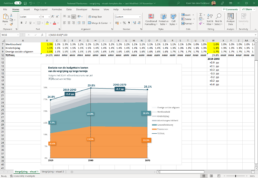
1. Abandon the defaults
Excel’s default chart settings are not meant to make your chart look good, they’re meant to help you get an idea of what’s possible. Feel free to add or remove gridlines, data labels or legends as you see fit to make your chart more clear and more beautiful.
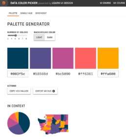
2. Find more suitable colors
Excel’s default color scheme is not exactly ideal. Each of the colors feels equally important, so it’s difficult to create a clear visual hierarchy. Use a tool like Coolors, ColorBrewer or the Data Color Picker to find a palette that matches the theme of the visual and allows you to use a strong accent color if needed. Don’t forget to use grey to send less important elements to the background!
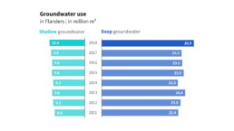
3. Make combinations of charts
Excel’s chart options are substantial, but also have their limits. Sometimes you’ll have to group different charts together to reach the desired result. The butterfly chart below was created by grouping two separate bar charts (make sure they use the same scale!) and adding a text box to act as a title.
Read more:

7 different goals for your chart
A crucial step in building a powerful chart is choosing the right type of chart. A lot of charts don’t work because they simply use the wrong type of chart. To avoid this trap, we must ask ourselves a basic question: what’s the ultimate goal of our data visual? What do we want to show with our data?

Making a data visual noise-free
Removing noise from a data visual is not only about taking things away such as gridlines, axes or legends. That’s just one part of it, which we could call removing physical noise. Improving the signal-to-noise ratio is often also about adding little things that help our audience better understand the visual. We are helping them by removing mental noise, or mental barriers.

A powerful chart has a high signal-to-noise ratio
‘Less is more’. It’s a crucial principle in most of our communication, and in data visualization in particular. Because of my background as a physicist, I prefer to talk about the ‘signal-to-noise ratio’. The message - our signal - should be amplified as much as possible, giving it all of the attention. Everything that can distract from our message - the noise - should be removed.

A powerful chart tells a story
A powerful chart has a clear message. It should be short and meaningful, and obvious in the blink of an eye. If there’s only one thing our audience remembers at the end of the day, this should be it.

Navigating the landscape of powerful charts
Once we’ve decided to create a data visual or infographic, there are a lot of questions we should ask ourselves to determine the most suitable format. These considerations could include size, readability, possible interactive functionality, and the level of detail we need.

How powerful charts can boost your career
An American accountant managed - as the youngest ever! - to win a crucial election in Los Angeles - thanks to the power of data visualization. And you, too, can use powerful charts to boost your career!
We are really into visual communication!
Every now and then we send out a newsletter with latest work, handpicked inspirational infographics, must-read blog posts, upcoming dates for workshops and presentations, and links to useful tools and tips. Leave your email address here and we’ll add you to our mailing list of awesome people!
