A powerful chart tells a story
A powerful chart has a clear message. It should be short and meaningful, and obvious in the blink of an eye. If there’s only one thing our audience remembers at the end of the day, this should be it.
Answering the ‘so what’ question
A visual without a clear key message might show the data, but it doesn’t show what’s interesting, surprising or noteworthy about the data. It leaves our audience guessing, they have to do all of the thinking work. Ideally, we want to create a visual that helps them to quickly see what’s important. A visual that not only answers the ‘what’ question, but more importantly also the ‘so what’ question.
Here’s one of my favourite examples to illustrate the importance of visual storytelling. This chart shows the evolution of meat consumption in the US since the 1960s. By itself, this chart is pretty clear. It shows us the data, in a way that is easy to understand. It answers the ‘what’ question. The design is satisfactory, with pleasing colours and good readability. But can it be improved?
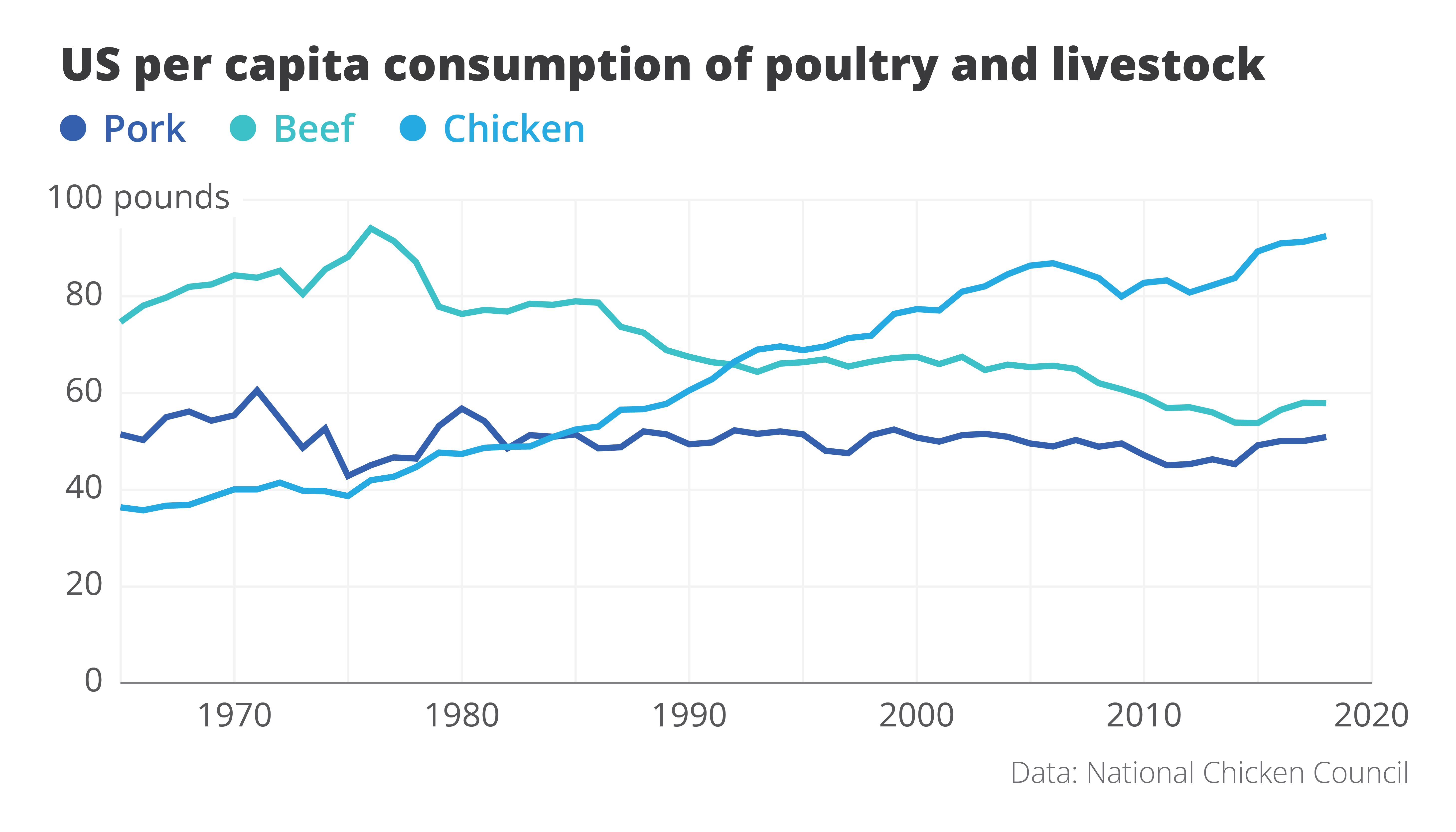
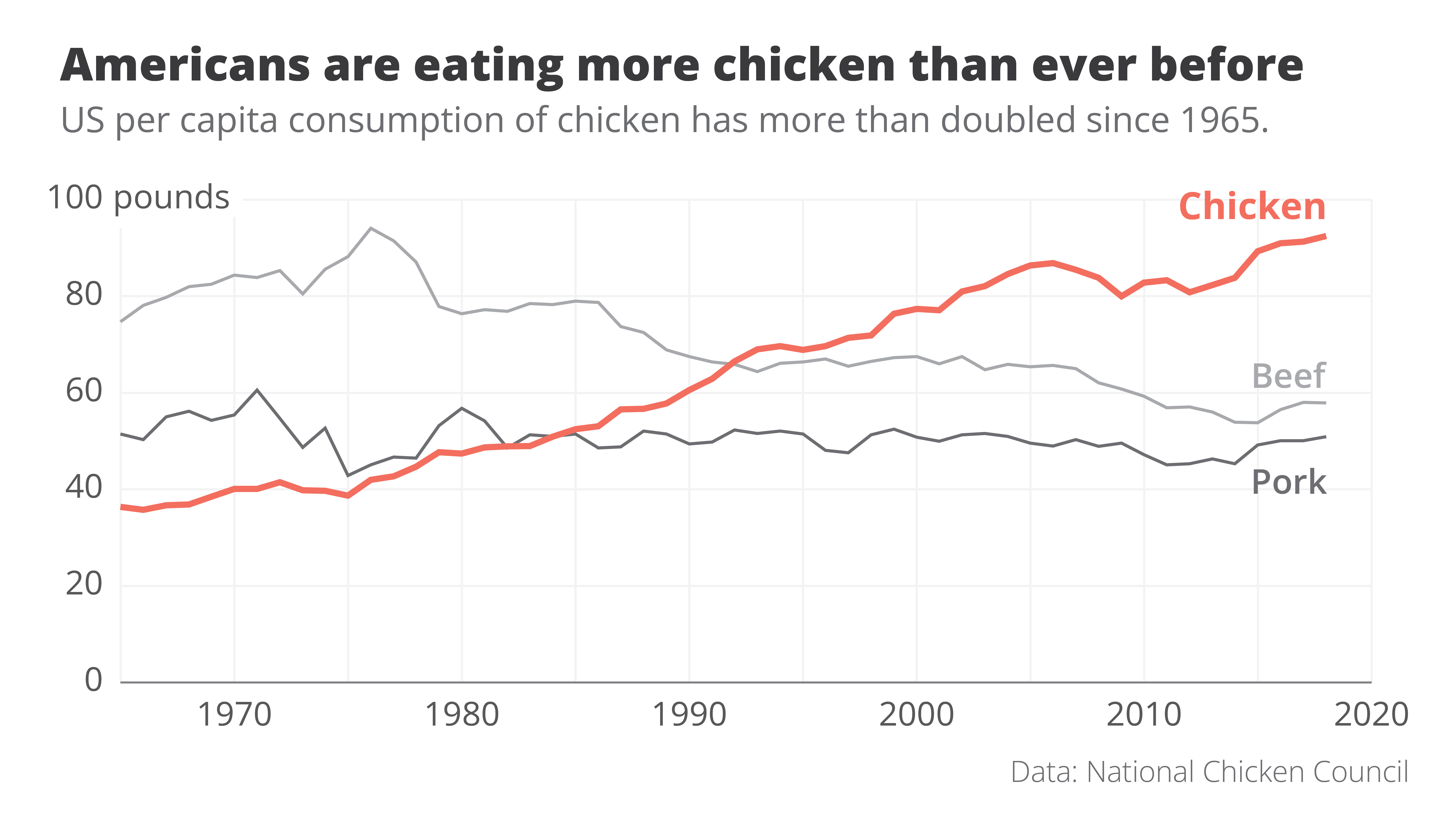
Here is an attempt at a rework. Even though we’re looking at exactly the same data – we wouldn’t want to lie to our audience! – the message in this new visual is loud and clear. It’s right there in the title: Americans are eating more chicken than ever before!
The power of data visualization at work
Two simple changes turned the original ‘what’ visual into this super-clear ‘so what’ visual.
- First of all, clever colour choices: the line that interests us – the one for chicken consumption – gets a bright orange colour, the other two become grey. They’re still there, but pushed a bit to the background.
- Secondly, clever text: the original title was very factual – ‘US per capita consumption of poultry and livestock’. All the thinking work is left for the reader. But what if we simply tell them the interesting part? The new title ‘Americans are eating more chicken than ever before’ is still 100% true, but now it tells us why this visual is actually quite surprising.
These two small but impactful changes turned the original visual, which simply shows the data, into a great visual that actually tells a story. For me, that’s the real power of data visualization at work.
If you want to know more about visualizing data in the right way, you can check out the other videos in this series. Or I invite you to read my book, Powerful Charts, that will give you actionable insights and practical guidelines to create data visuals that truly engage and inspire your audience.
Full video series
- 01. Why is data visualization so powerful?
- 02. Why is data visualization so challenging?
- 03. Navigating the landscape of powerful charts
- 04. A powerful chart tells a story
- 05. A powerful chart has a high signal-to-noise ratio
- 06. Making a data visual noise-free
- 07. 7 different goals for your chart
- 08. Three roles of colour in a data visual
- 09. Choosing the right font for your data visual
- 10. Can you use Excel to create a powerful chart? (coming on January 09, 2023)

Read more:

Review: Info We Trust
Info We Trust is an ambitious, visually stunning book that sits somewhere between philosophy, information design, and a collection of visual essays.

Gridlines are better than axes
Almost always, gridlines are better than axes. Vertical axes are the default option, and they have been around for centuries, so they are very well known. But they also have downsides. My biggest problem with vertical axes is that they’re often so far away from where the action is really happening.

Review: A History of Data Visualization and Graphic Communication
Michael Friendly and Howard Wainer clearly love graphs. But A History of Data Visualization and Graphic Communication isn’t just about graphs — it’s about the stories behind them: the context, the people, the new measurements that made them necessary, and the discoveries they enabled.

Report visuals don’t have to suck
Discover how CREG, Belgium’s electricity regulator, turns complex data into clear and engaging visuals. From smart annotations to small multiples and uncommon chart types, their Monitoring Report shows how thoughtful data visualization makes technical reports easier to read and understand.

Data visualization podcasts 2025
At Baryon, we’re huge fans of podcasts! Data visualization podcasts are a great way to stay up to date on the latest trends and techniques in data visualization.

Tell me why… I don’t like dashboards
I don't like dashboards. Well, most dashboards at least. They're just trying too hard... to do everything, everywhere, all at once. Why is that? And is there a better solution?
We are really into visual communication!
Every now and then we send out a newsletter with latest work, handpicked inspirational infographics, must-read blog posts, upcoming dates for workshops and presentations, and links to useful tools and tips. Leave your email address here and we’ll add you to our mailing list of awesome people!
