A powerful chart tells a story
A powerful chart has a clear message. It should be short and meaningful, and obvious in the blink of an eye. If there’s only one thing our audience remembers at the end of the day, this should be it.
Answering the ‘so what’ question
A visual without a clear key message might show the data, but it doesn’t show what’s interesting, surprising or noteworthy about the data. It leaves our audience guessing, they have to do all of the thinking work. Ideally, we want to create a visual that helps them to quickly see what’s important. A visual that not only answers the ‘what’ question, but more importantly also the ‘so what’ question.
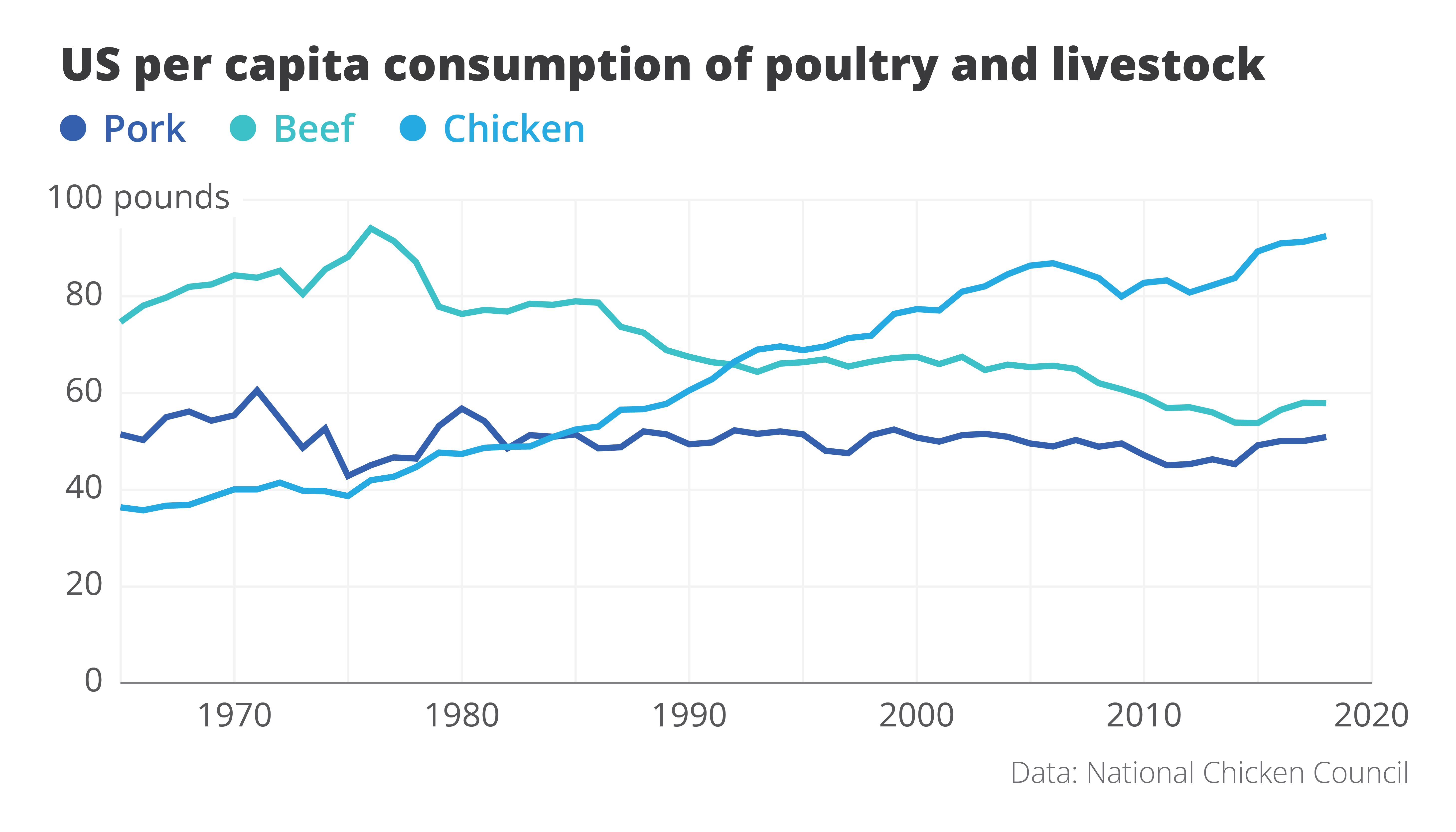
Here’s one of my favourite examples to illustrate the importance of visual storytelling. This chart shows the evolution of meat consumption in the US since the 1960s. By itself, this chart is pretty clear. It shows us the data, in a way that is easy to understand. It answers the ‘what’ question. The design is satisfactory, with pleasing colours and good readability. But can it be improved?
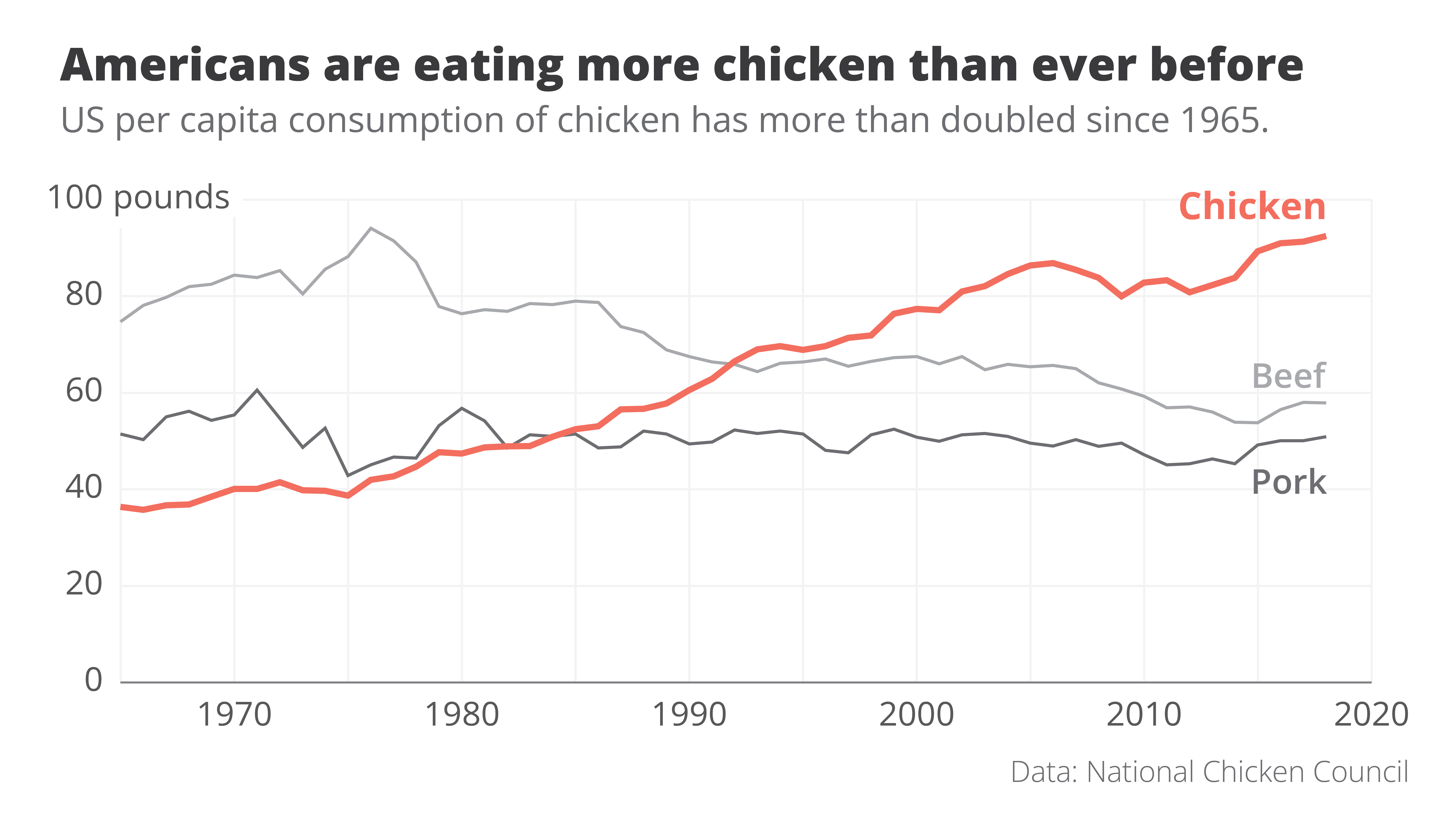
Here is an attempt at a rework. Even though we’re looking at exactly the same data – we wouldn’t want to lie to our audience! – the message in this new visual is loud and clear. It’s right there in the title: Americans are eating more chicken than ever before!
The power of data visualization at work
Two simple changes turned the original ‘what’ visual into this super-clear ‘so what’ visual.
- First of all, clever colour choices: the line that interests us – the one for chicken consumption – gets a bright orange colour, the other two become grey. They’re still there, but pushed a bit to the background.
- Secondly, clever text: the original title was very factual – ‘US per capita consumption of poultry and livestock’. All the thinking work is left for the reader. But what if we simply tell them the interesting part? The new title ‘Americans are eating more chicken than ever before’ is still 100% true, but now it tells us why this visual is actually quite surprising.
These two small but impactful changes turned the original visual, which simply shows the data, into a great visual that actually tells a story. For me, that’s the real power of data visualization at work.
If you want to know more about visualizing data in the right way, you can check out the other videos in this series. Or I invite you to read my book, Powerful Charts, that will give you actionable insights and practical guidelines to create data visuals that truly engage and inspire your audience.
Full video series
- 01. Why is data visualization so powerful?
- 02. Why is data visualization so challenging?
- 03. Navigating the landscape of powerful charts
- 04. A powerful chart tells a story
- 05. A powerful chart has a high signal-to-noise ratio
- 06. Making a data visual noise-free
- 07. 7 different goals for your chart
- 08. Three roles of colour in a data visual
- 09. Choosing the right font for your data visual
- 10. Can you use Excel to create a powerful chart? (coming on January 09, 2023)

Read more:

This chart is trying to trick you
The original chart in this example is trying to suggest a strong correlation between sugar intake and obesity in the US between 1980 and 2000. It does so by carefully choosing the vertical axis ranges and scaling so both lines nicely fall on top of each other.

Research visuals: all the resources you’ll ever need!
If you want to start creating clear and attractive visuals about your research, but don't know where to start, this page is for you! Here's a complete overview of tools, resources and inspiration you can use as a starting point for your designs.

Small datasets to practice your data visualization skills
When you're teaching data analysis or data visualization, or when you're learning new data visualization tools and techniques, you might be looking for datasets to practice with. Here are some great starting points.

How to create a graphical abstract
Graphical abstracts are becoming more and more important. Journal publishers such as Elsevier encourage you to create a concise visual summary of the main findings of your research. But where to start? What steps should you follow to create the perfect graphical abstract for your article? What tools can you use?

Behind the maps
In the 30-day Map Challenge, you are challenged to design a new map every day around a certain topic. I participated in November 2020, and wrote this post to share my thought processes, data sources, tools and results!
Data visualization resources: all the links you’ll ever need!
You want to start creating clear and attractive data visuals, but don't know where to start? No worries, here's a complete overview of tools, resources and inspiration you can use as a starting point for your designs.
We are really into visual communication!
Every now and then we send out a newsletter with latest work, handpicked inspirational infographics, must-read blog posts, upcoming dates for workshops and presentations, and links to useful tools and tips. Leave your email address here and we’ll add you to our mailing list of awesome people!
