Infographic
Amazing facts about the brain
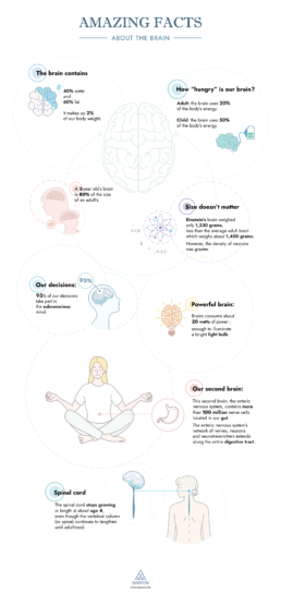
🧠 Did you know that our brain makes up 2% of our body weight, but consumes as much as 20% of our energy? Did you know that we have a second brain, located in our gut?
Our information designer Sofia is very passionate about our brain and how it works. She made this insightful brain infographic, giving you an overview of eight amazing facts about the brain!
If you’re looking for your own infographic to share a fascinating story with your audience, we’re here to help! Find out what we can do for you.
Read more:

Why is data visualization so challenging?
Data visualization is very powerful, but it can also be hard. That’s because a great data visual combines three different aspects simultaneously: clarity, correctness, and beauty.

Data visualization resources: all the links you’ll ever need!
You want to start creating clear and attractive data visuals, but don't know where to start? No worries, here's a complete overview of tools, resources and inspiration you can use as a starting point for your designs.

Why is data visualization so powerful?
The amount of data coming our way is growing exponentially. In 2021 alone, it is estimated that humankind generated 74 zettabytes of data – that’s about 10,000 GB per person. How on earth are we going to keep this manageable?

How common is your birthday?
Not all birthdays are created equal... in fact, for most countries in the north temperate zone, more people are born in summer (May - August) than in winter (October - January). This heatmap allows you to check how popular your birth date is. It shows the number of people in Belgium for each specific birthday.

Visualizing Complexity: Dataviz book review
Visualizing Complexity is a great new data visualization book published by information design Superdot. Here's our verdict.

This chart is trying to trick you
The original chart in this example is trying to suggest a strong correlation between sugar intake and obesity in the US between 1980 and 2000. It does so by carefully choosing the vertical axis ranges and scaling so both lines nicely fall on top of each other.
We are really into visual communication!
Every now and then we send out a newsletter with latest work, handpicked inspirational infographics, must-read blog posts, upcoming dates for workshops and presentations, and links to useful tools and tips. Leave your email address here and we’ll add you to our mailing list of awesome people!

