Data visualization in a time of pandemic - #4: We need to talk about flattening the curve
This is a multi-chapter post!
- Chapter 1: Finding reliable data
- Chapter 2: Visualizing exponential growth
- Chapter 3: Mapping the virus
- Chapter 4: We need to talk about flattening the curve
- Chapter 5: On top of the outbreak with daunting dashboards
- Chapter 6: Viral scrollytelling

Chapter 4: We need to talk about flattening the curve
Data visualizations rarely become hugely popular among the general public. But recently, a visual appeared which quickly spread on social media, in newspapers and magazines, and even in press conferences and on television. Hundreds of millions have probably seen it by now. Yes, the Flattening the Curve visual is truly a remarkable success story in the dataviz world. So let’s dive into it!
What curve are we flattening?
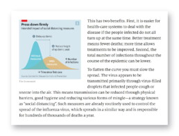
Let’s start by looking at a prime example of a ‘flatten the curve’ visual, the one in the COVID-19 #Coronavirus Data Pack at Information is Beautiful, as it combines a simple and clean curve design with a lot of additional information:
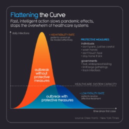
Flattening the curve visual from the Information is Beautiful COVID-19 #Coronavirus Data Pack.
We are looking at how the expected number of daily infections will evolve over time since the date of the first case. As described in chapter 2, the shape of these curves is expected to be more or less Gaussian in nature, with an exponential growth phase at the start of the outbreak and reaching a peak at a certain point in time, typically several weeks since the date of the first case. The crux of the graph is the dotted line – the capacity of our healthcare system. There is only a certain number of patients we can treat simultaneously in an effective way, be it due to a lack of equipment (intensive care beds, ventilators,…) or a lack of personnel.
The color choice is very smart here. Orange is related to the curve we want to avoid: an outbreak without protective measures being taken. In this case the number of daily infections will quickly outpace the capacity of our healthcare system, leading to a high fatality rate because patients cannot all be treated effectively.
Blue indicates the scenario we aim for when protective measures are taken (the protective measures are also listed in the figure above). In this case, the spread of the disease will be slowed down. This implies that the outbreak might take longer to die down, but more importantly, the peak in the number of daily infections will not (or not by much) exceed the capacity of our healthcare system. This enables us to treat all patients as effectively as possible and lower the fatality rate.
In one sentence: we need to take protective measures to flatten the curve.
Many visualizers have come up with their own version of the ‘flatten the curve’ graphic. One of the more popular examples was the following animation by illustrator Toby Morris and microbiologist Siouxsie Wiles for The Spinoff, an online magazine from New Zealand:
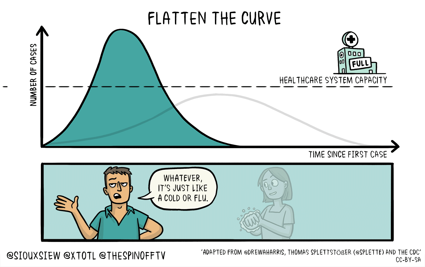
Flattening the curve visual by illustrator Toby Morris and microbiologist Siouxsie Wiles for The Spinoff.
Before we dive into the many different variations of this curve, we need to briefly discuss a more technical point: should both graphs have the same area, or not?
When looking at both visuals above, this is not very clear. In the Information is Beautiful version, it might seem that the blue, flat curve has a somewhat smaller surface area compared to the orange version, but it is not very extreme. In the animated version, both appear to have a similar area. In some visuals, the difference is much more extreme, such as in this one by Vox:
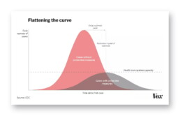
Flattening the curve visual by Vox on March 10, 2020.

‘Curve 0’: the original Flattening the Curve visual as it appeared in the CDC report ‘Community Mitigation Guidelines to Prevent Pandemic Influenza‘ in 2017.
And what happens after the curve? When strict protective measures, such as a lockdown, are released, will we not simply see a ‘restart’ of the outbreak as people start having more social contacts again? In that case, we will have only delayed the outbreak (at a very high economic – and possibliy psychological – cost) and still end up with millions of deaths. Not really, as we will have gained one unbelievably major advantage: time. Time to do more research, bring us closer to effective drugs or even a vaccine, time to build up capacity, time to educate the public.
Tomas Pueyo describes this very convincingly in his article ‘The Hammer and the Dance‘, so I will not go into further detail here. Just one word of advice: proceed with caution. Tomas Pueyo is a great and convincing writer, but he is not a doctor or microbiologist. He is an engineer, ex-consultant and entrepreneur (hmm, that sounds familiar to my own story). He is also the guy who wrote an entire book about the amazing Star Wars Ring Theory without even crediting Mike Klimo, the person who originally came up with it. That’s a pretty douche move, Tomas. But hey, let’s get back to visualizing data, shall we?
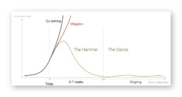
Key visual from Tomas Pueyo’s article ‘The Hammer and the Dance‘ on how to use protective measures to fight the epidemic.
When flattening the curve got out of hand
This is one of those rare times in history when a data visualization goes, well, viral (ugh!). I can hardly come up with data visuals which have reached the same level of fame as Flattening the Curve. It has popped up in press conferences, in newspapers and on television in nearly every country on earth. Millions of people have seen it. That’s quite an achievement!
If we try to trace this visual back to its origins, probably the first time it appeared in the media was in The Economist at the end of February, recreated from the CDC original by visual-data journalist Rosamund Pearce:
Probably the first appearance of the Flattening the Curve visual in the media. (The Economist)
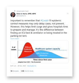
Thanks for sharing your wisdom, Drew. (Source)
The New York Times explains it very well in this article.
By now, Flattening the Curve adaptations have exploded. Maybe we should start talking about flattening the curve of Flattening the Curve visuals? (Not my joke, sorry, credits go to Andy Kirk.)
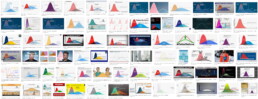
Ok, maybe this is getting just a tiny bit out of hand. (Source: Google Image Search)

Source: Rob Dubbin
Curve alternatives
Ah, the curve. It just works so well in educating the people! It convinces us in a single glance why staying at home serves the greater good. Never before was chilling in my couch such a great way to save millions of lives, right?
Nevertheless, there are some great curve alternatives (alcurvatives?) to the by now overused visual. The one I must highlight comes from (again, these guys are simply great visualizers) the Washington Post. I like it so much that maybe ‘One Visuals to Rule Them All’ is a more appropriate way to describe it. Rather than showing the same old curves, Harry Stevens decided to simulate the effects of protective measures and social distancing, and show the impact through a series of animations. This is the pandemic spreading with an enforced quarantine, which is starting to ‘leak’:
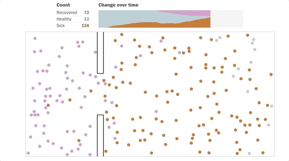
Animated simulation of a disease outbreak with quarantine enforced. (Source: Washington Post)
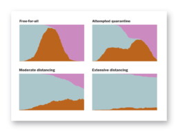
Simulation results showing the differences between different suppression strategies on the number of sick (brown), healthy (blue) and recovered (pink) people. (Washington Post)
It quickly became Washington Post’s most popular story ever.
To wrap up this chapter on curves, there is one final visual I would like to share with you. Don’t worry, it’s an alternative to the Flattening the Curve overload, so no curves this time. In fact, it’s another animated illustration by Toby Morris for The Spinoff, the same guy we started our chapter with. It shows how only one person avoiding contact with others can have a dramatic impact on the total number of infections:

Animated illustration by Siouxsie Wiles and Toby Morris, showing the impact of social distancing on the spread of an infection. (Source: The Spinoff)
I love it.
This is a multi-chapter blog post!
Continue reading:
- Chapter 1: Finding reliable data
- Chapter 2: Visualizing exponential growth
- Chapter 3: Mapping the virus
- Chapter 4: We need to talk about flattening the curve
- Chapter 5: On top of the outbreak with daunting dashboards
- Chapter 6: Viral scrollytelling
For all your comments, suggestions, errors, links and additional information, you can contact me at koen@baryon.be or via Twitter at @koen_vde.
Disclaimer: I am not a medical doctor or a virologist. I am a physicist running my own business (Baryon) focused on information design.
Read more:

Making a data visual noise-free
Removing noise from a data visual is not only about taking things away such as gridlines, axes or legends. That’s just one part of it, which we could call removing physical noise. Improving the signal-to-noise ratio is often also about adding little things that help our audience better understand the visual. We are helping them by removing mental noise, or mental barriers.

Three tips to create powerful charts in Excel
Creating charts in Excel can be a very powerful tool for making sense of complex data sets, and for visualizing them. But the default options are not always the most pretty or effective ones. Here are our top three tips to create better Excel charts.

A powerful chart has a high signal-to-noise ratio
‘Less is more’. It’s a crucial principle in most of our communication, and in data visualization in particular. Because of my background as a physicist, I prefer to talk about the ‘signal-to-noise ratio’. The message - our signal - should be amplified as much as possible, giving it all of the attention. Everything that can distract from our message - the noise - should be removed.

A powerful chart tells a story
A powerful chart has a clear message. It should be short and meaningful, and obvious in the blink of an eye. If there’s only one thing our audience remembers at the end of the day, this should be it.

Navigating the landscape of powerful charts
Once we’ve decided to create a data visual or infographic, there are a lot of questions we should ask ourselves to determine the most suitable format. These considerations could include size, readability, possible interactive functionality, and the level of detail we need.

How powerful charts can boost your career
An American accountant managed - as the youngest ever! - to win a crucial election in Los Angeles - thanks to the power of data visualization. And you, too, can use powerful charts to boost your career!
We are really into visual communication!
Every now and then we send out a newsletter with latest work, handpicked inspirational infographics, must-read blog posts, upcoming dates for workshops and presentations, and links to useful tools and tips. Leave your email address here and we’ll add you to our mailing list of awesome people!
