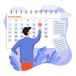
How common is your birthday?
Not all birthdays are created equal… in fact, for most countries in the north temperate zone, more people are born in summer (May – August) than in winter (October – January). This heatmap allows you to check how popular your birth date is. It shows the number of people in Belgium for each specific birthday.
There are some interesting outliers: January 1st and July 1st are extra common, because people with an unknown birth data are commonly assigned these birthdays. The national holidays (May 1, July 21, August 15, November 1 and 11, December 25) are clearly visible as dips in the data. And obviously, February 29th is also not very popular!
We haven’t figured out why more people are born on the 1st, 5th, 10th, 15th, 20th and 25th of each month, but possibly this has some administrative reasons as well…
Read more:

This chart is trying to trick you
The original chart in this example is trying to suggest a strong correlation between sugar intake and obesity in the US between 1980 and 2000. It does so by carefully choosing the vertical axis ranges and scaling so both lines nicely fall on top of each other.

Research visuals: all the resources you’ll ever need!
If you want to start creating clear and attractive visuals about your research, but don't know where to start, this page is for you! Here's a complete overview of tools, resources and inspiration you can use as a starting point for your designs.

Small datasets to practice your data visualization skills
When you're teaching data analysis or data visualization, or when you're learning new data visualization tools and techniques, you might be looking for datasets to practice with. Here are some great starting points.

How to create a graphical abstract
Graphical abstracts are becoming more and more important. Journal publishers such as Elsevier encourage you to create a concise visual summary of the main findings of your research. But where to start? What steps should you follow to create the perfect graphical abstract for your article? What tools can you use?

Behind the maps
In the 30-day Map Challenge, you are challenged to design a new map every day around a certain topic. I participated in November 2020, and wrote this post to share my thought processes, data sources, tools and results!
Data visualization resources: all the links you’ll ever need!
You want to start creating clear and attractive data visuals, but don't know where to start? No worries, here's a complete overview of tools, resources and inspiration you can use as a starting point for your designs.
We are really into visual communication!
Every now and then we send out a newsletter with latest work, handpicked inspirational infographics, must-read blog posts, upcoming dates for workshops and presentations, and links to useful tools and tips. Leave your email address here and we’ll add you to our mailing list of awesome people!
