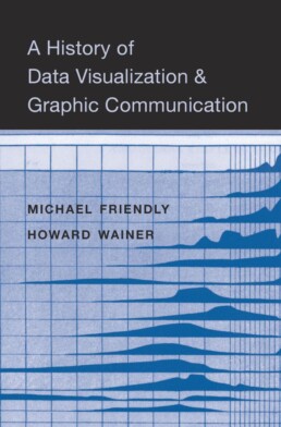
Review: A History of Data Visualization and Graphic Communication
Michael Friendly and Howard Wainer clearly love graphs. But A History of Data Visualization and Graphic Communication isn’t just about graphs — it’s about the stories behind them: the context, the people, the new measurements that made them necessary, and the discoveries they enabled. The authors don’t just show us the end result; they take us through the process that led there, often in a delightful amount of detail.
The structure of the book balances chronology with theme. This keeps the feeling of historical evolution intact, without falling into the trap of a dry timeline. We jump from 17th-century innovators to 20th-century pioneers, always with a clear narrative thread.
What stood out to me most was the variety of examples. While the book is clearly indebted to Edward Tufte’s work, it doesn’t recycle his canon. I encountered many visualizations I hadn’t seen before, and even familiar ones were presented with fresh insight. The ideas on how new data, collected with new measurement techniques, often prompt entirely new kinds of charts were particularly eye-opening for me. It’s a reminder that visualization doesn’t just explain data — it also adapts to it.
That idea was so powerful to me that I used it as one of the foundations for my keynote lecture, Graphs can save the world! This book helped me think more deeply about why visualizations matter — not just aesthetically or functionally, but historically and socially.
That said, not every chapter lands equally well. Some sections feel a bit scattered or lightweight, especially when they only briefly touch on developments that deserve more space. The final chapter, Graphs as Poetry, takes a more philosophical turn, but I wasn’t entirely sure what the authors were trying to argue there.
Also worth noting: while the book is visually rich, it’s a shame that most of it is printed in black and white. Some of the visual clarity and impact is lost as a result. And while the authors occasionally offer “reworked” versions of historical charts to show how they could be improved, these redesigns don’t always convince — sometimes the original speaks more eloquently in its own language.
Despite those minor critiques, this is a generous, well-researched, and deeply informative book. I’d recommend it to anyone interested in the intersection of data, history, and design. It’s a reminder that charts are tools, but also more than tools — they are artifacts of human thought, and sometimes, even acts of discovery.
Rating: ⭐⭐⭐⭐
Read this review, as well as many others, in our complete overview of data visualization books (work in progress).
Read more:

Why is data visualization so challenging?
Data visualization is very powerful, but it can also be hard. That’s because a great data visual combines three different aspects simultaneously: clarity, correctness, and beauty.

Data visualization resources: all the links you\’ll ever need!
Your Data Visualization Toolkit: Practical tips, templates, and inspiration to make your data shine. Explore, adapt, and create work that’s clear, compelling, and unforgettable.

Why is data visualization so powerful?
The amount of data coming our way is growing exponentially. In 2021 alone, it is estimated that humankind generated 74 zettabytes of data – that’s about 10,000 GB per person. How on earth are we going to keep this manageable?

Infographic: Amazing facts about the brain
Did you know that our brain makes up 2% of our body weight, but consumers about 20% of our energy? Did you know that we have a second brain, located in our gut?
Our information designer Sofia made this insightful infographic, giving you an overview of eight amazing facts about the brain!

How common is your birthday?
Not all birthdays are created equal... in fact, for most countries in the north temperate zone, more people are born in summer (May - August) than in winter (October - January). This heatmap allows you to check how popular your birth date is. It shows the number of people in Belgium for each specific birthday.

Visualizing Complexity: Dataviz book review
Visualizing Complexity is a great new data visualization book published by information design Superdot. Here's our verdict.
We are really into visual communication!
Every now and then we send out a newsletter with latest work, handpicked inspirational infographics, must-read blog posts, upcoming dates for workshops and presentations, and links to useful tools and tips. Leave your email address here and we’ll add you to our mailing list of awesome people!
