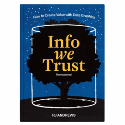
Review: Info We Trust (Remastered)
Info We Trust is an ambitious, visually stunning book that sits somewhere between philosophy, information design, and a collection of visual essays. It is clearly the product of many years of thinking, reading, and making. That depth and experience is both its greatest strength and, at times, its main challenge.
From a purely visual standpoint, the book is exceptional. Andrews is remarkably disciplined in his use of a limited color palette, and the combination of three colors with hand-drawn illustrations gives the book a distinctive and coherent visual identity. The drawings are both intentional and decorative, they are a pleasure to look at, page after page.
Content-wise, the book is dense with references. The marginal notes, quotations, and extensive bibliography leave no doubt about Andrews’ breadth of knowledge. Again and again, I found myself wanting to read the original sources and to follow the many intellectual threads Andrews lays out. In that sense, the book functions very well as a gateway to a much wider intellectual exploration.
At the same time, this abundance can be overwhelming. Especially in the earlier chapters, the book leans heavily into philosophical reflection. Ideas, metaphors, and quotations accumulate, but a clear argumentative trajectory is often hard to discern. Reading these chapters requires patience: each sentence needs to be savoured rather than devoured. For readers like me, who prefer an analytical, structured approach, this can make progress feel slow, even if the reading itself is never unpleasant. I must admit that I skipped most of the quotes and notes in the margins…
For me, the book truly comes into focus in the final chapters (roughly chapters 13–15). Here, Andrews becomes much more concrete, offering insight into his actual working process: how he frames problems, explores structure, reasons visually, and approaches projects as an information designer. These chapters are highly relatable and, I suspect, will resonate strongly with practitioners. They clarify retroactively what the earlier philosophical groundwork was aiming toward.
In the end, Info We Trust is not a manual or a step-by-step guide, and readers looking for quick, actionable takeaways may struggle with parts of it. But as a reflective, carefully crafted work about how we think with information, and how we might do so more responsibly, it is thoughtful, inspiring, and visually remarkable. Best approached slowly, selectively, and perhaps revisited over time rather than read straight through in one go.
Read this review, as well as many others, in our complete overview of data visualization books (work in progress).
Read more:

Gridlines are better than axes
Almost always, gridlines are better than axes. Vertical axes are the default option, and they have been around for centuries, so they are very well known. But they also have downsides. My biggest problem with vertical axes is that they’re often so far away from where the action is really happening.

Review: A History of Data Visualization and Graphic Communication
Michael Friendly and Howard Wainer clearly love graphs. But A History of Data Visualization and Graphic Communication isn’t just about graphs — it’s about the stories behind them: the context, the people, the new measurements that made them necessary, and the discoveries they enabled.

Report visuals don’t have to suck
Discover how CREG, Belgium’s electricity regulator, turns complex data into clear and engaging visuals. From smart annotations to small multiples and uncommon chart types, their Monitoring Report shows how thoughtful data visualization makes technical reports easier to read and understand.

Data visualization podcasts 2025
At Baryon, we’re huge fans of podcasts! Data visualization podcasts are a great way to stay up to date on the latest trends and techniques in data visualization.

Tell me why… I don’t like dashboards
I don't like dashboards. Well, most dashboards at least. They're just trying too hard... to do everything, everywhere, all at once. Why is that? And is there a better solution?

Why I love matrix charts
This one is definitely in my top 5 of favourite chart types: a matrix chart! Super flexible, can provide some great insights into the data, and it will fit well into your beautiful report design.
We are really into visual communication!
Every now and then we send out a newsletter with latest work, handpicked inspirational infographics, must-read blog posts, upcoming dates for workshops and presentations, and links to useful tools and tips. Leave your email address here and we’ll add you to our mailing list of awesome people!
