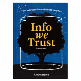
Review: Info We Trust (Remastered)
Info We Trust is an ambitious, visually stunning book that sits somewhere between philosophy, information design, and a collection of visual essays. It is clearly the product of many years of thinking, reading, and making. That depth and experience is both its greatest strength and, at times, its main challenge.
From a purely visual standpoint, the book is exceptional. Andrews is remarkably disciplined in his use of a limited color palette, and the combination of three colors with hand-drawn illustrations gives the book a distinctive and coherent visual identity. The drawings are both intentional and decorative, they are a pleasure to look at, page after page.
Content-wise, the book is dense with references. The marginal notes, quotations, and extensive bibliography leave no doubt about Andrews’ breadth of knowledge. Again and again, I found myself wanting to read the original sources and to follow the many intellectual threads Andrews lays out. In that sense, the book functions very well as a gateway to a much wider intellectual exploration.
At the same time, this abundance can be overwhelming. Especially in the earlier chapters, the book leans heavily into philosophical reflection. Ideas, metaphors, and quotations accumulate, but a clear argumentative trajectory is often hard to discern. Reading these chapters requires patience: each sentence needs to be savoured rather than devoured. For readers like me, who prefer an analytical, structured approach, this can make progress feel slow, even if the reading itself is never unpleasant. I must admit that I skipped most of the quotes and notes in the margins…
For me, the book truly comes into focus in the final chapters (roughly chapters 13–15). Here, Andrews becomes much more concrete, offering insight into his actual working process: how he frames problems, explores structure, reasons visually, and approaches projects as an information designer. These chapters are highly relatable and, I suspect, will resonate strongly with practitioners. They clarify retroactively what the earlier philosophical groundwork was aiming toward.
In the end, Info We Trust is not a manual or a step-by-step guide, and readers looking for quick, actionable takeaways may struggle with parts of it. But as a reflective, carefully crafted work about how we think with information, and how we might do so more responsibly, it is thoughtful, inspiring, and visually remarkable. Best approached slowly, selectively, and perhaps revisited over time rather than read straight through in one go.
Read this review, as well as many others, in our complete overview of data visualization books (work in progress).
Read more:

This chart is trying to trick you
The original chart in this example is trying to suggest a strong correlation between sugar intake and obesity in the US between 1980 and 2000. It does so by carefully choosing the vertical axis ranges and scaling so both lines nicely fall on top of each other.

Research visuals: all the resources you’ll ever need!
If you want to start creating clear and attractive visuals about your research, but don't know where to start, this page is for you! Here's a complete overview of tools, resources and inspiration you can use as a starting point for your designs.

Small datasets to practice your data visualization skills
When you're teaching data analysis or data visualization, or when you're learning new data visualization tools and techniques, you might be looking for datasets to practice with. Here are some great starting points.

How to create a graphical abstract
Graphical abstracts are becoming more and more important. Journal publishers such as Elsevier encourage you to create a concise visual summary of the main findings of your research. But where to start? What steps should you follow to create the perfect graphical abstract for your article? What tools can you use?

Behind the maps
In the 30-day Map Challenge, you are challenged to design a new map every day around a certain topic. I participated in November 2020, and wrote this post to share my thought processes, data sources, tools and results!
Data visualization resources: all the links you’ll ever need!
You want to start creating clear and attractive data visuals, but don't know where to start? No worries, here's a complete overview of tools, resources and inspiration you can use as a starting point for your designs.
We are really into visual communication!
Every now and then we send out a newsletter with latest work, handpicked inspirational infographics, must-read blog posts, upcoming dates for workshops and presentations, and links to useful tools and tips. Leave your email address here and we’ll add you to our mailing list of awesome people!
