Small datasets to practice your data visualization skills
When you’re teaching data analysis or data visualization, or when you’re learning new data visualization tools and techniques, you might be looking for datasets to practice with.
But such datasets are not always easy to find. They should be sufficiently small, so they are manageable with common analysis tools for beginners, such as Microsoft Excel. On the other hand, they should have sufficient depth to allow you to find interesting insights – the data should have at least a few different parameters and dimensions. Finally, the data should cover an interesting topic to keep your students (or yourself) engaged throughout the practice.
This page gives you some starting points to find interesting small datasets, which you can use for data analysis and data visualization teaching and practicing!
General dataset sources
- The wonderful chart creation tool RAWGraphs has an interesting set of data samples from various sources. Topics include wine aromas, cat classification, FIFA players statistics, letter frequency, and much more.
- Kaggle user Rachael Tatman has compiled a list of fun, beginner-friendly datasets specifically suited for statistical testing, but they can be used for data visualization as well.
- The weekly Makeover Monday challenge (initiated by the Tableau community) has generated an extensive list of datasets covering a wide variety of topics. Most of them are hosted on data.world.
- Looking for global, trustworthy data on societal topics such as health, education, food, or development? Our World In Data is the place to be – all of there (great!) data visuals have the option to download the raw data.
Some personal favorites

Here are some of the datasets I regularly use in my data analytics and visualization teaching and trainings:
- The Titanic Disaster Dataset listing, among other parameters, the age, gender and travel class of this famous ship’s passengers – including whether they survived the event or not.
- A list of Nobel Prize laureates from 1901 to 2020, including information on gender, country, age and category. I often use this as part of a Datawrapper exercise – you can see the finished visual at the bottom of this page!
- The results of the annual Stack Overflow Developer surveys. This is a pretty extensive dataset (over 83.000 rows and 49 columns) providing information on salary, tools used, level of experience, and much, much more.
- An overview of Summer Olympics medal winners, unfortunately only between 1976 and 2008, with information on discipline, country, gender, and type of medal received.
- Responses to the Ask a Manager Salary Survey 2021, with lots of opportunities for practicing data cleaning techniques.
- A pretty extensive but fictituous spreadsheet of US Regional Sales Data, excellent to demonstrate and practice basic data analysis techniques.
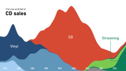
- I use this Makeover Monday dataset of 40 Years of Music Industry Sales often during my trainings as a way to demonstrate RAWGraphs.
What are your personal favorite datasets to use in data analytics or data visualization teaching? Let us know, and we’ll add them to this list!
Read more:

Why I love matrix charts
This one is definitely in my top 5 of favourite chart types: a matrix chart! Super flexible, can provide some great insights into the data, and it will fit well into your beautiful report design.

Vreemde plaatsnamen in Vlaanderen
Iedereen kent wellicht 'Kontich' en 'Reet', maar in Vlaanderen hebben we nog veel meer merkwaardige, onverwachte, en vaak grappige plaatsnamen. Heb je bijvoorbeeld ooit al gehoord van Buitenland, Dikkebus, of Grote Homo?

Small multiples can save your chart
When you're dealing with a chart that has too much information on it, the most straightforward advice to follow is: break it down into multiple charts, each with less information on them. A powerful example of this is a so-called small multiple approach.

Can you use Excel to create a powerful chart?
Spreadsheet tools such as Microsoft Excel or Numbers might not be the first thing on your mind when considering data visualization tools, but they can be pretty solid choices to build data visuals. Don’t let anyone convince you that using Excel to create data visuals is unprofessional.

Choosing the right font for your data visual
Fonts evoke emotions: there are very sophisticated fonts, playful fonts, attention-grabbing fonts, and elegant handwritten fonts. Using the wrong type of font can have a lot of impact. In data visualization the implications of typography are mainly focused on readability. Labels and annotations can easily become so small they get hard to read. Above all else, we should choose a font which is readable at small sizes.

Three roles of colour in a data visual
Colour is one of the most crucial tools we have to turn a normal chart into a powerful chart with a clear message, a chart which tells a story rather than simply presenting the information.
We are really into visual communication!
Every now and then we send out a newsletter with latest work, handpicked inspirational infographics, must-read blog posts, upcoming dates for workshops and presentations, and links to useful tools and tips. Leave your email address here and we’ll add you to our mailing list of awesome people!
