Storytelling with Data: Dataviz book review
The book
This dataviz book has been on my wishlist for a very long time! So many people have added it into their recommendations that I have lost track. It’s in nearly every list of ‘must read books on data visualization’ you will find. So it was about time for me to read, and review, Storytelling with Data by Cole Nussbaumer Knaflic.
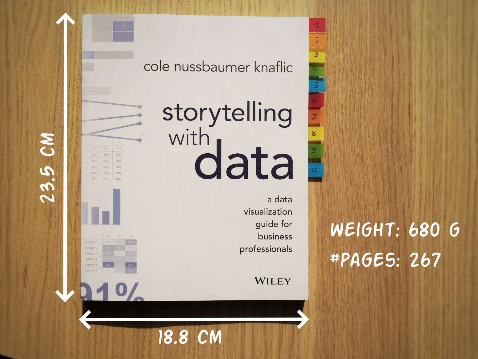
Storytelling with Data, published in 2015, is presented as a practical guide for business professionals (think managers or consultants) who regularly need to present data, or findings based on data. People who have no prior experience with data visualization, except maybe for the occasional default bar or pie chart in Microsoft Excel.
Knaflic wrote this book to teach how – as Nancy Duarte described it in her review – it’s not about the data, it’s about the meaning of the data. Or, as Jean-Luc Doumont would put it: it’s not about the what, but about the so what.
This book offers hands-on advice to turn mind-numbing default charts into powerful, convincing graphs telling a story. This way, rather than just ‘looking fancy’, data visualization becomes a tool to actually change people’s minds.
The author
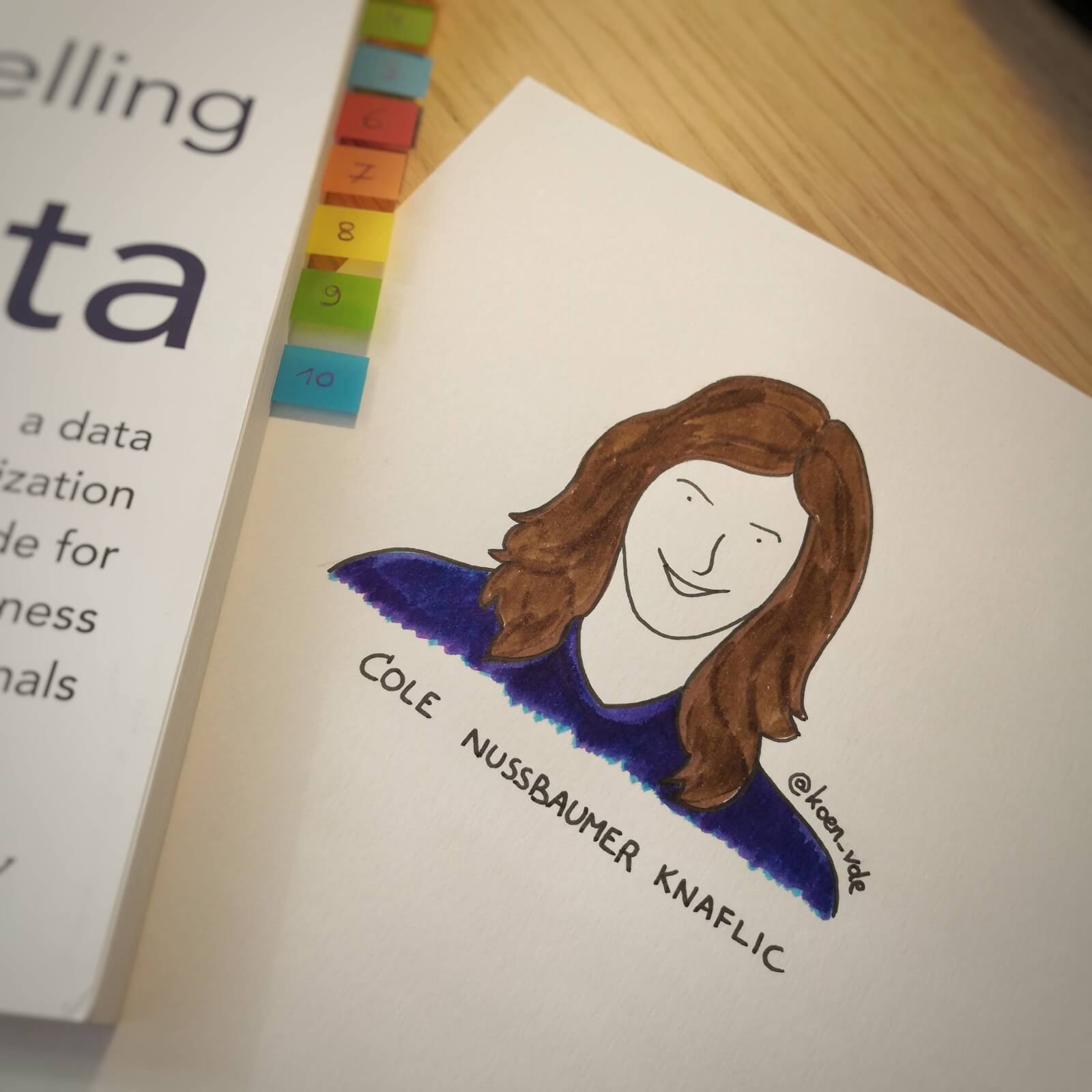
Cole Nussbaumer Knaflic is the perfect woman to teach us these techniques. Not only is she an excellent teacher in Information Visualization at the Maryland Institute College of Art, she also has an MBA and has worked as a manager on the Google People Analytics team for more than 5 years.
She is the founder and CEO of Storytelling with Data, where she has built a team to do exactly the things she describes in the book: she helps people and organizations to create graphs that tell compelling, action-inspiring stories.
In 2019 she wrote a companion book to this one, titled ‘Storytelling with Data: Let’s Practice‘, with even more examples, and with hands-on exercises.
The verdict
⭐⭐⭐
Storytelling with Data is definitely a dataviz book aimed at an audience of true business professionals, the kind of people you will find at large consulting firms, banks, or big tech companies, rather than die-hard fans of beautiful visualization art or information graphics. The author has (successfully) to convey the very simple, basic principles of building an excellent graph. She avoided adding complicated or jaw-droppingly beautiful examples, as this might discourage data visualization novices to try these principles for themselves.

This is the perfect book to pick up for your first encounter with data visualization. You will learn what’s wrong with default Excel charts and why they don’t work to convey your message. Knaflic shows how clever chart, font styling or color choices will dramatically improve the effectiveness of data visuals in your presentations. And she does it very well.
On the other hand, if you are a seasoned dataviz lover or admirer of infographics, this is not really the book for you. At times it will feel more like an academic syllabus or business report rather than a book you’ll read for fun or inspiration. But it could be the perfect gift for your colleague or friend who is just starting out and could use some basic, very practical advice!
Do you consider yourself a dataviz novice, or a true data wizard? What did you learn from this book?
And of course, if you have some data visualization challenges you think we could help you with, let me know as well – we are always happy to assist!
More dataviz book reviews? We have already covered:
- Dear Data
- Storytelling with Data
- Visualizing Complexity
Read more:

How powerful charts can boost your career
An American accountant managed - as the youngest ever! - to win a crucial election in Los Angeles - thanks to the power of data visualization. And you, too, can use powerful charts to boost your career!

Why is data visualization so challenging?
Data visualization is very powerful, but it can also be hard. That’s because a great data visual combines three different aspects simultaneously: clarity, correctness, and beauty.

Data visualization resources: all the links you\’ll ever need!
Your Data Visualization Toolkit: Practical tips, templates, and inspiration to make your data shine. Explore, adapt, and create work that’s clear, compelling, and unforgettable.

Why is data visualization so powerful?
The amount of data coming our way is growing exponentially. In 2021 alone, it is estimated that humankind generated 74 zettabytes of data – that’s about 10,000 GB per person. How on earth are we going to keep this manageable?

Infographic: Amazing facts about the brain
Did you know that our brain makes up 2% of our body weight, but consumers about 20% of our energy? Did you know that we have a second brain, located in our gut?
Our information designer Sofia made this insightful infographic, giving you an overview of eight amazing facts about the brain!

How common is your birthday?
Not all birthdays are created equal... in fact, for most countries in the north temperate zone, more people are born in summer (May - August) than in winter (October - January). This heatmap allows you to check how popular your birth date is. It shows the number of people in Belgium for each specific birthday.
We are really into visual communication!
Every now and then we send out a newsletter with latest work, handpicked inspirational infographics, must-read blog posts, upcoming dates for workshops and presentations, and links to useful tools and tips. Leave your email address here and we’ll add you to our mailing list of awesome people!
