Uncommon chart types: Slopegraphs
Maybe you have never heard the term ‘slopegraph’, but chances are high that you have seen one before. They appear in serious newspapers such as De Tijd or the Financial Times, but you can easily create them yourself (yes, even in Excel!) and use them for your own data communication purposes. They work particularly well due to their insanely high data-ink ratio… as long as you don’t overdo it!
What is a slopegraph?
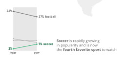
At its core, a slopegraph is a linegraph with just two data points for each category. In the majority of cases, such a graph will be used to compare between two different points in time, such as in the following example. This slopegraph shows how Americans’ favourite sports (to watch) have evolved between 2007 and 2017:
Slopegraphs are still a rather niche chart type. They were first suggested by Edward Tufte in his 1983 classical work ‘The visual display of quantitative information‘ – although at that time they were still nameless. I must admit I cannot trace back when the term ‘slopegraph’ first appeared. This was Tufte’s original design, showing the evolution of government tax collection in different countries, between 1970 and 1979:
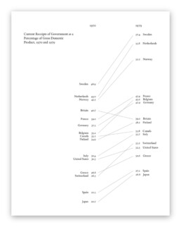
Original slopegraph design by Edward Tufte in 1983 (The Visual Display of Quantitative Information)
Here, we can immediately see why the data-ink ratio is so high: we can easily scan and understand the graph even without axes, ticks, axes labels or gridlines. Data points can be labeled directly, and no legend is needed, so we can quickly make a link between a line and the associated country.
Apparently, our brain is very good at comparing slopes of different lines. In the above examples, we can easily identify the strongest growers and fastest decliners, even for rather large sets of categories. For example, we can quickly see that Britain is the only country (from the given set) where tax collection went down between 1970 and 1979. And it grew pretty fast in the Nordics, Belgium and Switzerland.
Creating slopegraphs
As slopegraphs are basically just line graphs, they are very easy to create with basically any graphing software, including Excel. Because of this, Cole Nussbaumer Knaflic has dedicated an entire section to them in Storytelling with data (one of the best dataviz books for absolute beginners). She has even created a template for them here.
If you want to get your hands dirty and create a slopegraph yourself, there are two things to keep in mind:
- Try to remove as much ‘noise’ as possible: axes, gridlines and labels can usually be easily removed without harming interpretation.
- If you have many lines, make your message stand out by coloring most of the lines gray (or another neutral color), and highlight just the few you want to bring attention to, such as in the following example by Oliver Uberti for National Geographic:
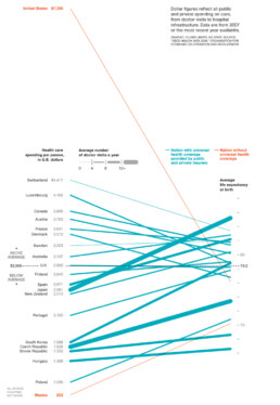
Notice that this is a very interesting example, as we are not comparing two different points in time, but two different metrics. On the left, we have the health care spending per person, on the right, the average life expectancy. The coloring draws our attention to the US and Mexico, two countries without universal health coverage. But the US is clearly an outlier: a very high health care spending which does not really reflect in the (below-average) life expectancy.
Some final things to remark about this very fine example, before we move on:
- Notice how the average of the health care spending (on the left side) is perfectly aligned with the average life expectancy (on the right side), shown with a dashed horizontal line. Clever!
- There is a third metric introduced into the chart by modifying the line thickness. The thicker the line, the more often people in these countries visit their doctor. Very clever again, although unfortunately it also counters some of the coloring effect: in countries without universal health coverage (in orange), people will visit their doctors much less frequently, resulting in very thin slopegraph lines.
Final slopegraph thoughts
Nothing is absolute when it comes to slopegraphs. In fact, we have already seen that the comparison can be between completely different metrics, such as in the National Geographic example above. And that you can introduce additional information by playing around with colors or line thickness.
Finally I would like to show that, even when we’re talking about comparing dates, you don’t have to stick to just two points in time. This is a graphic I created showing the evolution of a certain market in different regions between 2009 and 2019, but with an intermediate value given for 2014:
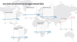
Also here, rather, than showing all the lines in a single slopegraph, I opted to separate them in a kind of small multiples approach. This allows me to arrange the charts spatially on top of a world map, and it makes even more clear how much of an outlier the Asia-Pacific region is for this data. As you can see, nothing is set in stone. Slopegraphs are so easy to create that you can easily play around with them, find what works best for your data and message, or even invent completely new approaches!
Got any more great examples of slopegraphs? Make sure to share them with me at koen@baryon.be !
Or maybe we can help you make a slopegraph?
More uncommon chart types? We have already covered:
- Slopegraphs
- Waffle charts
Read more:

Why I love matrix charts
This one is definitely in my top 5 of favourite chart types: a matrix chart! Super flexible, can provide some great insights into the data, and it will fit well into your beautiful report design.

Vreemde plaatsnamen in Vlaanderen
Iedereen kent wellicht 'Kontich' en 'Reet', maar in Vlaanderen hebben we nog veel meer merkwaardige, onverwachte, en vaak grappige plaatsnamen. Heb je bijvoorbeeld ooit al gehoord van Buitenland, Dikkebus, of Grote Homo?

Small multiples can save your chart
When you're dealing with a chart that has too much information on it, the most straightforward advice to follow is: break it down into multiple charts, each with less information on them. A powerful example of this is a so-called small multiple approach.

Can you use Excel to create a powerful chart?
Spreadsheet tools such as Microsoft Excel or Numbers might not be the first thing on your mind when considering data visualization tools, but they can be pretty solid choices to build data visuals. Don’t let anyone convince you that using Excel to create data visuals is unprofessional.

Choosing the right font for your data visual
Fonts evoke emotions: there are very sophisticated fonts, playful fonts, attention-grabbing fonts, and elegant handwritten fonts. Using the wrong type of font can have a lot of impact. In data visualization the implications of typography are mainly focused on readability. Labels and annotations can easily become so small they get hard to read. Above all else, we should choose a font which is readable at small sizes.

Three roles of colour in a data visual
Colour is one of the most crucial tools we have to turn a normal chart into a powerful chart with a clear message, a chart which tells a story rather than simply presenting the information.
We are really into visual communication!
Every now and then we send out a newsletter with latest work, handpicked inspirational infographics, must-read blog posts, upcoming dates for workshops and presentations, and links to useful tools and tips. Leave your email address here and we’ll add you to our mailing list of awesome people!
