Why I love matrix charts
🥰 This one is definitely in my top 5 of favourite chart types: a matrix chart!
🤔 What is it? A matrix chart is similar to a heatmap, and it has the same compact design. But rather than relying on color differences, we use bubbles with different sizes to show the data. It is cleaner and less visually cluttered than a heatmap, making it easier to fit in a stylish report design.
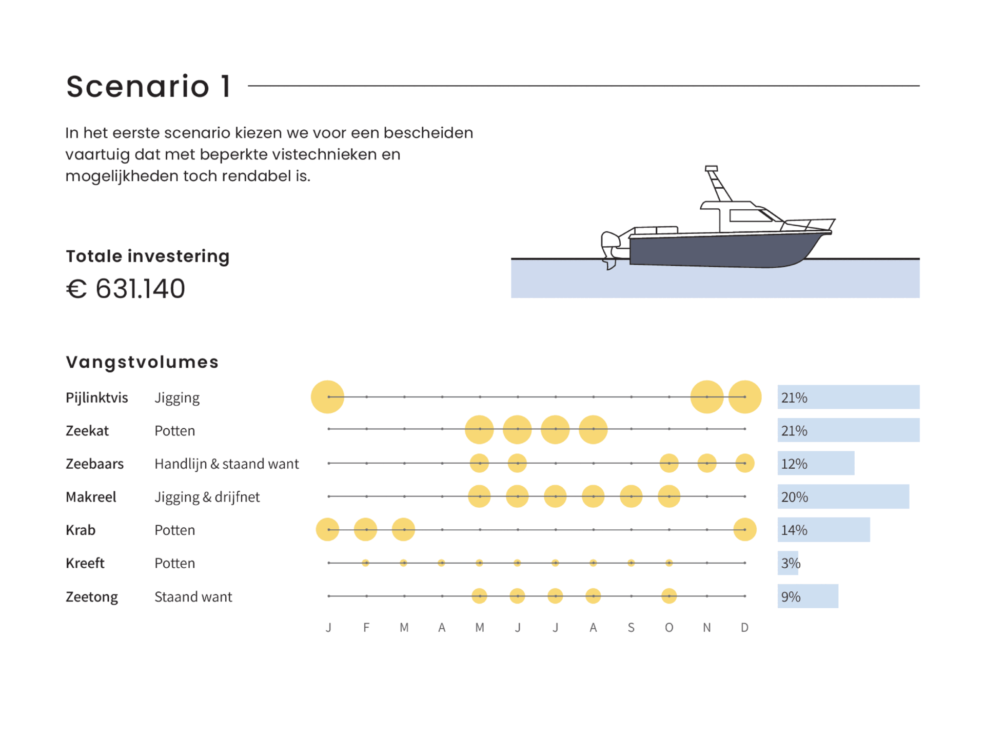
⚠️ Potential downside: this chart type works well only when there is sufficient variation between the data points. Otherwise it will be hard to see small differences between the bubble sizes.
💡 Worth noting: not everyone uses the term ‘matrix chart’. Some people prefer ‘proportional area chart’, or in this specific example – because the horizontal axis represents time – a ‘bubble timeline’. I like the term ‘matrix chart’ because it is a visual matrix of data, and it is also how RAWGraphs – my favourite tool to create these charts – calls it.
🐟 Example from the report ‘Toekomstvisie voor de kustvisserij 2024’ (Vision for the future of inshore fishing 2024) that we made for ILVO earlier this year.
Read more:

Navigating the landscape of powerful charts
Once we’ve decided to create a data visual or infographic, there are a lot of questions we should ask ourselves to determine the most suitable format. These considerations could include size, readability, possible interactive functionality, and the level of detail we need.

How powerful charts can boost your career
An American accountant managed - as the youngest ever! - to win a crucial election in Los Angeles - thanks to the power of data visualization. And you, too, can use powerful charts to boost your career!

Why is data visualization so challenging?
Data visualization is very powerful, but it can also be hard. That’s because a great data visual combines three different aspects simultaneously: clarity, correctness, and beauty.

Data visualization resources: all the links you’ll ever need!
You want to start creating clear and attractive data visuals, but don't know where to start? No worries, here's a complete overview of tools, resources and inspiration you can use as a starting point for your designs.

Why is data visualization so powerful?
The amount of data coming our way is growing exponentially. In 2021 alone, it is estimated that humankind generated 74 zettabytes of data – that’s about 10,000 GB per person. How on earth are we going to keep this manageable?

Infographic: Amazing facts about the brain
Did you know that our brain makes up 2% of our body weight, but consumers about 20% of our energy? Did you know that we have a second brain, located in our gut?
Our information designer Sofia made this insightful infographic, giving you an overview of eight amazing facts about the brain!
We are really into visual communication!
Every now and then we send out a newsletter with latest work, handpicked inspirational infographics, must-read blog posts, upcoming dates for workshops and presentations, and links to useful tools and tips. Leave your email address here and we’ll add you to our mailing list of awesome people!

