Why I love matrix charts
🥰 This one is definitely in my top 5 of favourite chart types: a matrix chart!
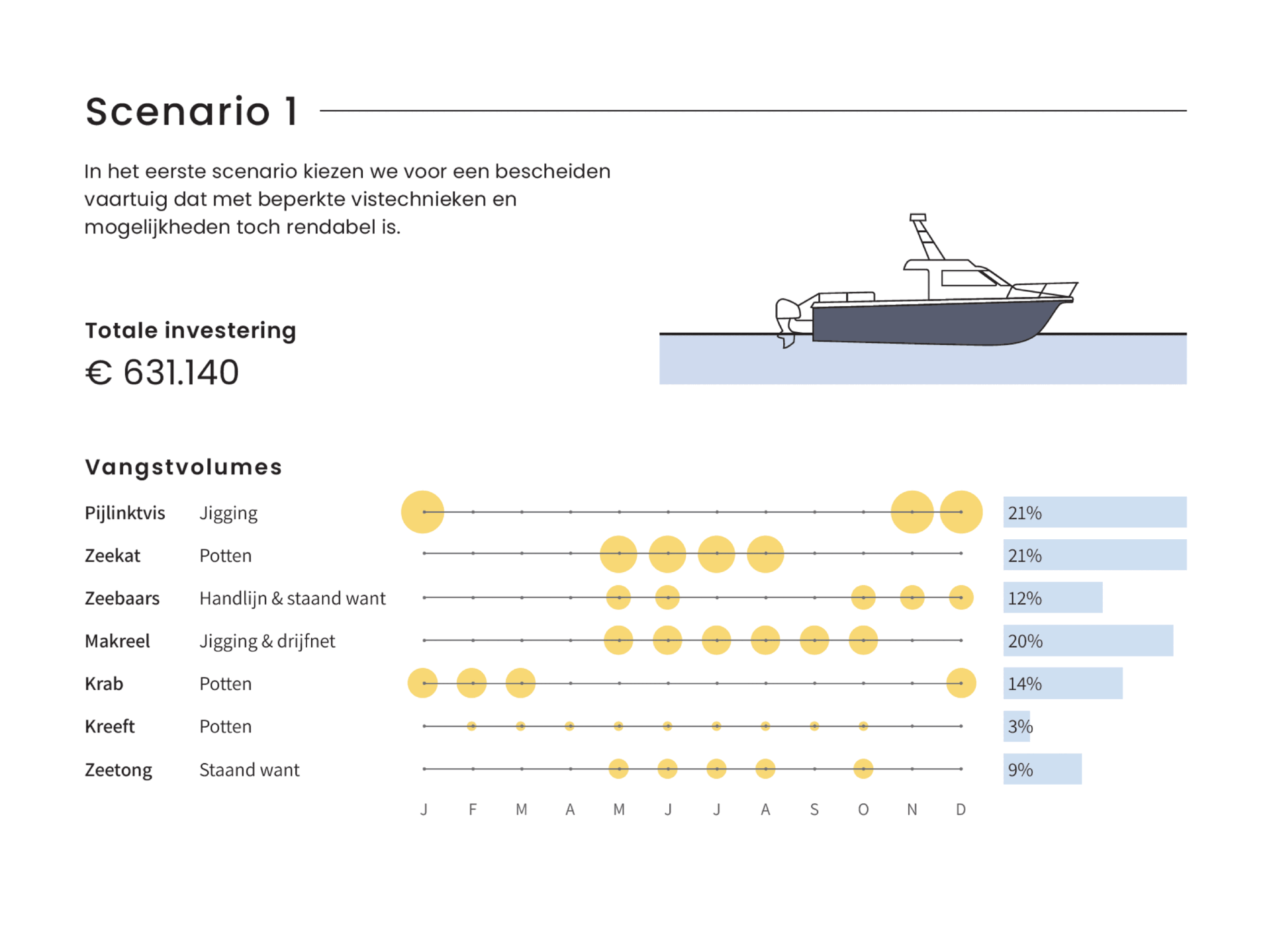
🤔 What is it? A matrix chart is similar to a heatmap, and it has the same compact design. But rather than relying on color differences, we use bubbles with different sizes to show the data. It is cleaner and less visually cluttered than a heatmap, making it easier to fit in a stylish report design.
⚠️ Potential downside: this chart type works well only when there is sufficient variation between the data points. Otherwise it will be hard to see small differences between the bubble sizes.
💡 Worth noting: not everyone uses the term ‘matrix chart’. Some people prefer ‘proportional area chart’, or in this specific example – because the horizontal axis represents time – a ‘bubble timeline’. I like the term ‘matrix chart’ because it is a visual matrix of data, and it is also how RAWGraphs – my favourite tool to create these charts – calls it.
🐟 Example from the report ‘Toekomstvisie voor de kustvisserij 2024’ (Vision for the future of inshore fishing 2024) that we made for ILVO earlier this year.

Read more:

How common is your birthday?
Not all birthdays are created equal... in fact, for most countries in the north temperate zone, more people are born in summer (May - August) than in winter (October - January). This heatmap allows you to check how popular your birth date is. It shows the number of people in Belgium for each specific birthday.

Visualizing Complexity: Dataviz book review
Visualizing Complexity is a great new data visualization book published by information design Superdot. Here's our verdict.

This chart is trying to trick you
The original chart in this example is trying to suggest a strong correlation between sugar intake and obesity in the US between 1980 and 2000. It does so by carefully choosing the vertical axis ranges and scaling so both lines nicely fall on top of each other.

Research visuals: all the resources you’ll ever need!
If you want to start creating clear and attractive visuals about your research, but don't know where to start, this page is for you! Here's a complete overview of tools, resources and inspiration you can use as a starting point for your designs.

Small datasets to practice your data visualization skills
When you're teaching data analysis or data visualization, or when you're learning new data visualization tools and techniques, you might be looking for datasets to practice with. Here are some great starting points.

How to create a graphical abstract
Graphical abstracts are becoming more and more important. Journal publishers such as Elsevier encourage you to create a concise visual summary of the main findings of your research. But where to start? What steps should you follow to create the perfect graphical abstract for your article? What tools can you use?
We are really into visual communication!
Every now and then we send out a newsletter with latest work, handpicked inspirational infographics, must-read blog posts, upcoming dates for workshops and presentations, and links to useful tools and tips. Leave your email address here and we’ll add you to our mailing list of awesome people!

