
7 different goals for your chart
A crucial step in building a powerful chart is choosing the right type of chart. A lot of charts don’t work because they simply use the wrong type of chart. To avoid this trap, we must ask ourselves a basic question: what’s the ultimate goal of our data visual? What do we want to show with our data?
Categories of graphical representation
As it turns out, there’s only a limited set of goals we might have for our chart. These goals, sometimes called ‘categories of graphical representation’, always boil down to the same seven categories.
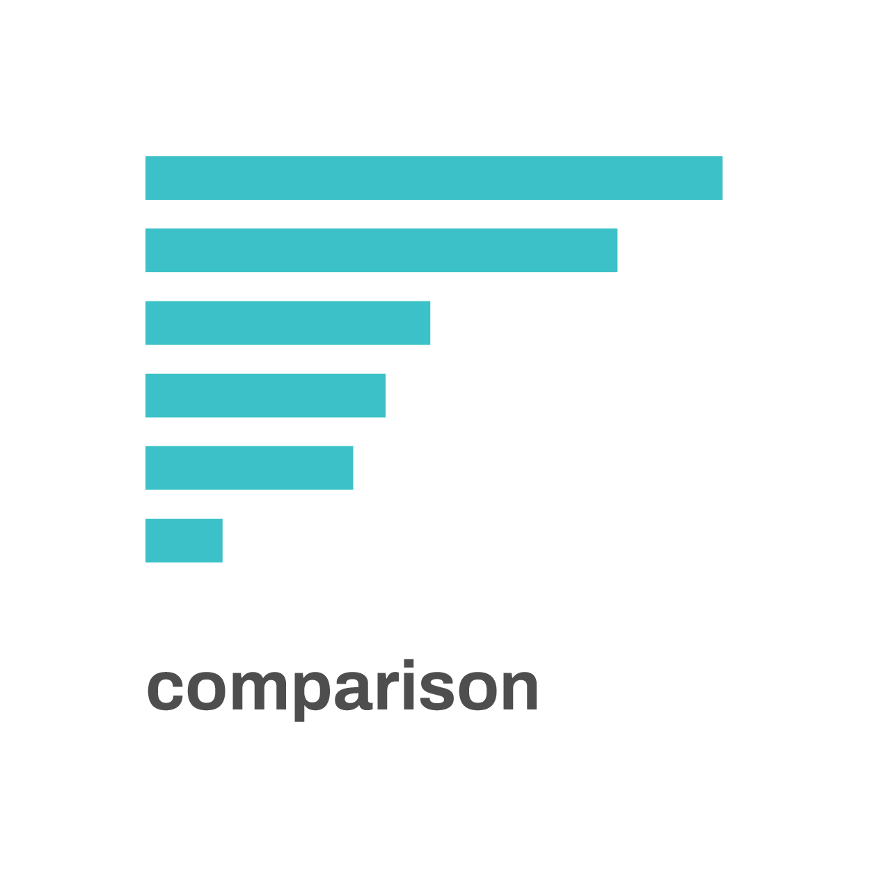
Comparison: in many cases, we want to compare different values for different categories with each other. A bar chart is perfect to do this: the length of the bars shows us the underlying data values, and makes it easy to compare them with each other.
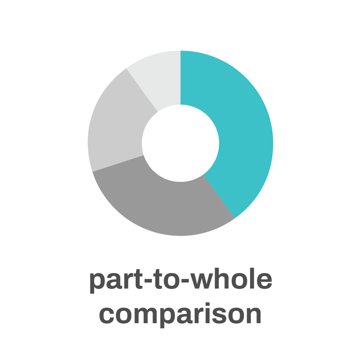
A part-to-whole comparison is comparison’s little brother. Rather than directly comparing categories with each other we’re comparing the size of a single category with the total size of all categories combined. Pie charts or stacked bar charts are ideal tools for this.
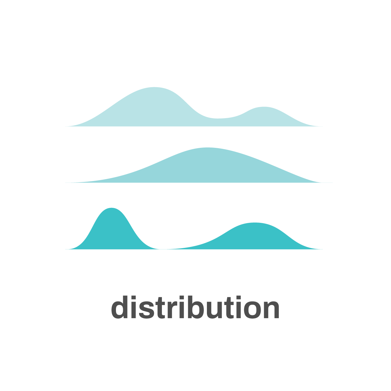
If our goal is to show a distribution, we want to get an impression of how data points are distributed along a certain parameter or dimension. Great charts to study or show distributions are histograms, box plots, density plots or ridgeline plots.
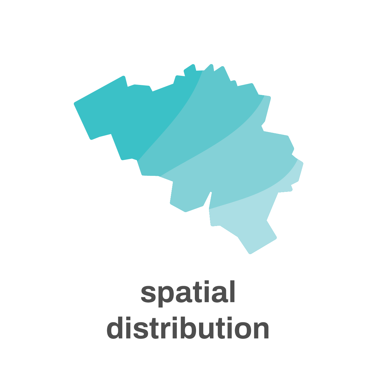
If the dimensions under consideration are spatial dimensions, such as latitude or longitude, we’re talking about a spatial distribution – the realm of maps.
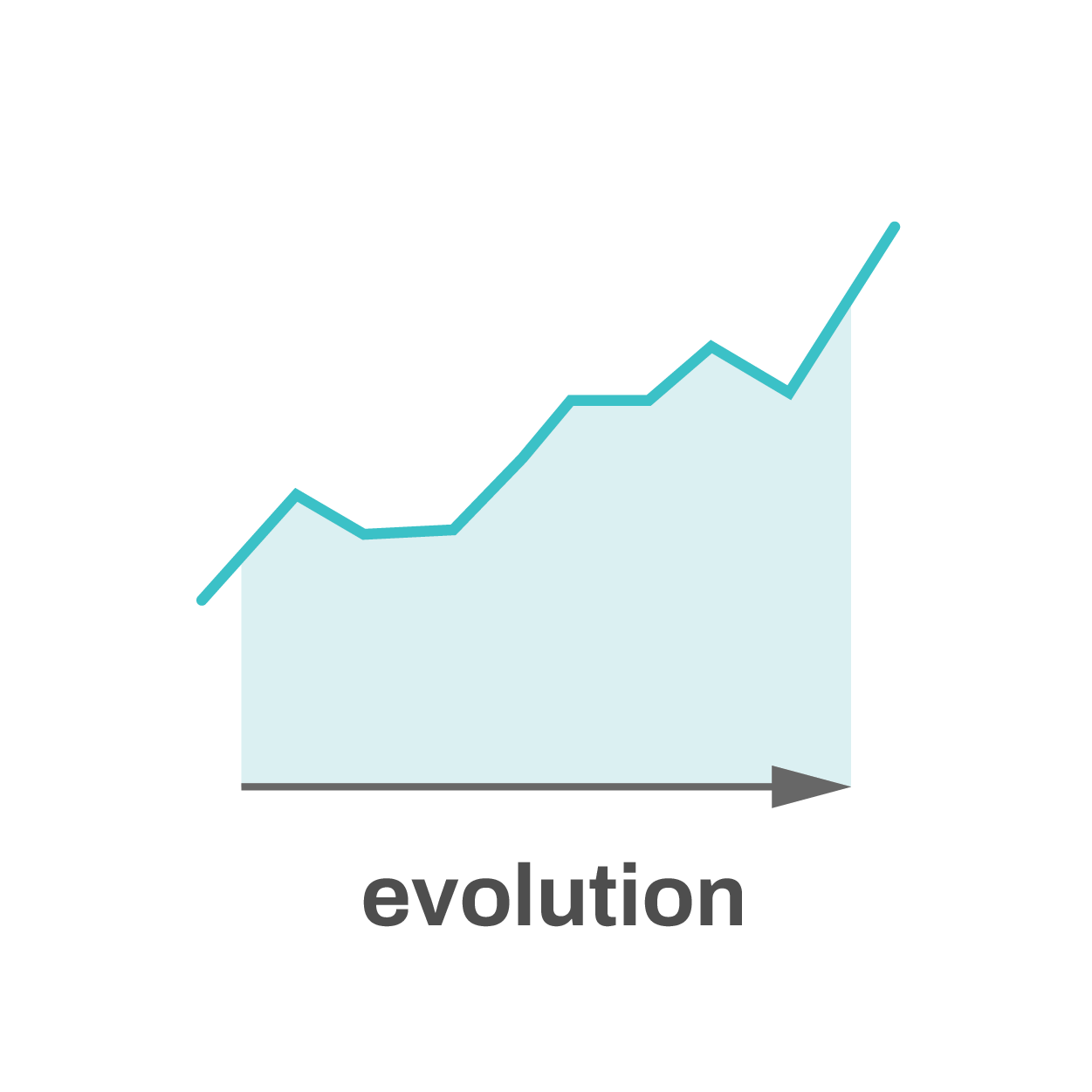
When one of the parameters in our dataset is time, we’re often interested in showing the evolution: how has a certain value changed over time?
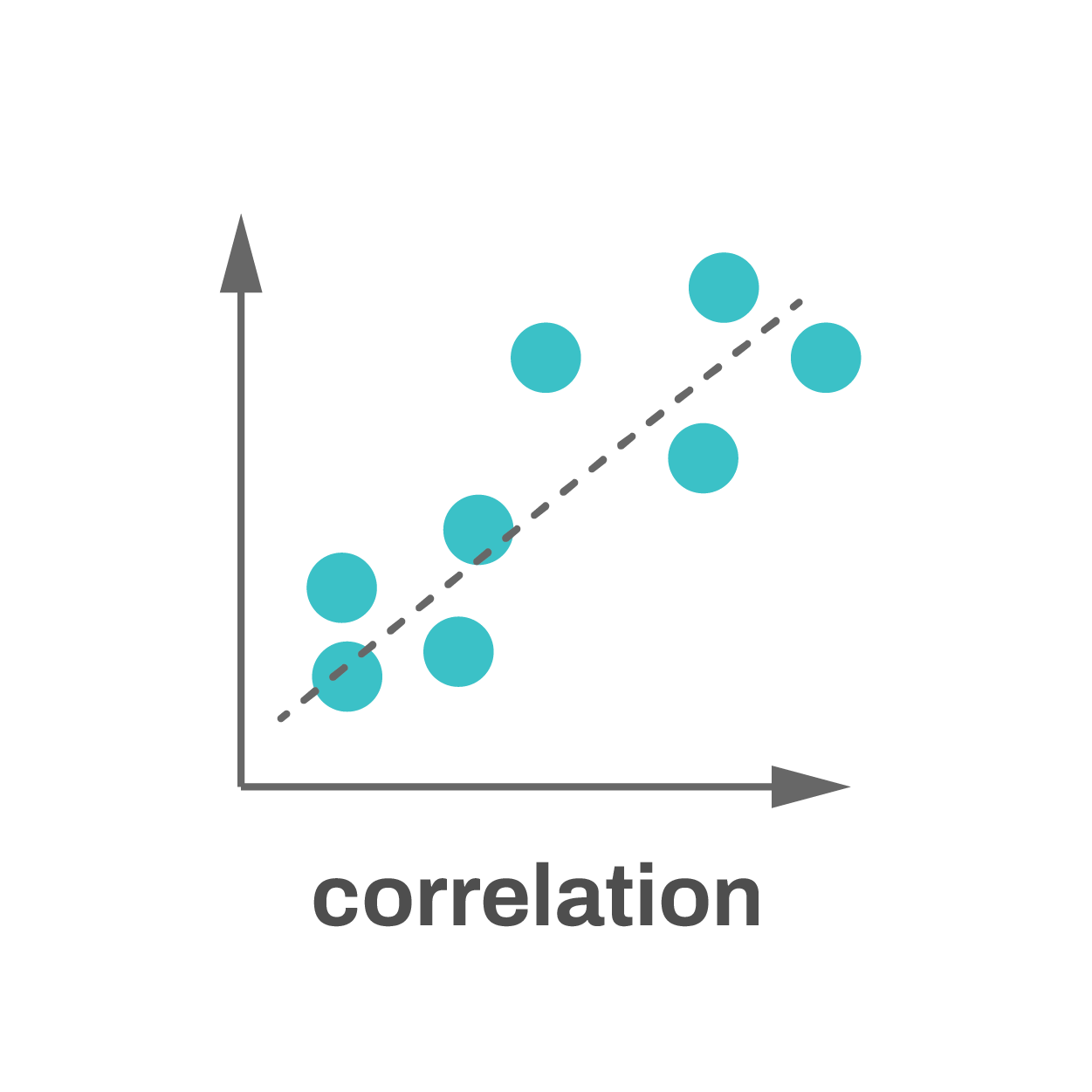
Correlation occurs when two parameters are related to each other. For example, if we take a large group of humans and have a look at their height and weight, we will find that, in general, taller people also have a larger weight. Typically scatter plots are used to study correlations, but there are other options as well.

Finally, hierarchy: we might want to show how different parts of a dataset are linked to each other. Maybe there’s a parent category with subcategories, and maybe those subcategories are again subdivided into even smaller categories. To show these hierarchies a sunburst diagram, treemap or network visualization might be what we need.
Start with the goal in mind
99% of all the charts we have to make fall into one of these seven categories. Clearly identifying our goal at the start of the creation process will help us find the most appropriate chart type, leading to the most powerful chart.
If you want to know more about visualizing data in the right way, you can check out the other videos in this series. Or I invite you to read my book, Powerful Charts, that will give you actionable insights and practical guidelines to create data visuals that truly engage and inspire your audience.
Full video series
- 01. Why is data visualization so powerful?
- 02. Why is data visualization so challenging?
- 03. Navigating the landscape of powerful charts
- 04. A powerful chart tells a story
- 05. A powerful chart has a high signal-to-noise ratio
- 06. Making a data visual noise-free
- 07. 7 different goals for your chart
- 08. Three roles of colour in a data visual
- 09. Choosing the right font for your data visual
- 10. Can you use Excel to create a powerful chart? (coming on January 09, 2023)

Read more:
Behind the maps
In the 30-day Map Challenge, you are challenged to design a new map every day around a certain topic. I participated in November 2020, and wrote this post to share my thought processes, data sources, tools and results!

Data visualization resources: all the links you’ll ever need!
You want to start creating clear and attractive data visuals, but don't know where to start? No worries, here's a complete overview of tools, resources and inspiration you can use as a starting point for your designs.
Storytelling with Data: Dataviz book review
The Storytelling with Data book has been on my wishlist as long as I can remember, because so many people recommend it as one of the must read dataviz books. So let's see what the fuzz is all about - here's my review!
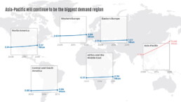
Uncommon chart types: Slopegraphs
Slopegraphs appear in 'serious' newspapers, but they are very easy to create yourself. Use them if you want to compare how values have changed between two different points in time!
Data visualization in a time of pandemic – #6: Viral scrollytelling
In this final chapter, we’ll dive deeper into some of the insightful stories which have been published about the novel coronavirus and the COVID-19 pandemic. Rather than looking at single charts, we’ll highlight some long-form stories about the origin of the virus, how it works, and how it spread.
Five steps towards improving your dashboard
Today I would like to share with you the five steps I usually follow when I analyze and improve dashboards. If you are planning to analyze and improve your own dashboard, or maybe the dashboard someone else created and you want to provide feedback on, you could follow these five steps as well.
We are really into visual communication!
Every now and then we send out a newsletter with latest work, handpicked inspirational infographics, must-read blog posts, upcoming dates for workshops and presentations, and links to useful tools and tips. Leave your email address here and we’ll add you to our mailing list of awesome people!
