
Why I love matrix charts
🥰 This one is definitely in my top 5 of favourite chart types: a matrix chart!
🤔 What is it? A matrix chart is similar to a heatmap, and it has the same compact design. But rather than relying on color differences, we use bubbles with different sizes to show the data. It is cleaner and less visually cluttered than a heatmap, making it easier to fit in a stylish report design.
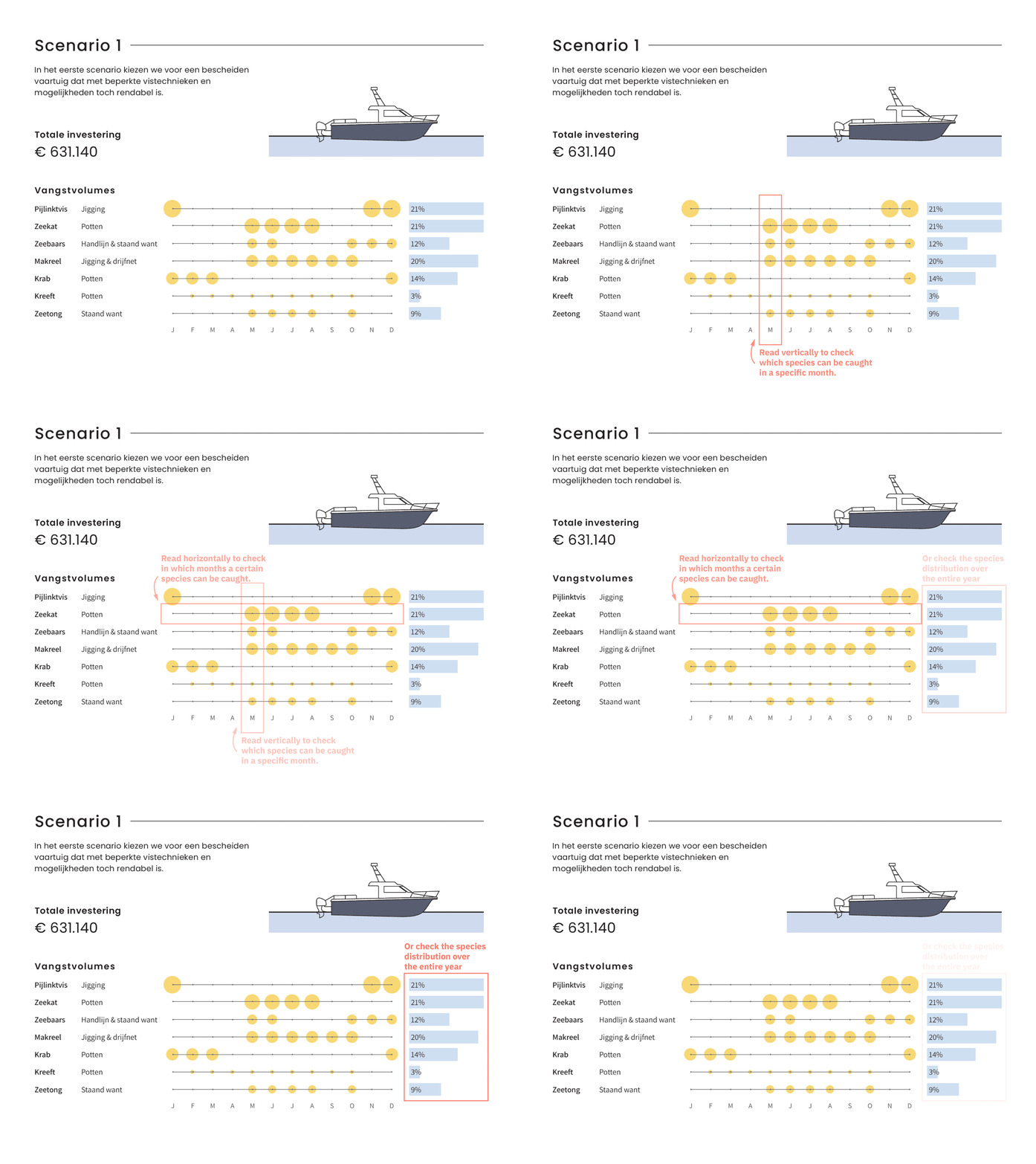
⚠️ Potential downside: this chart type works well only when there is sufficient variation between the data points. Otherwise it will be hard to see small differences between the bubble sizes.
💡 Worth noting: not everyone uses the term ‘matrix chart’. Some people prefer ‘proportional area chart’, or in this specific example – because the horizontal axis represents time – a ‘bubble timeline’. I like the term ‘matrix chart’ because it is a visual matrix of data, and it is also how RAWGraphs – my favourite tool to create these charts – calls it.
🐟 Example from the report ‘Toekomstvisie voor de kustvisserij 2024’ (Vision for the future of inshore fishing 2024) that we made for ILVO earlier this year.

Read more:

Avoiding abbreviations
People are lazy. Make it as easy as possible for them to see what you are trying to show. There are tons of ways to reduce mental noise in your charts, but one of the easiest is avoiding abbreviations.
The uncomfortable relationship between scientific illustrations and AI
Scientific journal Nature devoted the headline of its 23 July 2026 issue to “the human art of scientific illustration in the age of artificial intelligence”. Of course, that sparked my attention.

Review: Info We Trust
Info We Trust is an ambitious, visually stunning book that sits somewhere between philosophy, information design, and a collection of visual essays.
Gridlines are better than axes
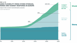
Almost always, gridlines are better than axes. Vertical axes are the default option, and they have been around for centuries, so they are very well known. But they also have downsides. My biggest problem with vertical axes is that they’re often so far away from where the action is really happening.
Review: A History of Data Visualization and Graphic Communication
Michael Friendly and Howard Wainer clearly love graphs. But A History of Data Visualization and Graphic Communication isn’t just about graphs — it’s about the stories behind them: the context, the people, the new measurements that made them necessary, and the discoveries they enabled.

Report visuals don’t have to suck
Discover how CREG, Belgium’s electricity regulator, turns complex data into clear and engaging visuals. From smart annotations to small multiples and uncommon chart types, their Monitoring Report shows how thoughtful data visualization makes technical reports easier to read and understand.
We are really into visual communication!
Every now and then we send out a newsletter with latest work, handpicked inspirational infographics, must-read blog posts, upcoming dates for workshops and presentations, and links to useful tools and tips. Leave your email address here and we’ll add you to our mailing list of awesome people!
