A powerful chart has a high signal-to-noise ratio
‘Less is more’. It’s a crucial principle in most of our communication, and in data visualization in particular. Because of my background as a physicist, I prefer to talk about the ‘signal-to-noise ratio’. The message – our signal – should be amplified as much as possible, giving it all of the attention. Everything that can distract from our message – the noise – should be removed.
Noise: the enemy of communication
Maximizing the signal-to-noise is important for every form of communication. A company that applies this principle very well is Apple. In their presentation of the first iPhone, back in 2007, the signal-to-noise ratio is very high.
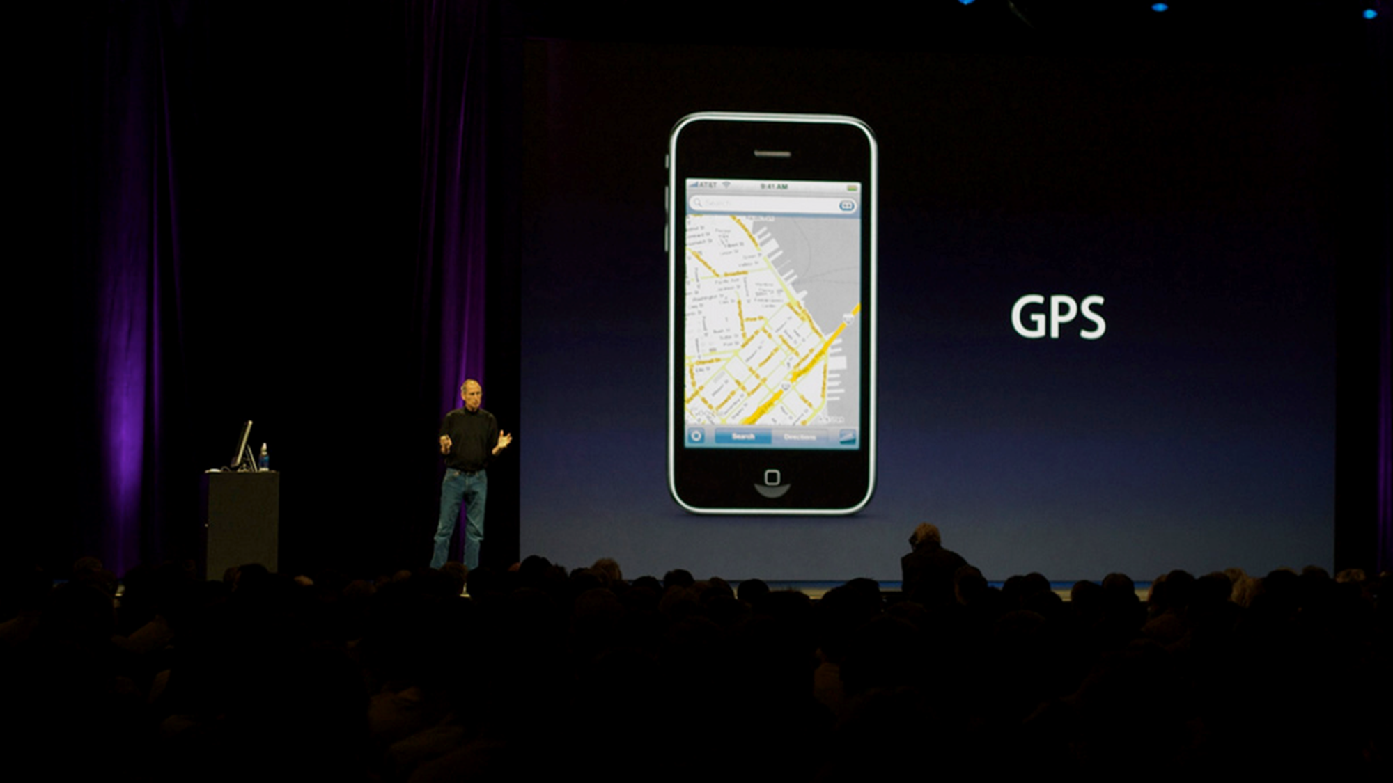
On the slide is just a picture of the iPhone with a single word: GPS. That’s what this part of the presentation is about: here’s our new phone, and it has GPS!
There’s nothing else on the slide – no slide numbers, dates or logos. Not even the Apple logo! Both the slide and the room have a dark background. Steve Jobs is not behind his desk, because it would be a barrier between him and the audience. He’s wearing neutral clothes, because anything too fancy might distract from the message. Every possible source of noise has been eliminated.
Noise in data visualization
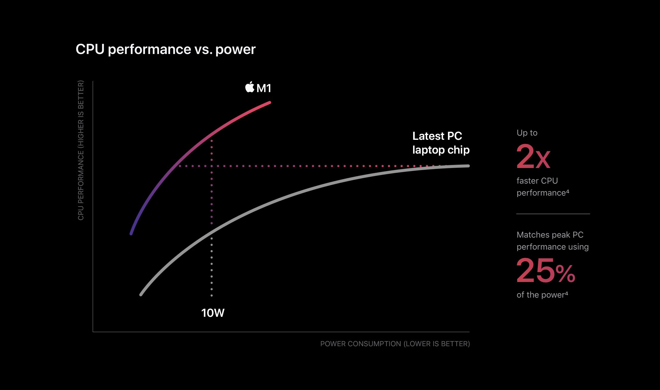
Apple still does this today, and they do it in their data visualization as well. This very clean chart was a part of their 2020 presentation of the M1 chip. Again, it has a noise-free dark background. Everything unnecessary is removed. There are no gridlines or axis ticks. There is not even a legend!
Remove the unnecessary
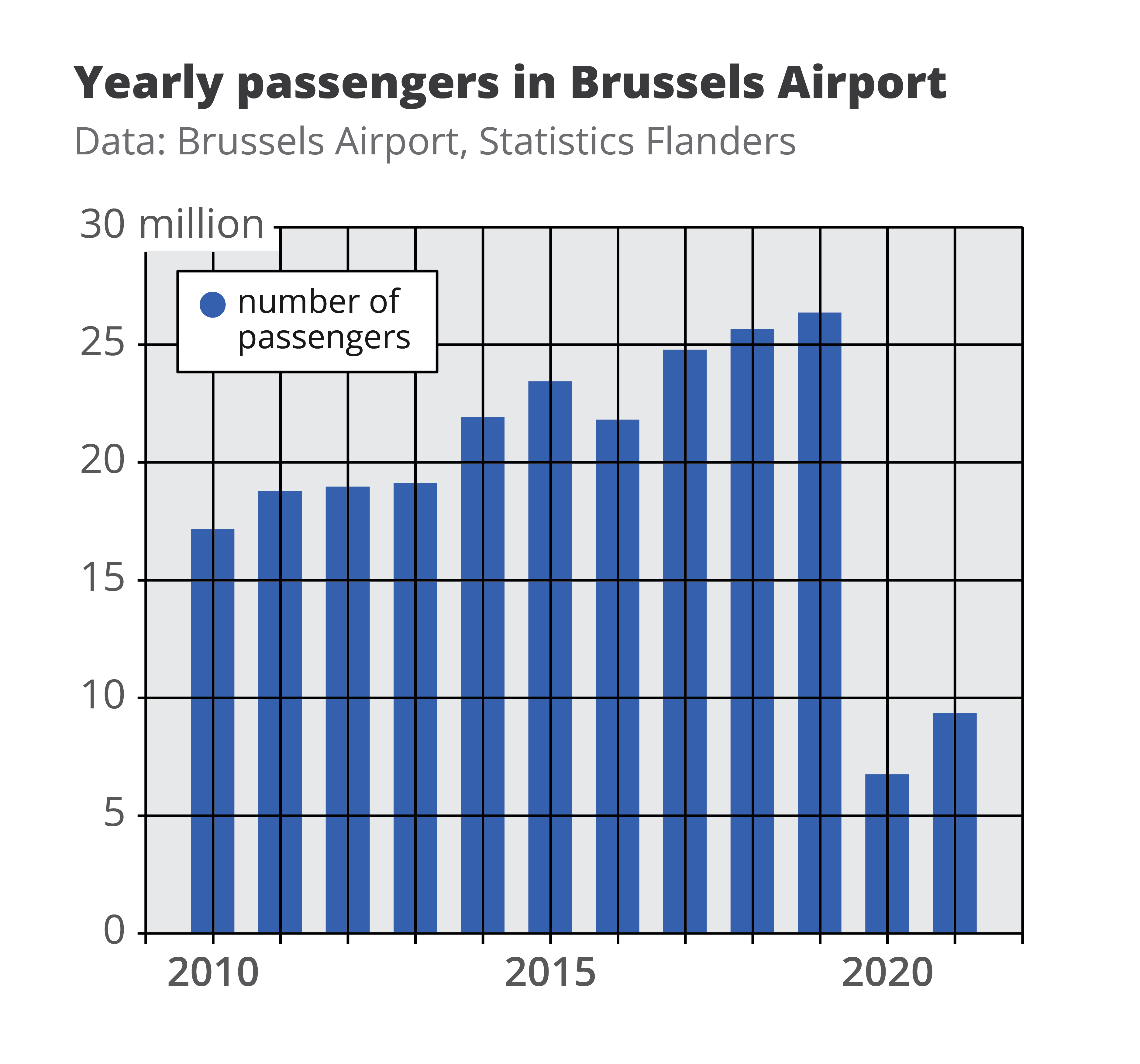
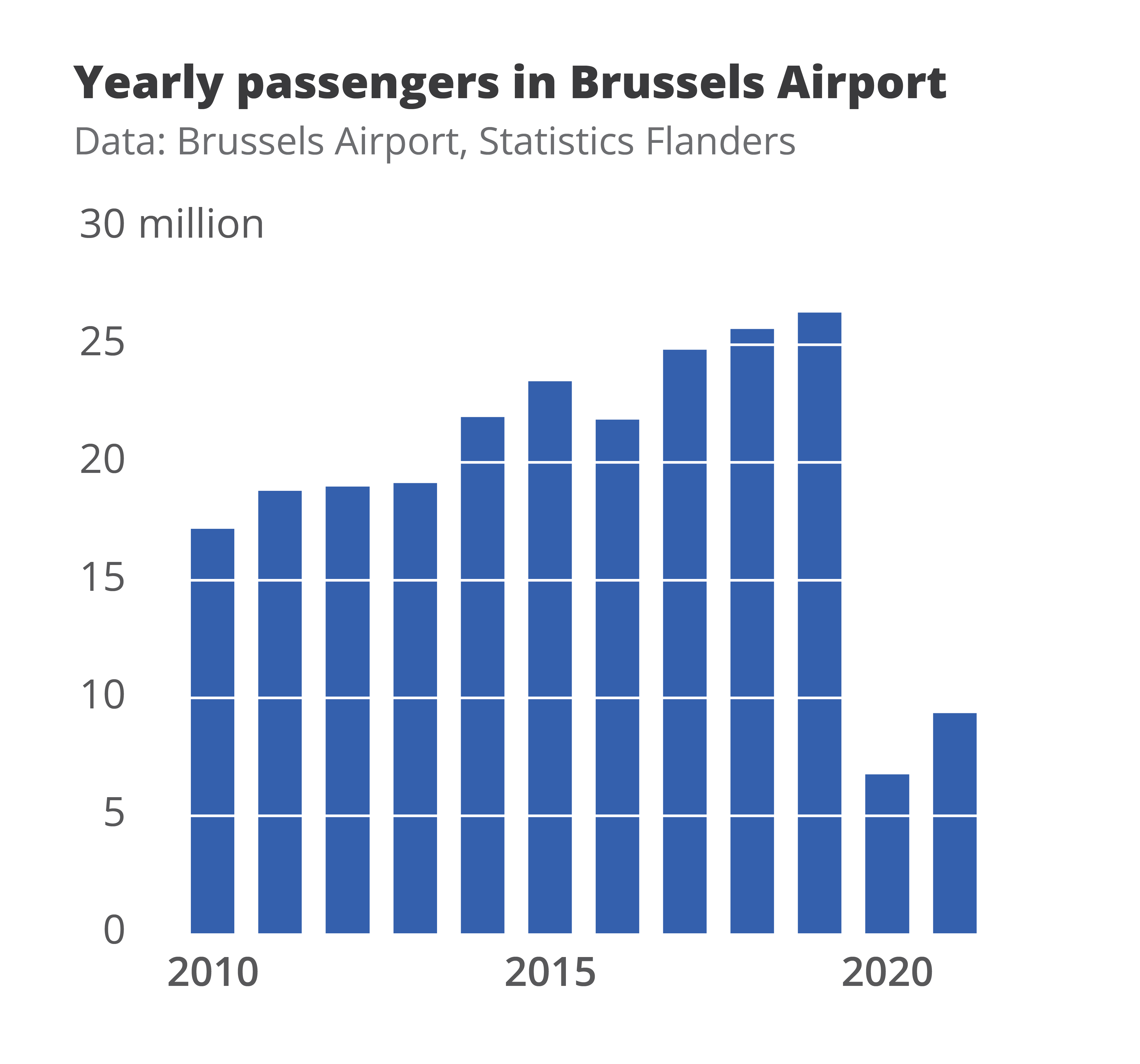
Here’s another practical example of signal-to-noise ratio applied to data visuals. From this chart we can remove the coloured background, the gridlines, the legend, and even the horizontal and vertical axes. Removing these elements doesn’t harm the data or the message of the visual. In fact, it makes the data even more accessible. That means they were just noise! We end up with a much clearer visual, with a much higher signal-to-noise ratio.
If you want to know more about visualizing data in the right way, you can check out the other videos in this series. Or I invite you to read my book, Powerful Charts, that will give you actionable insights and practical guidelines to create data visuals that truly engage and inspire your audience.
Full video series
- 01. Why is data visualization so powerful?
- 02. Why is data visualization so challenging?
- 03. Navigating the landscape of powerful charts
- 04. A powerful chart tells a story
- 05. A powerful chart has a high signal-to-noise ratio
- 06. Making a data visual noise-free
- 07. 7 different goals for your chart
- 08. Three roles of colour in a data visual
- 09. Choosing the right font for your data visual
- 10. Can you use Excel to create a powerful chart? (coming on January 09, 2023)

Read more:

This chart is trying to trick you
The original chart in this example is trying to suggest a strong correlation between sugar intake and obesity in the US between 1980 and 2000. It does so by carefully choosing the vertical axis ranges and scaling so both lines nicely fall on top of each other.

Research visuals: all the resources you’ll ever need!
If you want to start creating clear and attractive visuals about your research, but don't know where to start, this page is for you! Here's a complete overview of tools, resources and inspiration you can use as a starting point for your designs.

Small datasets to practice your data visualization skills
When you're teaching data analysis or data visualization, or when you're learning new data visualization tools and techniques, you might be looking for datasets to practice with. Here are some great starting points.

How to create a graphical abstract
Graphical abstracts are becoming more and more important. Journal publishers such as Elsevier encourage you to create a concise visual summary of the main findings of your research. But where to start? What steps should you follow to create the perfect graphical abstract for your article? What tools can you use?

Behind the maps
In the 30-day Map Challenge, you are challenged to design a new map every day around a certain topic. I participated in November 2020, and wrote this post to share my thought processes, data sources, tools and results!
Data visualization resources: all the links you’ll ever need!
You want to start creating clear and attractive data visuals, but don't know where to start? No worries, here's a complete overview of tools, resources and inspiration you can use as a starting point for your designs.
We are really into visual communication!
Every now and then we send out a newsletter with latest work, handpicked inspirational infographics, must-read blog posts, upcoming dates for workshops and presentations, and links to useful tools and tips. Leave your email address here and we’ll add you to our mailing list of awesome people!
