Choosing a colour scheme for your infographics
Choosing the colours for your infographic might not sound like a priority, but a colour scheme can make or break your entire design, no matter how good your structure or your images are.

Stephen Wildish, The importance of colour
There is an extremely large degree of freedom when choosing a colour scheme: whether you prefer light or dark colours, soft pastel tints or flashy saturated colours, playful or very serious, multiple varieties of the same colour or rather highly contrasting accents. For inspiration, just take a look at the ton of website colour scheme examples over at canva.com.
The hidden meaning of colours
Of course, this plethora of options can very quickly turn into a nightmare. If so many colour schemes exist, where should we start? In case of doubt, it’s always a good idea to return to the basics: the psychological meaning of colours.
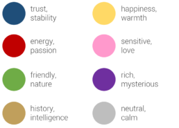
Every colour might trigger an unconscious response with your audience, to greater or lesser extent. For example, blue is often used to demonstrate trust and stability. This is the reason why many banks choose a blue logo and branding style. Red, on the other hand, is associated with energy or passion, possibly because of its meaning in nature. Red animals or plants mean trouble, danger, “don’t eat me!”.
If your infographic has a historical theme, (light) brown might be a good choice. That is the reason why I have selected it as the main colour of my Nobel Prize in Physics infographic, together with bright orange to draw the attention of the reader. Combined with a washed-out version of the medal in the background, the light brown adds a classical, intelligent feel to the visualization:
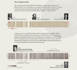
Personal project: history of the Nobel Prize in Physics
Does the product, brand, place or theme you’re making an infographic about have a characteristic colour? Then you’re lucky: you have already found the main colour to start building your colour scheme around. Imagine you are making an infographic about the history of Coca-Cola. Red would be the logical — and probably best — choice for that. Or an infographic about the oceans, fishing, and the diversity of marine life? Blue is the colour you need!
Finding inspiring colour schemes
If you don’t feel confident about building your own infographic colour scheme from scratch, there’s no need to worry. The internet is an endless source of inspiration to add colours to your designs. In the past few years, several handy, free tools have emerged to help you with this task.
One of my personal favourites is coolors.co, which suggests a great new colour scheme at the click of a button (or rather, a spacebar stroke). If you like a colour, but not the entire scheme, you can keep it locked while getting new suggestions for the other colours. Or you can simply play with the sliders to modify the hue, saturation or value of the suggested colours. To top it off, there are multiple easy export options available.

Coolors.co colour scheme generator (screenshot)
A somewhat older, but more community-based sit is COLOURlovers. Here, the colours and colour schemes are chosen by the visitors, and you can browse, search, and like your way through an endless collection of them. And if you’re feeling confident, you can of course share your own favourite personal scheme with the entire community.
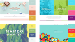
If you make or find some great infographics using a stunning colour scheme, please share them with us, for example using the comments below! As a start, here are some of my favourite examples with a bold colour scheme choice!
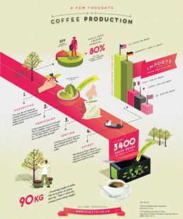
A few thoughts on coffee production (Café du Monde UK)
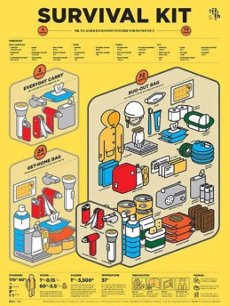
Survival kit (found on Pinterest, artist unknown)
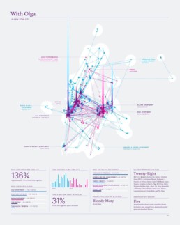
With Olga in New York City (Nick Felton)
Read more:

7 different goals for your chart
A crucial step in building a powerful chart is choosing the right type of chart. A lot of charts don’t work because they simply use the wrong type of chart. To avoid this trap, we must ask ourselves a basic question: what’s the ultimate goal of our data visual? What do we want to show with our data?

Making a data visual noise-free
Removing noise from a data visual is not only about taking things away such as gridlines, axes or legends. That’s just one part of it, which we could call removing physical noise. Improving the signal-to-noise ratio is often also about adding little things that help our audience better understand the visual. We are helping them by removing mental noise, or mental barriers.

Three tips to create powerful charts in Excel
Creating charts in Excel can be a very powerful tool for making sense of complex data sets, and for visualizing them. But the default options are not always the most pretty or effective ones. Here are our top three tips to create better Excel charts.

A powerful chart has a high signal-to-noise ratio
‘Less is more’. It’s a crucial principle in most of our communication, and in data visualization in particular. Because of my background as a physicist, I prefer to talk about the ‘signal-to-noise ratio’. The message - our signal - should be amplified as much as possible, giving it all of the attention. Everything that can distract from our message - the noise - should be removed.

A powerful chart tells a story
A powerful chart has a clear message. It should be short and meaningful, and obvious in the blink of an eye. If there’s only one thing our audience remembers at the end of the day, this should be it.

Navigating the landscape of powerful charts
Once we’ve decided to create a data visual or infographic, there are a lot of questions we should ask ourselves to determine the most suitable format. These considerations could include size, readability, possible interactive functionality, and the level of detail we need.
We are really into visual communication!
Every now and then we send out a newsletter with latest work, handpicked inspirational infographics, must-read blog posts, upcoming dates for workshops and presentations, and links to useful tools and tips. Leave your email address here and we’ll add you to our mailing list of awesome people!
