Choosing a colour scheme for your infographics
Choosing the colours for your infographic might not sound like a priority, but a colour scheme can make or break your entire design, no matter how good your structure or your images are.
Stephen Wildish, The importance of colour
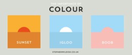
There is an extremely large degree of freedom when choosing a colour scheme: whether you prefer light or dark colours, soft pastel tints or flashy saturated colours, playful or very serious, multiple varieties of the same colour or rather highly contrasting accents. For inspiration, just take a look at the ton of website colour scheme examples over at canva.com.
The hidden meaning of colours
Of course, this plethora of options can very quickly turn into a nightmare. If so many colour schemes exist, where should we start? In case of doubt, it’s always a good idea to return to the basics: the psychological meaning of colours.
Every colour might trigger an unconscious response with your audience, to greater or lesser extent. For example, blue is often used to demonstrate trust and stability. This is the reason why many banks choose a blue logo and branding style. Red, on the other hand, is associated with energy or passion, possibly because of its meaning in nature. Red animals or plants mean trouble, danger, “don’t eat me!”.
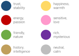
If your infographic has a historical theme, (light) brown might be a good choice. That is the reason why I have selected it as the main colour of my Nobel Prize in Physics infographic, together with bright orange to draw the attention of the reader. Combined with a washed-out version of the medal in the background, the light brown adds a classical, intelligent feel to the visualization:
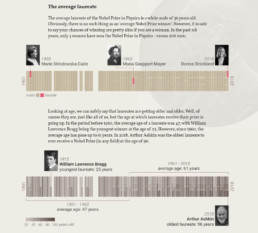
Personal project: history of the Nobel Prize in Physics
Does the product, brand, place or theme you’re making an infographic about have a characteristic colour? Then you’re lucky: you have already found the main colour to start building your colour scheme around. Imagine you are making an infographic about the history of Coca-Cola. Red would be the logical — and probably best — choice for that. Or an infographic about the oceans, fishing, and the diversity of marine life? Blue is the colour you need!
Finding inspiring colour schemes
If you don’t feel confident about building your own infographic colour scheme from scratch, there’s no need to worry. The internet is an endless source of inspiration to add colours to your designs. In the past few years, several handy, free tools have emerged to help you with this task.
One of my personal favourites is coolors.co, which suggests a great new colour scheme at the click of a button (or rather, a spacebar stroke). If you like a colour, but not the entire scheme, you can keep it locked while getting new suggestions for the other colours. Or you can simply play with the sliders to modify the hue, saturation or value of the suggested colours. To top it off, there are multiple easy export options available.

Coolors.co colour scheme generator (screenshot)
A somewhat older, but more community-based sit is COLOURlovers. Here, the colours and colour schemes are chosen by the visitors, and you can browse, search, and like your way through an endless collection of them. And if you’re feeling confident, you can of course share your own favourite personal scheme with the entire community.
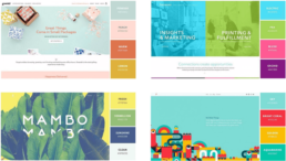
If you make or find some great infographics using a stunning colour scheme, please share them with us, for example using the comments below! As a start, here are some of my favourite examples with a bold colour scheme choice!
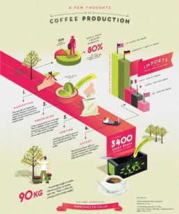
A few thoughts on coffee production (Café du Monde UK)
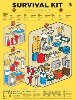
Survival kit (found on Pinterest, artist unknown)
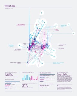
With Olga in New York City (Nick Felton)
Read more:

How powerful charts can boost your career
An American accountant managed - as the youngest ever! - to win a crucial election in Los Angeles - thanks to the power of data visualization. And you, too, can use powerful charts to boost your career!

Why is data visualization so challenging?
Data visualization is very powerful, but it can also be hard. That’s because a great data visual combines three different aspects simultaneously: clarity, correctness, and beauty.

Data visualization resources: all the links you\’ll ever need!
Your Data Visualization Toolkit: Practical tips, templates, and inspiration to make your data shine. Explore, adapt, and create work that’s clear, compelling, and unforgettable.

Why is data visualization so powerful?
The amount of data coming our way is growing exponentially. In 2021 alone, it is estimated that humankind generated 74 zettabytes of data – that’s about 10,000 GB per person. How on earth are we going to keep this manageable?

Infographic: Amazing facts about the brain
Did you know that our brain makes up 2% of our body weight, but consumers about 20% of our energy? Did you know that we have a second brain, located in our gut?
Our information designer Sofia made this insightful infographic, giving you an overview of eight amazing facts about the brain!

How common is your birthday?
Not all birthdays are created equal... in fact, for most countries in the north temperate zone, more people are born in summer (May - August) than in winter (October - January). This heatmap allows you to check how popular your birth date is. It shows the number of people in Belgium for each specific birthday.
We are really into visual communication!
Every now and then we send out a newsletter with latest work, handpicked inspirational infographics, must-read blog posts, upcoming dates for workshops and presentations, and links to useful tools and tips. Leave your email address here and we’ll add you to our mailing list of awesome people!
