Data visualization in a time of pandemic - #1: Finding reliable data
Oh no! Not another coronavirus post! Yes, I know, we are bombarded by pandemic content these days. My apologies for creating even more. However, it is not my purpose to bore you with more of the same, or to confuse you with pointless details. Being a passionate information designer I decided to have a look at good and bad practices in COVID-19 related content from a data visualization point of view. I hope this will be a useful and inspiring overview.
This is a multi-chapter post!
- Chapter 1: Finding reliable data
- Chapter 2: Visualizing exponential growth
- Chapter 3: Mapping the virus
- Chapter 4: We need to talk about flattening the curve
- Chapter 5: On top of the outbreak with daunting dashboards
- Chapter 6: Viral scrollytelling
We are living in remarkable times. The novel coronavirus is causing an epidemic spreading with a velocity we have never experienced before. Busy long-distance air and rail traffic have made it impossible to contain the virus after its first outbreak in China. For the first time our modern world is confronted with a pandemic of this scale and magnitude, and our healthcare systems are being put to the test.
But in fighting these challenges, the world has never been as united as today. Research teams across the globe are working together to develop cures, social media are used extensively to keep everyone informed, and innovative companies are coming up with solutions to keep people at home and the virus at bay. Technology plays a crucial role in this fight.
As an information designer, I am specifically fascinated by the efforts of the data science and visualization communities. The newest developments in these fields are put to use to turn a complex and rapidly changing topic into easy-to-communicate visuals. In only a matter of days, nearly everyone is familiar with the ‘flatten the curve’ visuals, or Washington Post’s animations on the impact of social distancing.
In this post, we will explore some of the marvelous ways people around the world are using data visualization in the fight against the novel coronavirus.

Chapter 1: Finding reliable data
As noted by Edward Tufte, excellent graphics consist of complex ideas communicated with clarity, precision, and efficiency. At the core of a good data visual, therefore, lies accurate data. So before we start diving into coronavirus graphs, we will first take a brief stop at trustworthy data sources.
Sources of reliable data
There are currently three important places where one can obtain reliable and relatively complete aggregate data about the Coronavirus epidemic:
- World Health Organization
The World Health Organization publishes daily Situation reports detailing the number of confirmed cases and deaths per country. They also provide a Situation dashboard which is updated three times per day.
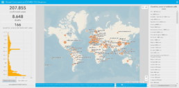
WHO Novel Coronavirus Situation Dashboard
- John Hopkins University
Researchers at John Hopkins University also maintain a dashboard providing an overview of the current number of cases, deaths and recoveries on a per country basis. The underlying data is made freely available through GitHub.
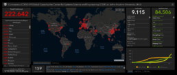
John Hopkins University Coronavirus Dashboard
- European Center for Disease Control and Prevention
The ECDC publishes daily statistics on the pandemic for the entire country (despite its name!). Data is published daily at 1 p.m. CET and is presented on a situation update page.
- Our World in Data
The team of Max Roser collects and combines all available data and information about the epidemic on a single page. This excellent summary provides interactive charts on many different topics ranging from the number of cases to symptoms, incubation period and fatality rate. Each chart comes with a downloadable data set.
Accuracy of data
Collecting and aggregating global data in a rapidly changing environment, such as during a pandemic, is obviously very tricky. None of the above datasets should therefore be considered an ‘absolute truth’, as minor errors are bound to happen. Such errors can be related to reporting difficulties or contradicting sources, or differences and shifts in methodology, but can also be due to minor errors such as typos.
As an example, let us compare the three datasets above for the total number of confirmed cases in Belgium (between March 1 and March 19) with the official numbers communicated by the Belgian government (which can be found here).
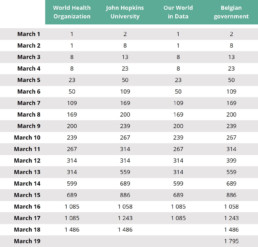
Comparison between different data sources of the reported total number of confirmed COVID-19 cases in Belgium between March 1 and March 19, 2020.
Immediately we can note some discrepancies. The John Hopkins University data follows the government data most closely, with an exception on March 12 where for some reason the number was not updated.
The two other datasets (WHO and Our World in Data) appear to lag behind by one day up until March 16, possibly because WHO Situation reports are published at specific timings which don’t match accurately with government reporting timings. Also, these datasets miss the same update as the John Hopkins numbers (from 314 to 399 cases), they were not updated on March 17, and they appear to have a typing error in them (1.085 cases on March 16, while the official government number was 1.058).
Finally, Our World in Data temporarily stopped updating beyond March 17 because WHO shifted their reporting window: up until Situation report 57 the observed 24-hour time window ended at 10 a.m. CET, since then it ends at midnight. This causes a small overlap making it difficult to accurately compare data and analyze trends.
- Update March 23: Note that Our World in Data stopped relying on WHO data as they found too many errors in the daily Situation reports. Instead, they switched to data provided by the ECDC.
In summary, John Hopkins University data most closely matches official government numbers (for Belgium).
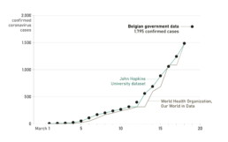
Total number of confirmed COVID-19 cases in Belgium in March 2020, comparison between different sources.
Finding more data sources
If you are looking for alternative data sources, direct reports by governments, or data on specific regions or cities, I highly recommend the data section of the Coronavirus Tech Handbook, a crowdsourced document bringing together all the tools, datasets and visualizations on this topic.
The sheer amount of available data can make it a bit overwhelming, especially taking into account that new numbers are being announced almost constantly. When in doubt, I would advise to stick to the four most complete data sources listed above.
This is a multi-chapter blog post!
Continue reading:
- Chapter 1: Finding reliable data
- Chapter 2: Visualizing exponential growth
- Chapter 3: Mapping the virus
- Chapter 4: We need to talk about flattening the curve
- Chapter 5: On top of the outbreak with daunting dashboards
- Chapter 6: Viral scrollytelling
For all your comments, suggestions, errors, links and additional information, you can contact me at koen@baryon.be or via Twitter at @koen_vde.
Disclaimer: I am not a medical doctor or a virologist. I am a physicist running my own business (Baryon) focused on information design.
Read more:

How powerful charts can boost your career
An American accountant managed - as the youngest ever! - to win a crucial election in Los Angeles - thanks to the power of data visualization. And you, too, can use powerful charts to boost your career!

Why is data visualization so challenging?
Data visualization is very powerful, but it can also be hard. That’s because a great data visual combines three different aspects simultaneously: clarity, correctness, and beauty.

Data visualization resources: all the links you\’ll ever need!
Your Data Visualization Toolkit: Practical tips, templates, and inspiration to make your data shine. Explore, adapt, and create work that’s clear, compelling, and unforgettable.

Why is data visualization so powerful?
The amount of data coming our way is growing exponentially. In 2021 alone, it is estimated that humankind generated 74 zettabytes of data – that’s about 10,000 GB per person. How on earth are we going to keep this manageable?

Infographic: Amazing facts about the brain
Did you know that our brain makes up 2% of our body weight, but consumers about 20% of our energy? Did you know that we have a second brain, located in our gut?
Our information designer Sofia made this insightful infographic, giving you an overview of eight amazing facts about the brain!

How common is your birthday?
Not all birthdays are created equal... in fact, for most countries in the north temperate zone, more people are born in summer (May - August) than in winter (October - January). This heatmap allows you to check how popular your birth date is. It shows the number of people in Belgium for each specific birthday.
We are really into visual communication!
Every now and then we send out a newsletter with latest work, handpicked inspirational infographics, must-read blog posts, upcoming dates for workshops and presentations, and links to useful tools and tips. Leave your email address here and we’ll add you to our mailing list of awesome people!
