Data visualization in a time of pandemic - #3: Mapping the virus
This is a multi-chapter post!
- Chapter 1: Finding reliable data
- Chapter 2: Visualizing exponential growth
- Chapter 3: Mapping the virus
- Chapter 4: We need to talk about flattening the curve
- Chapter 5: On top of the outbreak with daunting dashboards
- Chapter 6: Viral scrollytelling

Chapter 3: Mapping the virus
A pandemic has a strong geographical factor attached to it, so obviously we are drawn to using maps to visualize how the virus is spreading. Both data visualizers and their audience simply love maps, and I personally do to. As a child, my (geographical, historical, biological, even biblical) atlases where my favourite books and I could browse through them for days. However, pretty as they may be, maps have their own pitfalls and caveats. So be prepared!

Beauty in times of despair
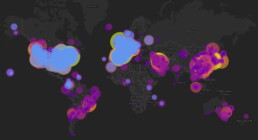
Let’s start with some of the most well-designed examples of maps I have encountered during my research for this chapter. The absolute winner, in my opinion, are these clean but very effective maps by the Washington Post:
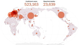
Map showing the global spread of the coronavirus on March 27, 2020 (Washington Post).
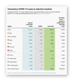
To further clarify things, these maps are complemented by a simple table detailing the exact number of confirmed infections or deaths. This gives the reader the choice to look at the broader picture, dive into the detailed numbers, or both.
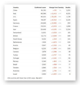
Table showing the global spread of the coronavirus on March 27, 2020 (Washington Post).
It should be noted that the BBC uses very similar, equally beautiful maps. These are examples of proportional symbol maps, or what most normal people simply call bubble maps. But why exactly do these bubble maps work so well?
Mapping issues

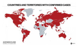
Countries and territories with confirmed cases on March 10, 2020 (ABC News).
Although somewhat helpful, such a map may say more about how connected a country is to the rest of the world, rather than showing how the virus has spread. In any case, it does not provide information about the number of cases. From this map on March 10, we cannot deduct that there was only one confirmed case in Burkina Faso, but over 10.000 in Italy, and over 80.000 in China.
A typical approach to avoid this issue are choropleth maps, a complicated name for something very simple. Blame the Greeks, choros means ‘region’ and plethos means ‘multitude’, hence the name. My scientific brain always tricks me into saying ‘chloropleth maps’, probably because it thinks about chloroplasts in plant cells. But don’t get your hopes up, there’s no connection at all — just my stupid brain. The ‘chloro-’ in chloroplasts also comes from Greek, but from chloros, ‘green’. The same origin, it turns out, as chlorine (because of its pale green color) or chloroform (which contains chlorine). But my apologies, I digress… I might have been reading too much Stephen Fry lately, who would probably love this kind of etymological exploratory ramblings.
So, a choropleth map. In such a map, regions are again colored, but the value of the color (lightness or darkness) depends on the underlying parameter, for example the number of infections in a country. In its most basic form it looks like this example by CNBC:
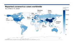
Choropleth map of reported coronavirus cases worldwide as of March 17, 2020 (CNBC).
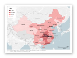
Choropleth map of the spread of the coronavirus in China as of January 26, 2020 (CNN).
However, choropleth maps have their own unfortunate downsides and pitfalls. I will not go into much detail here, as everything was already written down excellently by ‘cartonerd’ Kenneth Field. Let me just summarize:
- choose your colors or color scheme responsibly,
- choose your categories responsibly, and
- use relative numbers to avoid population density distortion.
Or, just maybe, a bar chart might be a better choice:
🎵 The map isn’t the best way to show your data, so the bar chart is where I go. (Source: Kenneth Field)
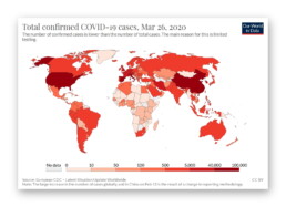
Choropleth map of the total confirmed COVID-19 cases as of March 26, 2020 (Our World in Data)
Bubble maps, such as the ones by the Washington Post shown above, avoid this trap because each nation gets its own bubble, independent of area, population, or population density. This is what makes this kind of chart so successful to map a wide range of values in a wide range of countries around the globe.
There is only one minor downside: bubbles can start overlapping each other when two neighbouring regions have very large values (or one of them has a large value while the other only a small one). Then your bubble chart might start looking like this:
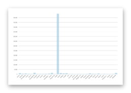
Bubble map on the nCoV-2019 Data Working Group dashboard.
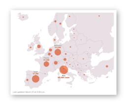
Bubble chart showing confirmed coronavirus cases throughout Europe as of March 27, 2020 (Washington Post)
The return of the table
I already hinted earlier that in some cases, a simple bar chart might be a better option than a complicated map. As Leonardo Da Vinci said: “Simplicity is the ultimate sophistication” (except that he never said that). Another simple but effective alternative might just be… a table.
Many great examples can be found, including the Washington Post ones at the beginning of this chapter, but I was particularly charmed by the Datawrapper ones by Lisa Charlotte Rost, with a clever use of color to bring a touch of optimism to this heavy subject matter:
Datawrapper tables by Lisa Charlotte Rost (screenshot: March 18, 2020).
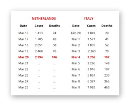
Table comparing the number of infections and deaths between the Netherlands and Italy.
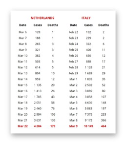
Same data (well, more or less), different story.
Also, differences in age distribution among the population have an impact on the death rate, so it’s rarely a good idea to blindly start comparing different columns or rows with each other, without thinking things through. Remember: if creating panic is your goal, you will always find some data somewhere presented in such a way that you can do so.
There are many, mány more amazing things you can do with tables, also in coronavirus times, but that will be something for another chapter!
Nightmare maps


BBC, by the way, has written an interesting story on an old map showing air travel routes going viral (pun not intended) and causing panic because of poor journalism, such as this badly chosen tweet by the Sun:
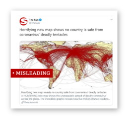
Journalism: you’re doing it wrong.
Finally, if you would ever think about using a pie chart as an alternative to a map… just don’t:
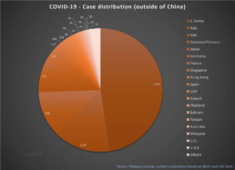
I like pies — Pecan pie! Frangipane pie! Key lime pie! — but not this kind, thanks. (Source: European Scientist)
This is a multi-chapter blog post!
Continue reading:
- Chapter 1: Finding reliable data
- Chapter 2: Visualizing exponential growth
- Chapter 3: Mapping the virus
- Chapter 4: We need to talk about flattening the curve
- Chapter 5: On top of the outbreak with daunting dashboards
- Chapter 6: Viral scrollytelling
For all your comments, suggestions, errors, links and additional information, you can contact me at koen@baryon.be or via Twitter at @koen_vde.
Disclaimer: I am not a medical doctor or a virologist. I am a physicist running my own business (Baryon) focused on information design.
Read more:

7 different goals for your chart
A crucial step in building a powerful chart is choosing the right type of chart. A lot of charts don’t work because they simply use the wrong type of chart. To avoid this trap, we must ask ourselves a basic question: what’s the ultimate goal of our data visual? What do we want to show with our data?

Making a data visual noise-free
Removing noise from a data visual is not only about taking things away such as gridlines, axes or legends. That’s just one part of it, which we could call removing physical noise. Improving the signal-to-noise ratio is often also about adding little things that help our audience better understand the visual. We are helping them by removing mental noise, or mental barriers.

Three tips to create powerful charts in Excel
Creating charts in Excel can be a very powerful tool for making sense of complex data sets, and for visualizing them. But the default options are not always the most pretty or effective ones. Here are our top three tips to create better Excel charts.

A powerful chart has a high signal-to-noise ratio
‘Less is more’. It’s a crucial principle in most of our communication, and in data visualization in particular. Because of my background as a physicist, I prefer to talk about the ‘signal-to-noise ratio’. The message - our signal - should be amplified as much as possible, giving it all of the attention. Everything that can distract from our message - the noise - should be removed.

A powerful chart tells a story
A powerful chart has a clear message. It should be short and meaningful, and obvious in the blink of an eye. If there’s only one thing our audience remembers at the end of the day, this should be it.

Navigating the landscape of powerful charts
Once we’ve decided to create a data visual or infographic, there are a lot of questions we should ask ourselves to determine the most suitable format. These considerations could include size, readability, possible interactive functionality, and the level of detail we need.
We are really into visual communication!
Every now and then we send out a newsletter with latest work, handpicked inspirational infographics, must-read blog posts, upcoming dates for workshops and presentations, and links to useful tools and tips. Leave your email address here and we’ll add you to our mailing list of awesome people!
