Data visualization in a time of pandemic - #5: On top of the outbreak with daunting dashboards
This is a multi-chapter post!
- Chapter 1: Finding reliable data
- Chapter 2: Visualizing exponential growth
- Chapter 3: Mapping the virus
- Chapter 4: We need to talk about flattening the curve
- Chapter 5: On top of the outbreak with daunting dashboards
- Chapter 6: Viral scrollytelling

Chapter 5: On top of the outbreak with daunting dashboards
There’s so much coronavirus data out there – and more is being generated every second. In order to keep the overview, or at least keep some of our sanity, many organizations and individuals have created dashboards. Rather than being a lengthy, descriptive overview, this chapter will point you to some of the best dashboards out there. For those who want to stay on top of things, even during these crazy times.
Dashboards by official organizations
The WHO maintains a Situation Dashboard. This one was recently updated to a much brighter and cleaner design. Make sure to scroll down to see more than just the map! Especially the breakdowns by country are a great addition:
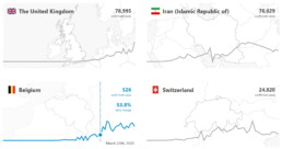
Country breakdowns for the number of cases on the WHO Situation Dashboard.
The WHO Regional Office for Europe also maintains a dashboard, albeit of somewhat dubious design quality. Nevertheless, it contains some interesting gauge graphs (created with Infogram) to illustrate how much the most affected countries contribute to the total number of cases in Europe:
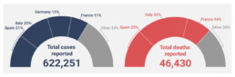
Gauge graphs indicating the contribution of the most affected countries to the total number of cases and deaths (Source: WHO Regional Office for Europe).
The European CDC (Centre for Disease Prevention and Control) has its own dashboard, although in my experience, it is rather difficult to navigate, with a complex layout, a few visual bugs and some counterintuitive (sideways) scrolling which makes it difficult to quickly find the numbers you are looking for.

Dashboards by experts
No, we are not talking about the many armchair virologists or epidemiologists popping up on social media or Medium. This is the real stuff: dashboards created by universities, groups of universities, or teams of experts.
Johns Hopkins University – of course, who else – has probably the most well-known dashboard on COVID-19, built in Ember.js. The focal point of this rather gloomy-colored dashboard is a bubble world map with different viewing options including confirmed cases, active cases, incidence rate and case-fatality ratio. The map is somewhat difficult to read for certain heavily affected regions, but can easily be zoomed in on:
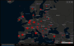
Cumulative confirmed cases in Europe as visualized on the JHU dashboard.
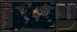
General overview of the JHU dashboard.
The Johns Hopkins dashboard also has a mobile-friendly version.
Other noteworthy expert dashboards include:
- University of Virginia COVID-19 Surveillance Dashboard
- The dashboard by Edward Parker and Quentin Leclerc at the London School of Hygiene & Tropical Medicine which, as a nice bonus, also allows you to visualize past outbreaks of SARS (2003), swine flu (2009) or Ebola (2014).
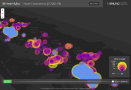
- The Novel Coronavirus HealthMap by the Open COVID-19 Data Curation Group, an initiative including many famous universities such as the University of Oxford and Harvard Medical School. With even a publication in The Lancet, this will be as expert-y as it gets! Basically a (somewhat difficult to read) bubble map, but with some weird navigation tools for you to play around with:
Article-like dashboards
As you probably know by now I’m a sucker for beautiful examples of data journalism. An overview of dashboards would not be complete without mentioning some excellent articles summarizing our information about the outbreak:
- Coronavirus Map: Tracking the Global Outbreak in the New York Times
- Mapping the worldwide spread of the coronavirus in the Washington Post
- Sorry for the patriotism, but I should mention the excellent visuals by the dataviz team at Belgian newspaper De Tijd.
- Coronavirus tracked: the latest figures as the pandemic spreads in the Financial Times. Here, I especially like the bold choice to visualize the spread using small multiples – I don’t usually like this approach, but here I must admit it works really well:
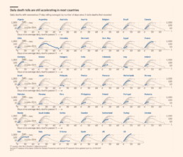
More small multiples! MOAR! (Source: Financial Times)
Other initiatives
And finally, some other noteworthy initiatives:
- The Coronavirus Dashboard by Avi Schiffmann and Jensen. Currently at the top of the Google results if you’re looking for coronavirus dashboards, well done!
- Vinícius Henrique Neves created a dashboard in Microsoft Power BI.
- Bing created their own dashboard, which adds some relevant news items and videos to the mix, as well as some interesting treemaps and strip charts:
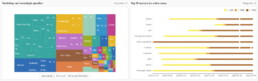
Treemap and strip chart on the Bing COVID-19 dashboard.
This is a multi-chapter blog post!
Continue reading:
- Chapter 1: Finding reliable data
- Chapter 2: Visualizing exponential growth
- Chapter 3: Mapping the virus
- Chapter 4: We need to talk about flattening the curve
- Chapter 5: On top of the outbreak with daunting dashboards
- Chapter 6: Viral scrollytelling
For all your comments, suggestions, errors, links and additional information, you can contact me at koen@baryon.be or via Twitter at @koen_vde.
Disclaimer: I am not a medical doctor or a virologist. I am a physicist running my own business (Baryon) focused on information design.
Read more:

This chart is trying to trick you
The original chart in this example is trying to suggest a strong correlation between sugar intake and obesity in the US between 1980 and 2000. It does so by carefully choosing the vertical axis ranges and scaling so both lines nicely fall on top of each other.

Research visuals: all the resources you’ll ever need!
If you want to start creating clear and attractive visuals about your research, but don't know where to start, this page is for you! Here's a complete overview of tools, resources and inspiration you can use as a starting point for your designs.

Small datasets to practice your data visualization skills
When you're teaching data analysis or data visualization, or when you're learning new data visualization tools and techniques, you might be looking for datasets to practice with. Here are some great starting points.

How to create a graphical abstract
Graphical abstracts are becoming more and more important. Journal publishers such as Elsevier encourage you to create a concise visual summary of the main findings of your research. But where to start? What steps should you follow to create the perfect graphical abstract for your article? What tools can you use?

Behind the maps
In the 30-day Map Challenge, you are challenged to design a new map every day around a certain topic. I participated in November 2020, and wrote this post to share my thought processes, data sources, tools and results!
Data visualization resources: all the links you’ll ever need!
You want to start creating clear and attractive data visuals, but don't know where to start? No worries, here's a complete overview of tools, resources and inspiration you can use as a starting point for your designs.
We are really into visual communication!
Every now and then we send out a newsletter with latest work, handpicked inspirational infographics, must-read blog posts, upcoming dates for workshops and presentations, and links to useful tools and tips. Leave your email address here and we’ll add you to our mailing list of awesome people!

