Data visualization in a time of pandemic - #6: Viral scrollytelling
This is a multi-chapter post! Read the other chapters here:
- Chapter 1: Finding reliable data
- Chapter 2: Visualizing exponential growth
- Chapter 3: Mapping the virus
- Chapter 4: We need to talk about flattening the curve
- Chapter 5: On top of the outbreak with daunting dashboards
- Chapter 6: Viral scrollytelling

Chapter 6: Viral scrollytelling
In this final chapter, we’ll dive deeper into some of the insightful stories which have been published about the novel coronavirus and the COVID-19 pandemic. Rather than looking at single charts, we’ll highlight some long-form stories about the origin of the virus, how it works, and how it spread.
Two concepts should be explained beforehand: visual storytelling, and scrollytelling. Lorenzo Amabili explains both of them very well in his Nightingale article ‘From Storytelling To Scrollytelling: A Short Introduction and Beyond‘ (unfortunately a premium article):
- Visual storytelling, also called narrative visualisation, consists of creating a logical sequence of related (data-driven) visualisations, or visual elements, needed to convey a message to an audience in an engaging and effective way.
In other words, different visuals are strung together to form a logical story, which will keep readers more engaged and increase their understanding. It also allows you to discuss more complex topics by breaking them down into multiple easily understood visuals. These visuals will often be data-driven, but they can also be illustrations, videos, maps,… the possibilities are virtually endless!

- Scrollytelling is visual storytelling for the web: a powerful technique based on a simple concept: new content and visuals appear or change through transitions as users scroll down or up the web page.
This way of presenting information keeps the reader actively engaged with the content and the story. Furthermore, people can easily control the pace by scrolling up and down, back and forth through the story if they choose to re-read difficult sections or skip certain less interesting parts.
I must admit, I absolutely LOVE ❤ scrollytelling, and particularly well-executed examples are appearing more and more regularly in journalism. These advances are fueled by more innovative newsrooms such as the New York Times or the Washington Post, but quickly spreading throughout the world. For example, in Belgium, De Tijd regularly brings engaging scrollytelling stories by the team of Thomas Roelens and, before that, Maarten Lambrechts.
The remainder of this text is dedicated to some remarkable and marvelous examples of visual storytelling and scrollytelling about the coronavirus pandemic. This is absolutely not intended to be an exhaustive list, but rather a collection of interesting examples I encountered during my background research for these blog posts.
Anatomy of a killer
In March, The Economist published ‘Understanding SARS-CoV-2 and the drugs that might lessen its power‘, an in-depth story about the science behind the virus: how is SARS-CoV-2 built, how does it work and replicate itself, what does its genetic sequence look like, and which drugs might have a serious shot at eliminating it. A pretty hardcore scientific explanation, but made easily digestible thanks to some very clear and beautiful illustrations, such as this one by infographer Manuel Bortoletti:

Flattening the curve, revisited
Several scrollytelling articles have been created to explain the reasoning behind the epidemiological curve, how we can flatten it, and differences between different countries’ strategies to do so.
- ‘What Happens Next?‘ by epidemiologist Marcel Salathé and coder/designer Nicky Case explains the curve, SIR and SEIR models using playable simulations.
- ‘What we can learn from the countries winning the coronavirus fight‘ by ABC News uses scrollytelling to explain in detail what exponential growth is, how logarithmic charts work, and what flattening the curve really means.
- At this point, it might be useful to bring up again the infamous Washington Post article ‘Why outbreaks like coronavirus spread exponentially, and how to “flatten the curve”‘ by Harry Stevens, which we discussed in chapter 4, and is a great example of visual storytelling in itself.
- Another Washington Post article worth mentioning, on a similar note, is ‘How epidemics like covid-19 end (and how to end them faster)‘, also showing the effectiveness of wearing facemasks, or enforcing quarantaine.

Detail from ‘How epidemics like covid-19 end (and how to end them faster)’ (Washington Post)
- Or, if you prefer the Spanish version, ‘Cómo el confinamiento frena la cadena de contagios‘ by El País.
How the virus got out
‘How the Virus Got Out‘ by the New York Times uses mesmerizing animations and crystal-clear maps to show how the virus spread from Wuhan, through long-distance train and air travel, to other parts of China and other countries throughout the world. They end with Donald Trump’s quote ‘The virus will not have a chance against us’ on March 11, placed next to a visual showing how by then, the virus already had a secure foothold in the US, with just over 1000 cases.

Detail from ‘How the Virus Got Out’ (New York Times)
This detailed look at how the virus spreads is taken one step further by Reuters Graphics in ‘The Korean Clusters‘. Thanks to insanely accurate contact tracing data being gathered in South Korea, the authorities were able to identify each individual case and how they infected each other. During the first four weeks, the disease was relatively contained, but then ‘patient 31’ emerged, who had at least 1160 traced contacts and went to crowded places such as churches and a hotel buffet while being infected. This is by far one of the most captivating visual stories I have encountered over the past few months!
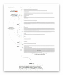
Detail from ‘The Korean Clusters’ (Reuters Graphics), an amazing piece of visual storytelling.
How bad will it get?
It is worth mentioning two stories detailing how the virus can spread, in particular in public transport or between people passing by each other outside:
- South China Morning Post describes a situation where a sick traveler on a four-hour bus journey (feeling sick but not wearing a mask) infected 9 other passengers – complete with detailed seating plans of the bus in question.
- The New York Times describes 6 key factors determining how bad the epidemic will get, including how contagious and deadly the virus is, and how long it will take before a treatment or vaccine is developed. They also indicate how far the virus can typically travel in a public transport environment.

Detail from ‘How Bad Will the Coronavirus Outbreak Get?’ (New York Times)
Remembering lives lost
In the end, it’s all about people. In his article ‘The Workers Who Face the Greatest Coronavirus Risk‘ for the New York Times, Lazaro Gamio uses scrollytelling to guide readers through a stunning scatterplot, showing which professions are most at risk during the pandemic, either because they come in close contact with others (such as hairdressers), or because they have a high exposure to diseases (such as garbage collectors or healthcare workers). The article ends with an interactive version of the graph, enabling readers to explore the data themselves.
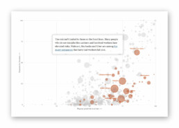
Detail from ‘The Workers Who Face the Greatest Coronavirus Risk’ (New York Times). Did I already mention that I ❤ scrollytelling stories like this?
Let’s end this exploration into pandemic data visualization with one of the most heartbreaking visual stories, published by the New York Times on May 24, 2020. ‘An Incalculable Loss‘ visually shows the 100 000 lives lost to COVID-19 in the US up to that point. 100 000 figures, many of them with additional information making it all the more real. “Marion Krueger, 85, Kirkland, Washington. Great-grandmother with an easy laugh.” Or “Torrin Jamal Howard, 26, Waterbury, Connecticut. Gentle giant, athlete and musician.”

100 000 times.
Cherish the people you love and the present moment, as scary as it is. It is all we have for certain.
– Daily Stoic
Stay safe, everyone. ❤
This is a multi-chapter blog post!
Continue reading:
- Chapter 1: Finding reliable data
- Chapter 2: Visualizing exponential growth
- Chapter 3: Mapping the virus
- Chapter 4: We need to talk about flattening the curve
- Chapter 5: On top of the outbreak with daunting dashboards
- Chapter 6: Viral scrollytelling
For all your comments, suggestions, errors, links and additional information, you can contact me at koen@baryon.be or via Twitter at @koen_vde.
Disclaimer: I am not a medical doctor or a virologist. I am a physicist running my own business (Baryon) focused on information design.
Read more:

Why I love matrix charts
This one is definitely in my top 5 of favourite chart types: a matrix chart! Super flexible, can provide some great insights into the data, and it will fit well into your beautiful report design.

Vreemde plaatsnamen in Vlaanderen
Iedereen kent wellicht 'Kontich' en 'Reet', maar in Vlaanderen hebben we nog veel meer merkwaardige, onverwachte, en vaak grappige plaatsnamen. Heb je bijvoorbeeld ooit al gehoord van Buitenland, Dikkebus, of Grote Homo?

Small multiples can save your chart
When you're dealing with a chart that has too much information on it, the most straightforward advice to follow is: break it down into multiple charts, each with less information on them. A powerful example of this is a so-called small multiple approach.

Can you use Excel to create a powerful chart?
Spreadsheet tools such as Microsoft Excel or Numbers might not be the first thing on your mind when considering data visualization tools, but they can be pretty solid choices to build data visuals. Don’t let anyone convince you that using Excel to create data visuals is unprofessional.

Choosing the right font for your data visual
Fonts evoke emotions: there are very sophisticated fonts, playful fonts, attention-grabbing fonts, and elegant handwritten fonts. Using the wrong type of font can have a lot of impact. In data visualization the implications of typography are mainly focused on readability. Labels and annotations can easily become so small they get hard to read. Above all else, we should choose a font which is readable at small sizes.

Three roles of colour in a data visual
Colour is one of the most crucial tools we have to turn a normal chart into a powerful chart with a clear message, a chart which tells a story rather than simply presenting the information.
We are really into visual communication!
Every now and then we send out a newsletter with latest work, handpicked inspirational infographics, must-read blog posts, upcoming dates for workshops and presentations, and links to useful tools and tips. Leave your email address here and we’ll add you to our mailing list of awesome people!
