Data visualization podcasts for 2023
At Baryon, we’re huge fans of podcasts! Data visualization podcasts are a great way to stay up to date on the latest trends and techniques in data visualization. They provide valuable insights into various topics like data visualization design, visual communication, data exploration, and more. Listening to podcasts can also provide inspiration for your own data visualization projects. Finally, podcasts are a great way to learn from experienced professionals in the field, as well as stay connected to the data visualization community. They often present interviews with the most famous people in the field.
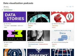
Popular data visualization podcasts include Data Stories, Storytelling with Data and Data Viz Today, but there are many more!
We’ve compiled a list of our favourite podcasts about data visualization (and data science in general) on Notion. This updated list shows the data visualization podcasts you should give a try in 2023. Use the button below to find information on all of them, including links to Spotify, Apple Podcasts and Google Podcasts!
Read more:

Three roles of colour in a data visual
Colour is one of the most crucial tools we have to turn a normal chart into a powerful chart with a clear message, a chart which tells a story rather than simply presenting the information.

7 different goals for your chart
A crucial step in building a powerful chart is choosing the right type of chart. A lot of charts don’t work because they simply use the wrong type of chart. To avoid this trap, we must ask ourselves a basic question: what’s the ultimate goal of our data visual? What do we want to show with our data?

Making a data visual noise-free
Removing noise from a data visual is not only about taking things away such as gridlines, axes or legends. That’s just one part of it, which we could call removing physical noise. Improving the signal-to-noise ratio is often also about adding little things that help our audience better understand the visual. We are helping them by removing mental noise, or mental barriers.

Three tips to create powerful charts in Excel
Creating charts in Excel can be a very powerful tool for making sense of complex data sets, and for visualizing them. But the default options are not always the most pretty or effective ones. Here are our top three tips to create better Excel charts.

A powerful chart has a high signal-to-noise ratio
‘Less is more’. It’s a crucial principle in most of our communication, and in data visualization in particular. Because of my background as a physicist, I prefer to talk about the ‘signal-to-noise ratio’. The message - our signal - should be amplified as much as possible, giving it all of the attention. Everything that can distract from our message - the noise - should be removed.

A powerful chart tells a story
A powerful chart has a clear message. It should be short and meaningful, and obvious in the blink of an eye. If there’s only one thing our audience remembers at the end of the day, this should be it.
We are really into visual communication!
Every now and then we send out a newsletter with latest work, handpicked inspirational infographics, must-read blog posts, upcoming dates for workshops and presentations, and links to useful tools and tips. Leave your email address here and we’ll add you to our mailing list of awesome people!

