Tell me why... I don't like dashboards
😶 I don’t like dashboards. There, I said it.
Ok, some nuance: I don’t like _most_ dashboards. The main reason: they’re trying to do everything, everywhere, all at once.
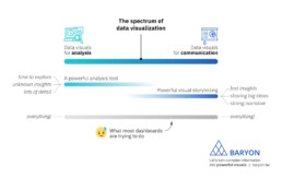
On the spectrum of data visualization, two main clusters of powerful visuals exist:
1️⃣ Data visuals for analysis: useful for data analysts, who have time to explore the data in full detail, with lots of filters, offering many different perspectives on the data. Their goal: extracting the insights from the data.
2️⃣ Data visuals for communication: useful for managers, or a more general audience. They don’t have a lot of time and want to know the major insights, fast, loud and clear. For more complicated stuff, we can craft a strong narrative to guide them through the major insights.
What most dashboards are trying to do, is both of these things simultaneously: raw data goes in, crystal-clear insights come out – or so people expect.

The solution? We make a full-fledged dashboard for the analysts, and a dedicated light-weight version for the management, showing only what they need to know for their decision-making. Or we do our analysis first, and translate those insights into an engaging visual storytelling piece, or an attractive visual report.
As always, we have to think about the audience and their goals. Not just dump the data on top of them, and hope they will figure it out!
Read more:

Vreemde plaatsnamen in Vlaanderen
Iedereen kent wellicht 'Kontich' en 'Reet', maar in Vlaanderen hebben we nog veel meer merkwaardige, onverwachte, en vaak grappige plaatsnamen. Heb je bijvoorbeeld ooit al gehoord van Buitenland, Dikkebus, of Grote Homo?

Small multiples can save your chart
When you're dealing with a chart that has too much information on it, the most straightforward advice to follow is: break it down into multiple charts, each with less information on them. A powerful example of this is a so-called small multiple approach.

Can you use Excel to create a powerful chart?
Spreadsheet tools such as Microsoft Excel or Numbers might not be the first thing on your mind when considering data visualization tools, but they can be pretty solid choices to build data visuals. Don’t let anyone convince you that using Excel to create data visuals is unprofessional.

Choosing the right font for your data visual
Fonts evoke emotions: there are very sophisticated fonts, playful fonts, attention-grabbing fonts, and elegant handwritten fonts. Using the wrong type of font can have a lot of impact. In data visualization the implications of typography are mainly focused on readability. Labels and annotations can easily become so small they get hard to read. Above all else, we should choose a font which is readable at small sizes.

Three roles of colour in a data visual
Colour is one of the most crucial tools we have to turn a normal chart into a powerful chart with a clear message, a chart which tells a story rather than simply presenting the information.

7 different goals for your chart
A crucial step in building a powerful chart is choosing the right type of chart. A lot of charts don’t work because they simply use the wrong type of chart. To avoid this trap, we must ask ourselves a basic question: what’s the ultimate goal of our data visual? What do we want to show with our data?
We are really into visual communication!
Every now and then we send out a newsletter with latest work, handpicked inspirational infographics, must-read blog posts, upcoming dates for workshops and presentations, and links to useful tools and tips. Leave your email address here and we’ll add you to our mailing list of awesome people!
